Data Comics for Education: Evaluating Effectiveness, Benefits, and the Ethics of AI-Assisted Creation
Abstract
In today’s data-driven world, students often struggle with interpreting visualisations due to limited visualisation literacy. Data comics have emerged as a promising medium to enhance engagement and understanding, but their educational value has seen little empirical examination, partly due to the effort required to create them. Recent advances in Generative AI (GenAI) offer a scalable solution to this challenge. We conducted a within-subjects study with 60 university students, comparing conventional visualisations with data comics, created with assistance from GenAI tools, across information retrieval and comprehension tasks. Students consistently performed better with data comics, particularly in insight comprehension tasks, independent of prior visualisation literacy. Students also commented data comics as more engaging and easier to understand, though concerns were raised about GenAI-driven misinformation and ownership. Our findings highlight the potential of data comics as a potentially effective tool for data communication in education, while underscoring the need to address ethical concerns related to AI-assisted creation.
Keywords: Data Comics, Data Storytelling, Data Visualisation, Visualisation Literacy, Generative Artificial Intelligence
1 Introduction
In recent years, technological advancements have generated vast amounts of data, driving innovations in analytics, which now underpin decision-making processes across industries [19, 84]. Higher education, therefore, faces the challenge of preparing students from diverse disciplines to develop foundational skills in interpreting and using data for reasoning, problem-solving and critical thinking as part of their future professional practice [68, 81, 80].
To support these goals, educators have adopted a wide range of data visualisation approaches as a means for translating complex data into accessible visual formats [70, 26]. These visualisations, ranging from simple line charts to intricate alluvial diagrams, aim to communicate data-driven insights effectively [87]. However, students’ capacity to derive meaning from these visualisations, including identifying key data points and interpreting the insights they convey, is not solely a function of their exposure to them. It is shaped both by their level of visualisation literacy – the skills required to interpret and reason with visual data [82, 26] – and by the design choices that determine how information is encoded and presented in more intuitive ways [96]. Indeed, research suggests that students, including those in STEM-related disciplines (Science, Technology, Engineering, Mathematics) [65], often struggle to interpret data visualisations presented during class [10, 36].
One response to these educational challenges has been a trend toward adopting data storytelling, which integrates narrative structures with data visualisations to guide attention, highlight trends, and provide context for interpretation [54, 55, 29], presenting a promising design space for educational use [30, 36, 37]. Within this genre, data comics have emerged as a promising format that adapts the familiar structure of comics, such as panels, sequencing, characters, and narratives, to communicate data-driven stories [6, 7, 100, 101]. This approach has been suggested as particularly supportive for novice students, while also fostering the gradual development of visualisation literacy [101, 13]. For education, data comics opens a unique design space to simplify the communication of complex insights [7]. Evidence of their growing use across K–12 [67, 94, 97, 44] and higher education [70, 12] highlights their potential as educational tools that can enhance students’ engagement [67], and encourage active exploration of data insights [44, 12].
However, although some authors have conceptually suggested that data comics are novice-friendly and potentially beneficial in educational settings [57, 13, e.g.,], empirical evidence on their actual effectiveness remains limited, especially in direct comparisons to conventional visualisations. A significant gap exists in understanding students’ perceptions of data comics and whether they can effectively interpret them to grasp data insights. One of the main obstacles that has long hindered such investigations is the time-consuming and labour-intensive creation process, which often relies on manual design and crafting [70, 51], and requires expertise and skills across multiple domains such as data visualisation, art, storytelling, and pedagogy [13, 12]. This production bottleneck constrains opportunities to systematically evaluate their educational potential.
Yet, recent advancements in generative artificial intelligence (GenAI), particularly text-to-image GenAI tools (e.g., Midjourney, DALL-E 3), offer new opportunities to address this production bottleneck. Researchers and practitioners can now use such tools to accelerate the creation of visual content and narratives for building data comics [49, 70, 107]. Yet, despite the potential benefits, using GenAI for educational purposes raises ethical concerns related to critical aspects such as misinformation, bias, ownership and transparency [105, 33]. Thus, understanding both the educational potential and the ethical risks, before deployment in authentic settings, is essential for exploring how GenAI and data comics can be integrated to support learning tasks.
To this end, we conducted a comparative study with 60 student participants to examine: i) the extent to which data comics, co-created with GenAI assistance, effectively communicate data insights compared to conventional visualisations for information retrieval and comprehension tasks; ii) the potential mediating role of students’ visualisation literacy; and iii) students’ reflections on the benefits and limitations of these data comics, as well as ethical concerns regarding their AI-assisted creation for educational purposes. Effectiveness was assessed through students’ accuracy in responding to questions about the data represented through visualisations or data comics, aligning with prior comparative studies of data visualisation [86, 72] (i). The Mini-VLAT instrument was used to measure students’ visualisation literacy [76] (ii), while thematic analysis captured perceptions of benefits, limitations, and ethical implications (iii). To the best of our knowledge, this is the first study to empirically investigate the effectiveness of communicating data insights to students through data comics co-created with GenAI technologies.
2 Background and Related Works
2.1 Foundations of Data Storytelling in Education
Conventional data visualisation transforms raw data into visual forms that enable viewers to explore, uncover, and interpret information [46]. Various techniques such as line charts, bar charts and boxplots are commonly used to facilitate interpretation [82]. However, fully understanding the insights extracted from data often requires individual’s ability to interact effectively with these visualisations [66, 92, 58, 15].
In educational contexts, interpreting these data insights often expects students’ ability to connect new information with prior knowledge and experiences [48, 1]. This aligns with constructivism theory, which views learning as an active process of integrating new information into existing cognitive frameworks [18, 78, 1]. Yet, students bring varying level of background in data visualisation, making interpretation challenging. Prior studies show difficulties in interpreting visualisations in learning dashboards [10, 36] and even simple classroom charts among STEM undergraduates [65]. Thus, limited visualisation literacy can hinder insight extraction especially when visualisations lack the contextual and cognitive support [11, 65, 93]. To address these challenges, data storytelling has been proposed as a novice-friendly, constructively aligned approach to communicating insights [54].
Data storytelling combines narrative elements (e.g., annotations, descriptions, sequencing) with visualisation design features (e.g., colour, arrows, clear titles) to guide attention towards critical insights [29]. By emphasising on the most relevant data points and providing contextual annotations intentionally, data storytelling can make insights more interpretable and meaningful [54, 86].
Studies in education has primarily examined the impact of data storytelling on educators. Storytelling elements have been shown to facilitate educators’ comprehension of visual analytics [31], direct attention to relevant insights [30], and support reflection [71] through narrative-embedded visualisation. While annotated charts have been found to support healthcare students in gaining insights on their own practice, empirical evidence regarding its impact on students remains scarce [66]. Collectively, this body of work suggests that exploring specific genres of data storytelling, such as data comics, may be timely for supporting novice students [13, 10, 36].
2.2 Data Comics for Student Learning
As a rather novel branch of data storytelling inspired by comic strips [85], Data comics utilise similar design principles (e.g., frame, image, word) as in traditional comics [95] and integrating narrative elements (e.g., textual and pictorial content) into panel layouts to convey insights from data [100, 6]. The adoption of data comics for communicating data-driven narratives aims to maximise the clarity of the communicated insights to both experts and non-experts [7, 100, 61].
For this purpose, 7 delineated two fundamental dimensions (i.e., content relation and layout) to form several design patterns that guide how these dimensions can be organised to facilitate insight communication coherently. Some researchers [61, 70, e.g.,] have applied these patterns to communicate convoluted data insights effectively and address the skill gap that non-experts, such as students, may have to understand conventional visualisations [65, 10, 36]. For instance, 61 used data comics to present knowledge graphs of endangered Indigenous Australian languages, finding that narrative elements, presented with detailed information, scaffold easier understanding for both educators and students. Similarly, 70 transformed conventional visualisations from educational simulations into data comics to support students’ engagement and reflection.
However, the effectiveness of data comics in conveying data insights to students compared to conventional visualisations remains underexplored. The closest study is by 102, who compared data comics with infographics and found comics to be more enjoyable and easier to follow, leading to improved comprehension and recall. Likewise, 42 reported higher engagement with personal data comics than annotated visualisations, while differences in efficiency, accuracy, and recall were not statistically significant. Moreover, the study was limited by its single comparison set and lack of attention to participants’ visualisation literacy.
Consequently, it remains to be examined: (1) whether data comics are more, less, or equally effective than conventional visualisations for communicating insights; (2) how students with different levels of visualisation literacy navigate data comics; and (3) how students perceive the benefits, limitations, and effectiveness of data comics for insight communication. Addressing these questions has traditionally been constrained by the time and effort required to create data comics [70, 51]. Recent advances in AI-assisted content generation, however, offer exciting opportunities to accelerate data comic creation and allow the wider adoption in educational research and practice [7, 71, 70]. This opens the door to systematically exploring the educational potential of data comics at scale.
2.3 AI-Assisted Creation of Data Storytelling and Data Comics
Recent advancements in GenAI are transforming the ways in which people engage with data [49], particularly in enabling multimodal content generation, ranging from text-to-text (T2T) [8] to text-to-image (T2I) [107] and text-to-video (T2V) [52]. These capabilities substantially reduce the time and effort required to produce media and introduce new opportunities for the automated creation of data-driven narratives [59].
Early automated data storytelling systems, such as Calliope [90], relied on rule-based approaches to identify and sequence “data facts” into coherent structures. More recently, the field has rapidly shifted towards Large Language Model (LLM)-based multi-agent frameworks (e.g., “Data Director”) that decomposed data analysis, narrative generation, and visual design, enabling more flexible and sophisticated storytelling workflows [88, 98].
In the specific domain of comics, 21 proposed a collaborative generation system that integrates visual narrative theories and “comic authoring idioms”. By encoding narrative grammars (e.g., transition types between panels) as constraints, their system generates comics that maintain structural coherence while leveraging the creative capabilities of diffusion models. Beyond structural automation, researchers are exploring leveraging AI to translate technical data into accessible visual metaphors. 45 developed a pipeline that uses an LLM to interpret software source code and generate metaphorical descriptions that guide comic creation through Stable Diffusion. To address concerns about “hallucination” and data misrepresentation, 91 proposed a taxonomy of constraints and Domain-Specific Languages (DSLs) to preserve data fidelity throughout the visual generation process.
In educational contexts, these AI-enhanced formats are beginning to be evaluated for their pedagogical effectiveness. 70 employed GenAI tools to transform learning analytics data into personalised comic strips and found significantly increased student engagement and emotional connection to the data. However, concerns remained regarding the perceived “professionalism” of the comic medium. More broadly, evaluations of GenAI-generated educational materials have highlighted both the scalability benefits and the need for rigorous validation to prevent subtle visual or factual errors [27].
Collectively, these studies illustrate the significant potential of AI technologies, especially GenAI, in facilitating the creation of data storytelling artefacts, while serving as a reminder that their successful integration into education requires careful consideration of its appropriateness to meet the pedagogical intent.
2.4 Ethical Concerns of using Generative AI in Education
While there is considerable enthusiasm about the opportunities that GenAI offers for supporting new forms of interaction with data in educational contexts, its integration is shaped by valid and pressing ethical concerns raised by educational stakeholders [2, 69]. A primary challenge is the risk of dissemination of misinformation. While GenAI holds the potential of enhancing personalised learning through tailored feedback and adaptive interventions, it also risks generating content that appears authoritative but lacks factual accuracy, potentially misleading both students and educators [105]. Additionally, concerns about bias and fairness can emerge when GenAI models trained on biased data perpetuate stereotypes, as noted by 33. This can compromise educational fairness, especially for diverse student groups. Moreover, GenAI’s impact on equity and accessibility has been questioned, with visually impaired users facing difficulties verifying content accuracy without additional support [41].
Ownership and intellectual property issues can also challenge the applications of GenAI for educational purposes, especially in terms of generating images. The blurring of authorship lines can lead to disputes, particularly when GenAI is used to create deepfakes or plagiarised content, undermining the integrity of educational materials [23]. While much of the existing research has focused on educators’ concerns, little attention has been given to the ethical concerns that may be raised by students, who are key stakeholders in the learning process. Ensuring their perspectives are considered is crucial, particularly in the case of data comics, where ethical implications may directly impact their understanding and engagement [4].
2.5 Contributions and Research Questions
This study aims to address the gaps identified above by applying principles for designing data comics with GenAI assistance and empirically evaluating their effectiveness in communicating data insights to students. Situated at the intersection of human behaviour and emerging technologies, this work builds on prior research exploring the potential of data storytelling to facilitate information retrieval and comprehension [86, 42, 72], our contributions include a quantitative comparison of the effectiveness of data comics versus conventional visualisations in conveying data insights for information retrieval and comprehension tasks. These two tasks align with the foundational levels of Bloom’s taxonomy as adapted for data visualisation [5], which have also been examined in prior comparative studies on conventional data visualisations [86, 72]. We also investigate the impact of students’ visualisation literacy levels on the effectiveness to which students complete these tasks with conventional visualisations and data comics, respectively. Additionally, we assess students’ perceptions of the factors that may enhance or hinder insight communication, including perceived benefits and limitations. Lastly, we examine students’ ethical concerns regarding the use of GenAI in assisting the creation of data comics. As a result, we propose the following research questions:
- RQ1.
To what extent do data comics effectively communicate data insights to students compared to conventional visualisations?
- RQ2.
To what extent do the effectiveness of data comics, as compared to conventional visualisation, vary in communicating data insights for information retrieval and comprehension tasks?
- RQ3.
To what extent do the students’ visualisation literacy influence the effectiveness of data comics compared to conventional visualisations?
- RQ4.
What are the students’ perceptions on potential benefits and limitations of data comics in communicating data insights compared to conventional visualisations?
- RQ5.
What are students’ perceived ethical implications of employing GenAI in supporting the creation of data comics?
3 Methods
3.1 Dataset and Materials
For this study, we selected the globally relevant topics of climate change and global warming, which have garnered increasing concern worldwide. Some data in this field have proven difficult for students to interpret, especially those with limited visualisation skills [89, 40]. We included four conventional visualisations in our study: one based on a dataset from Kaggle and the others derived from a pertinent comparative study [86].
To generate the four data comics, we drew on the established data comic design patterns proposed by 7, which structure data-driven stories along two key dimensions: content relation (how individual insights relate to one another) and layout (how panels are spatially arranged on the page). Guided by these patterns, we followed a two-stage process – separating human-led narrative design from the human–AI co-creation of visual elements – carried out by three researchers: one with expertise in data science and visual analytics (RA) and two with backgrounds in visualisation and dashboard design (RB & RC). The full process, with worked examples and illustrative panels, is detailed in Appendix I.
In Stage 1 (human-led narrative design), RA acted as the primary content creator, extracting key insights from the data and classifying each into one or more of the six content relation categories defined by 7 (Narrative, Temporal, Faceting, Visual Encoding, Granular, and Spatial; see Appendix F). Based on these categories, the insights were mapped onto panel layouts (e.g., Parallel, Annotated) selected from the same set of design patterns, so that the sequencing and spatial arrangement of panels guided the reader’s attention in a principled manner. RB and RC acted as reviewers, validating the chosen insights and contributing to decisions about narrative sequencing and layout structures.
In Stage 2 (human–AI co-creation of comic strips), RA generated and refined image elements using DALL-E 3 (OpenAI), accessed via its integration with ChatGPT-4 and following the prompting guidelines reported in Appendix H. The curated images were then integrated into the pre-defined panel layouts to construct the comic strips, with RB and RC providing input on visual consistency and narrative clarity across panels. Finally, storytelling elements such as titles, annotations, and highlights were layered onto the strips, and the comics were assembled using Canva.
The final set of four data comics, created through the aforementioned crafting process, is presented in Appendix C.
3.2 Study Design and Procedure
We designed a controlled study in which we manipulated a single variable: visualisation type – the conventional visualisation condition (CV), versus the data comics condition (DC). A within-subjects study design was implemented, where participating students were presented with both conventional visualisations and data comics. To counterbalance its order effects, we randomised the order of visualisation presentation. Therefore, each participant served as their own control, ensuring the statistical power and sensitivity in investigating effects [25]. The study was established in the form of a survey using Qualtrics, an online platform for designing and conducting research experiments. Ethics approval was obtained from the Human Research Ethics Committee at the university where the study was conducted (Project ID: 37307) and consent from participants were acquired. The study was structured to be accomplished within approximately 35 minutes. The study consisted of five parts (see details in Appendix A to E):
- 1.
Part 1: Demographic questions;
- 2.
Part 2: Basic visualisation literacy questions (relevant to RQ3) - the Mini-Visualisation Literacy Assessment Test (Mini-VLAT) developed by 76 was employed to assess students’ comprehension and interpretation of various visualisation types, including those used in the study (e.g., bar charts and stacked area charts);
- 3.
Part 3: Comparative visualisations questions (relevant to RQ1 and RQ2) - students were presented with four sets of questions, each containing two information retrieval questions and two comprehension questions;
- 4.
Part 4: Open-ended perception questions (relevant to RQ4) - students’ perceptions and attitudes regarding using data comics for insight communication were gathered through open-ended questions;
- 5.
Part 5: Ethical implication questions (relevant to RQ5) - open-ended questions were provided, allowing students to elaborate on their ethical concerns about using GenAI in the creation of data comics.
Further details of the last three sections are provided next.
3.2.1 Comparison Study (Study Part 3)
Data Comics vs. Conventional Visualisations. This subsection outlines Part 3 of our study, where we created four pairs of visualisations - four conventional visualisations (CV1-4) and four data comics (DC1-4). Each pair comprised a conventional visualisation and a data comic, both presenting the same data insights under different conditions to maintain comparison consistency.
Figures 1 and 2 show an example of one of our comparative pairs, specifically pair 2, which includes CV2 and DC2, respectively. To mitigate order effects and learning biases in our study, we used a counterbalanced design where each participant randomly viewed two items from each condition in a random order, unaware of which were conventional or comics. For example, one participant might view visualisations CV1 and CV2 along with comics DC3 and DC4, while another might encounter CV3 and CV4 paired with comics DC1 and DC2 and so on.


Types of questions. Following the approach by 86 and 72 for scrutinising the effectiveness of data storytelling approaches, we structured the questions for our comparative visualisations using the first two levels of Bloom’s taxonomy tailored to data visualisation tasks [5, 17]: “knowledge” and “comprehension”. These levels were chosen to align with the goals of our RQ2. Participants were presented with four questions per visualisation — two assessing their “knowledge” and two assessing their “comprehension”. For consistency, the same set of questions was used for each paired visualisation (e.g., CV1 and DC1). The design of each question category is detailed below:
Level 1 - Knowledge questions in Bloom’s taxonomy served to assess whether users can identify and select relevant data points, categories, or trends from a dataset. In our study, participants were required to answer two information retrieval questions for each visualisation (see Table 1, row 1).
Level 2 - Comprehension questions tested the participants’ abilities to understand, interpret, and derive insights from visualisations. Participants were asked to respond to two comprehension questions per visualisation. These questions were split into two sub-types: i) single insight - required selecting the correct answer about a single insight provided by the visualisation (see Table 1, row 2), and ii) multiple insights - involved identifying an incorrect statement among four, requiring a broader understanding of multiple insights [5, 17] (see Table 1, row 3).
| Bloom Taxonomy | Question Type (each visualisation) | Examples | |||||
|---|---|---|---|---|---|---|---|
| Level 1: Knowledge | Information Retrieval (x2) |
| |||||
| Level 2: Comprehension | Comprehension (single insight x1) |
| |||||
| Comprehension (multiple insights x1) |
|
3.2.2 Open-ended Perception Questions (Study Part 4)
In this part of the study, participants were invited to share their perspectives on the effectiveness of data comics in conveying data insights compared to conventional visualisations by responding to four open-ended questions. We gathered participants’ views on the features (if any) of data comics that may enhance communication and engagement, their examples of instances where data comics may have outperformed conventional visualisations (if this was perceived), and their perceived limitations or concerns, addressing RQ4 (see questions in Appendix D). Their responses were then analysed to shed light on investigating the advantages and disadvantages of data comics, addressing our RQ4.
3.2.3 Ethical Implication Questions (Study Part 5)
In this final part of the study, we revealed to students that all data comics presented in the previous questions were produced to some extent with the assistance of GenAI. We provided three yes/no questions to allow students to express their ethical concerns regarding the use of GenAI in the creation of visual content, specifically focusing on commonly-held concerns regarding misinformation [105], bias [33], and ownership [23] as discussed in Section 2.4, addressing RQ5 (see in Appendix E). Two open-ended questions were provided to elaborate on these three ethical concerns and express additional concerns beyond those mentioned above. For example, one question was: “Do you believe there are concerns about potential misinformation associated with the use of GenAI-powered data comics?” If yes, please elaborate on your concerns.
3.3 Participants
Participant recruitment was conducted through two channels: Prolific, an online platform for academic research, and the researchers’ university. An a priori power analysis using G*Power 3.1 [34] indicated that 47 participants were required to achieve sufficient power (, power = 0.95, effect size = 0.5), based on [86, 71]. We recruited 60 student participants. Eligible participants were required to have advanced English proficiency and complete the survey on a laptop or desktop to ensure consistent visual display. Before the main study, two pilot participants helped refine the survey; their responses were excluded from analysis. Responses were considered invalid if participants skipped more than three questions or failed to complete the survey. The participants’ demographics were reported in Appendix G.
3.4 Analysis
3.4.1 Metrics
We defined the following metrics to address our research questions and both of them were calculated for both conventional visualisations and data comics:
- •
Correct Rate: In the comparison study detailed in Section 3.2.1, each question regarding individual pairs of visualisations carried a raw score of 1 for each correct answer. For calculating the Correct Rate (CR) based on each participant, we collected associated indices: i) the number of total questions (TQ), which was 16 for each condition (CV and DC) and ii) the total number of correct answers (CA). The computing formula is given below:
(1) To provide a more accurate reflection of the individual’s actual understanding, minimising the impact of guesses on their performance, we implemented the “correction for guessing” formula proposed by 39. This formula is employed to adjust scores in assessments, particularly suitable for multiple-choice questions, reducing the influence of guessing [39]:
(2) In this formula, “CS” represents the correct rate of a participant’s accuracy (corrected for guessing). “Right” refers to the total number of correct answers, while “Wrong” reflects the total number of incorrect answers. The variable “k” indicates the number of choices per question, set at four in our study. By applying these formulas in our case, the adjusted CS was used to account for the correct answer (i.e., CA = CS), and hence, the numerical value for Correct Rate (CR) ranges from 0 to 1.
- •
Visualisation Literacy Correct Rate: Similar to the calculation of Correct Rate detailed in Section 3.4.1, each question in the Mini-VLAT (see in Section 3.2) also carried 1 raw score for each correct answer. For calculating the Visualisation Literacy Correct Rate (VLCR) based on each participant, we collected associated indices: i) the number of total questions in Mini-VLAT(VLTQ), which was 12 and ii) the total number of correct answers in Mini-VLAT (VLCA). The computing formula is given below:
(3) We also applied the “correction for guessing” formula [39] to adjust for the probability of correct answers that may have been achieved through guessing. The value range for this metric is 0 to 1.
3.4.2 Analysis for each RQ
To address RQ1, we utilised R to compute the median and interquartile range (IQR) of the correct rate metric, visualising the results with a box plot. Specifically, we conducted the Shapiro-Wilk W-test to evaluate the normality of the data collected [83]. Our analysis revealed that the correct rates collected in our study did not follow a normal distribution (), and the visualisation literacy correct rates were likely not normally distributed (p 0.1). Therefore, we applied the Wilcoxon signed-rank test, tailored for paired data and accommodating individual differences by regarding each participant as their own control. In our analysis, we adopted a significance threshold of p 0.05 to assess statistical significance [73]. We used the as the effect size measure, chosen for its appropriateness in comparing non-parametric paired data.
To address RQ2, we categorised the collected data based on question type, distinguishing between information retrieval and comprehension tasks. For comprehension tasks, we further identified subtypes, containing single insights versus multiple insights. For each subtype, we computed the median and interquartile range (IQR), visually presenting these statistics through box plots. Furthermore, we employed the same statistical tests used for RQ1 to evaluate differences in effectiveness between data comics and conventional visualisations across the two task levels. To prevent the issue of statistical significance occurring by chance due to multiple comparisons, we applied Bonferroni correction to adjust the p-values by multiplying the original values by 4 (n comparisons) [50].
To address RQ3, we tested whether visualisation literacy (VL) predicts task accuracy and whether this relationship differs between data comics (DC) and conventional visualisations (CV) conditions. We conducted a linear regression with CorrectRate as the dependent variable, and VL correct rate, Condition and their interaction (VL correct rate × Condition[DC]) as predictors. This interaction tested whether the effect of VL on accuracy varied across conditions.
In all models, referred to the intercept, with the CV condition serving as the baseline, while Condition[DC] indicated the DC condition.
| (4) |
To address RQ4, two independent coders carried out thematic analyses [16] on participants’ perceptions concerning the advantages and disadvantages of using data comics for conveying data insights versus conventional visualisations, coding each of the 60 valid responses11 1 While the participants were asked to answer four questions, the last question was optional. Thus, participants’ answers to the four (or three in some cases) questions were concatenated as a single response per participant.. During the analyses, emerging themes were validated through an iterative process of constant comparison with the raw data and refinement. Reflexive discussions among the research team helped to check potential biases and ensure that interpretations remained grounded in participants’ accounts. Final themes were assessed collaboratively for coherence and distinctiveness, with illustrative quotations used to demonstrate their credibility. The consistency of the thematic analysis was validated by assessing inter-rater reliability through Cohen’s Kappa [24]. In these analyses, the two coders achieved Cohen’s kappa values of 0.76 and 0.81 for benefits and limitations respectively, indicating “substantial” to “almost perfect” agreement [56]22 2 56 described kappa values between 0.61 and 0.80 as “substantial” agreement, and values between 0.81 and 1.00 as “almost perfect” agreement.. Disagreements were resolved through case-by-case discussion between the two coders to enhance consistency.
To address RQ5, we quantified the frequency of participants’ concerns regarding leveraging GenAI in the production of data comics, with the primary focus on misinformation, bias, and ownership issues. For the two open-ended questions, we combined their answers into a single entry to capture each participant’s perspective holistically; thus, the participant is the unit of analysis. We then applied thematic analysis [16], following an inductive coding approach to identify recurrent patterns in participants’ concerns. Codes were iteratively refined into broader themes that captured common perspectives and issues raised across participants. Responses from the sixty participants were coded independently by two researchers using broader themes, and inter-rater reliability was evaluated to ensure consistency and reliability in the analysis of this segment [74]. The two coders achieved a Cohen’s of 0.83, indicating a very good level of agreement in evaluating participants’ ethical concerns.
4 Results
4.1 Preliminary Exploration
Before diving into the research questions, a preliminary analysis of participants’ responses in Study Part 3 (Section 3.2.1) was conducted. Our exploration revealed that participants’ overall accuracy was moderate (median: 0.500, IQR: 0.250). Our analysis showed that participants performed better on information retrieval questions (median = 0.667, IQR = 0.333) than on comprehension questions (median = 0.333, IQR = 0.333). This difference was significant, with a large effect size (Mann–Whitney , , , ). Within comprehension items, performance was comparable between single-insight (median = 0.333, IQR = 0.667) and multiple-insight questions (median = 0.333, IQR = 0.334). The difference was small and only marginally significant (, , , ). However, performance on information retrieval items remained significantly higher than on both single- and multiple-insight comprehension questions (). These preliminary findings suggest that comprehension questions were consistently more challenging than retrieval questions, as intended in the study design.
4.2 Effectiveness of Data Comics (RQ1)
To address RQ1, we compared the effectiveness of data comics (DC) and conventional visualisations (CV) in communicating data insights, measured by participants’ Correct Rate (correct answers). participants achieved a significantly higher CorrectRate with DC (median = 0.750, IQR = 0.333) than with CV (median = 0.333, IQR = 0.333), indicating a large effect (, , , ). These differences are illustrated in Figure 3.

These findings suggest that data comics enhance accuracy, highlighting the potential of data comics to improve the communication of insights. Further analyses are required to examine differences across specific question types, which we present in the next section.
4.3 Effectiveness in Information Retrieval and Comprehension Tasks (RQ2)
To address RQ2, we examined the impact of data comics across two task levels: information retrieval and comprehension of insights, further dividing comprehension into single-insight and multiple-insight tasks.
For information retrieval tasks, participants achieved a significantly higher correct rate in the DC condition (median = 0.667, IQR = 0.333) compared to conventional visualisations (CV) (median = 0.667, IQR = 0.334), with a moderate effect size (, , , ), corresponding to an average increase of 0.156. For comprehension tasks, participants also performed significantly better with DC (median = 0.667, IQR = 0.667) than with CV (median = 0.000, IQR = 0.333), showing a large effect size (, , , ). That is, data comics increased the correct rate by a mean of 0.417, suggesting greater benefits for comprehension relative to retrieval tasks. These differences can be seen in Figure 4.

When separating comprehension into subtypes, DC also outperformed CV. For single-insight questions, DC yielded a higher correct rate (median = 0.333, IQR = 0.667) than CV (median = 0.167, IQR = 0.333), with a large effect (, , , ), an average increase of 0.322 (Figure 5). For multiple-insight questions, DC showed an even larger improvement (median = 1.000, IQR = 0.667) compared to CV (median = 0.333, IQR = 0.333), with a large effect (, , , ), corresponding to an average increase of 0.406 (see Figure 5).

In summary, across both information retrieval and comprehension tasks, data comics consistently outperformed conventional visualisations, with the largest gains observed in comprehension, particularly for multiple-insight questions, highlighting their potential to support deeper data understanding.
4.4 Visualisation Literacy and Effectiveness (RQ3)
To address RQ3, we examined the relationship between visualisation literacy (VL) and effectiveness using a linear regression model (see Equation (4) in Section 3.4.2). The model explained a significant proportion of variance (, , ). The intercept was significant (, , ), indicating a baseline correct rate of 17.2% when VL = 0 and the condition was conventional visualisation (CV). VL was a significant positive predictor of effectiveness (, , ), suggesting that each 1% increase in VL corresponded to a 0.371% increase in task accuracy.
We also found a significant main effect of condition (, , ), indicating that participants working with data comics (DC) achieved on average 28.1% higher accuracy compared to CV. However, the interaction term (VL Condition[DC]; , , ) was not significant, indicating that the positive association between VL and effectiveness was consistent across both conditions.
Taken together, these results indicate that while data comics positively impact the communication of data insights (RQ1), particularly for higher-level comprehension tasks (RQ2), visualisation literacy remains a critical factor (RQ3). Even in the data comics condition, students with higher visualisation literacy outperform those with lower literacy, much as they do when using conventional visualisations.
4.5 Perceived Benefits and Limitations of Data Comics (RQ4)
4.5.1 Perceived Benefits
All participants agreed that data comics offered notable benefits (N=60). Ninety percent (N=54) perceived them as more accessible for broader audiences and more efficient in conveying information compared to conventional visualisations. Elaborations on perceived benefits were distilled in the following three themes.
Theme 1 - Accessible and efficient insight communication. The first theme referred to the perceived augmented accessibility and efficiency of data comics in delivering data insights (N=54). For some participants, data comics can make data relatable as they “contextualise data” (P15, P23) through “weaving the story” (P50) behind the data, offering an “easier way to associate the data to the corresponding topic” (P46). The assembling of pictorial and textual elements was perceived as an organised reading sequence (“works like a comic book to convey information step-by-step” - P4), leading participants to “easily follow the flow of data storytelling” (P8). With the assistance of visual elements (e.g., bold fonts or explanatory annotations), some participants said that they found data comics to be “easier to follow and understand” (P4, P45, P57), thus audiences were “quicker to grasp the key point” (P6, P7). A few participants (P5, P21) perceived it easier to differentiate data relationships (“pictures and textual explanations allowed me to know the relationship more directly than traditional data visualisations” - P14). Notably, some participants (P4, P39, P53) also described data comics to be “easier for people who have difficulty reading graphs”. These comments suggest that data comics, in contrast to conventional visualisation, provide more accessible opportunities in conveying intended data insights efficiently.
Theme 2 - Engaging presentation. Another theme identified referred to participants’ perceiving data comics as a more attractive format to engage the audience into the story (N=44). The majority of participants expressed positive views about the use of colourful images and visual cues (N=36), which were depicted to be fairly appealing and attractive (“Comics are sort of fun and captivating, which keeps audience engaged - P40”). These graphics “make the data more emotive” (P45, P18) and hence, further “awakening unmotivated readers” (P52). Moreover, the manner in which information is laid out was perceived as contributing to foster “more entertaining reading” (P20), which was echoed by the perspective of one student arguing that “The visual diversity of data comics is better at capturing and holding the viewers’ attention than cookie-cutter statistical graphics” (P14). Interestingly, one student noted that data comics surpassed at “associating with the traditional comic strip format to encourage the audience engage with them because they are familiar [with comics]” - P31. These comments suggest that data comics can enhance the aesthetic appeal of information presentation to create a more engaging experience for the audience.
Theme 3 - Perceived ease of information retention. Some participants (N=20) reported finding it easier to recall key insights in data comics conditions. The cartoonish style was perceived as more interesting to aid participants remembering key data points (P8, P10). Most participants pointed out that the imagery elements can promote the retention of detailed information (“visual metaphors and symbols which connects data points in a coherent story helping to maintain the reader’s interest and improving memory retention” - P37; “ Images and pictures make it stand out more and give more retention” - P53). In addition, one student highlighted the value of the narrative style in boosting information recall, “increasing the likelihood that readers will see the data presentation through to the end” - P60. These perspectives suggest the potential of data comics in enhancing memory retention through visual formats that associate cohesive narrative, making information more memorable. Nonetheless, we did not measure this construct.
4.5.2 Perceived Limitations
Two-thirds of participants (N=36) highlighted limitations in data comics, primarily citing information overload (N=18). Their responses were summarised in four themes.
Theme 1 - More information = overwhelming. This theme referred to participants’ perceived information overload in data comics to hinder efficient information location (N=18). Though the use of vividly coloured graphs captivated participants’ interest in investigating the narrative, some found the layouts “too busy” (P55), which may “introduce confusion to the viewer” (P17), “draw attention away” (P16), and “affect locating key information” (P7), thus leading to more distractions than conventional visualisations. This sentiment was supported by P33, who stated: “it’s easy to add too much information, or lose track of the story”. Additionally, a few participants also pointed out that data comics are more time-consuming in key insights locating as “images took a lot of space” (P9), which “slows down the reading pace” (P12). These comments indicate that data comics can sometimes increase readers’ cognitive load with excessive detail, complicating the process of extracting key data insights.
Theme 2 - Less generalisable application. This theme suggested that data comics could fall short in depicting complex and diverse information, being inappropriate in some formal contexts (N=18). Occupied with visual elements and annotations, data comics suffer from “limited space” (P3) to convey nuanced insights. Importantly, some participants (P5, P38, P57) pointed out the potential difficulty of comparing the multi-dimensional data relationships through data comics, a task that could be achieved by conventional visualisations (“ It may be difficult to compare large variations of data using data comics than it would be using conventional visualisations” -P57). Furthermore, P12 offered a critical viewpoint, identifying the format of data comics as “informal or unsophisticated in professional or academic situations where the tone is serious”, a sentiment echoed by another student (P47) who noted that “conventional visualisations can get more of a global approach to the topic”. These perspectives reveal that data comics may not be universally applicable, especially in settings requiring thorough data analysis.
Theme 3 - More design-centric and author-guided. Participants (N=15) perceived the information delivery of data comics to be highly dependent on how they were designed by the authors. Some participants (P14, P32, P34) perceived that producing comics was a labour-intensive task that necessitated relatively more time to design (“I reckon the distribution of data, images, text, and colours on a comic takes time to design” - P14). They noted that realising a suitable arrangement of pictorial and textual elements “heavily relies on the design skills of the author” (P27). Poor design can adversely introduce ambiguity and misinterpretation of intended insights (P37, P46, P48). Moreover, several participants (P4, P18, P31, P56) also critiqued that the narrative approach in data comics could restrict participants’ ability to independently interpret and creatively engage with data (“you are guiding the narrative directly and limiting the audience’s ability to make their own opinions or extract their own insights” - P31). These comments suggest that, unlike conventional visualisations – often perceived as more objective and open for independent exploration – data comics are highly design-driven and thus more susceptible to the creator’s choice of focus leaving little space for interpretation.
Theme 4 - Partial information presentation and oversimplification. This theme suggested that data comics tend to present information selectively rather than providing a comprehensive view of the data (N=10). Participants (e.g., P23, P33, P37) pointed out that data comics might prioritise readability by simplifying complex information, presenting only a portion of the overall picture, which could result in the loss of precision. One student expressed concern that such simplification risks “potentially omitting crucial details needed for deeper understanding” (P18). Similarly, others (P45, P49) pointed out that by “not giving out the full picture of information to the viewers”, data comics might “lose a lot of data when only key figures are used”. These perspectives underscore the importance of carefully balancing readability and the depth of insight when creating data comics, to ensure that the narrative remains accessible without sacrificing critical information.
4.6 Ethical Concerns of Using GenAI
A majority of participants (N=45) raised concerns about misinformation in using GenAI to support data comics creation, with two-thirds (N=40) highlighting bias and inequity issues. Additionally, many (N=37) viewed these aesthetics as a threat to intellectual property, and over one-third (N=23) perceived them as less reliable. Four themes captured these concerns.
Theme 1 - Reinforcing misinformation. Participants were consistently concerned about the GenAI-generated graphics presented in data comics to inadvertently disseminate inaccurate information (N=45). Not limiting to the flaws of training data, such as “being fed with incorrect information” (P22) or embedded “algorithmic biases” (P23), “generative models were concerned to be making mistakes” (P30), leading to the propagation of misinformation through data comics. Hallucination, a notable phenomenon of misinformation, was identified by a few participants as a potential source of images representing “nonfactual situation of the reality” (P7, P25). One student elaborated on this as follows: “It’s easy to tweak the input requests to get a false and faulty output out of them and yet the ultimate output image would look genuine” (P49). In addition, another student (P56) also questioned the overall quality of the images produced by GenAI, arguing “I don’t think the quality of AI-generated data comics would be high due to its low accuracy”. These comments emphasised the scepticism surrounding the reliability and integrity of using GenAI applications in data comics.
Theme 2 - Perpetuating biases and undermining fairness. This theme referred to the inevitable biases in output generated by GenAI, as observed by forty participants (N=40). AI models trained with datasets harbouring historical biases (P4, P22, P26), algorithmic biases (P23, P25), stereotypes (P3, P43), and skewed perspectives (P5, P40, P56), were likely to perpetuate portrayal or biased narratives and misrepresenting certain groups or facts (“There are risks that GenAI tools might generate biased and unfair visualisations if the training datasets are biased” - P4). Moreover, participants noted that a lack of diversity in training data can introduce inaccurate representation of multifaceted or culturally varied data into data comics (“If certain languages or racial groups predominate, the results will emphasise these characteristics over others” - P30). These comments suggested that participants might perceive the use of GenAI as reinforcing existing disparities in data comics, highlighting the need for diverse, well-curated datasets and carefully designed prompts to ensure equitable visualisations.
Theme 3 - Threatening ownership and intellectual property. Participants (N=37) expressed concerns about the challenges surrounding the ownership and intellectual property rights of GenAI-generated images in data comics. A majority highlighted issues related to the unauthorised reproduction of copyrighted works. GenAI tools often directly “make use of art or texts that were copyrighted” (P39), typically exploiting them “without giving credit to their sources” (P45). Consequently, the ownership of these altered/reprocessed works remained ambiguous (“Does it belong to the AI company, the human prompter, or both” - P41), leading to a “grey area in terms of profiting from AI-generated content” (P41). From participants’ perspectives, the integration of GenAI into data comics production was perceived as potentially complicating intellectual property considerations.
Theme 4 - Reducing trustworthiness. This theme distilled referred to the limited trustworthiness of GenAI co-created content perceived by participants (N=23). The majority emphasised the need for critical oversight of content creation, arguing the outputs should be “overseen by human” (P20). This content, generated by GenAI, was supposed to undergo scrutiny for “credibility” (P39) and “validity” (P55). P23 also highlighted the necessity of maintaining transparency about the role AI plays in the imagery production process. Moreover, a few participants shared their concerns regarding the infringement of data privacy, claiming there’s a risk of sensitive information exposure by these visual artefacts co-created with GenAI (“Ensuring that personal data is anonymous and that the comics do not inadvertently reveal sensitive information is essential” - P37). These perspectives indicated that the integration of GenAI in producing data comics may diminish the credibility of the conveyed data insights due to the lack of trust in GenAI.
5 Discussion
5.1 Summary of the Results and Research Questions
Regarding RQ1, we found evidence about the superior effectiveness of data comics over conventional visualisations for interpreting data insights more accurately. This aligns with the findings from previous research that focused on data storytelling in general [42, 61, 100, 13], embodying empirical evidence with significant results to reinforce the claims but now focused on data comics being effective for data insights communication to students.
For RQ2, we found strong evidence that data comics strengthen effective data insights communication across different question types, including information retrieval and comprehension (with sub-categories), compared to conventional visualisations. Similar to findings in 86 on annotated charts, our results suggest that data comics, as a form of data storytelling, effectively guide audiences to insights and enhance accuracy even in tasks that require discerning multiple data points within a single visualisation.
Regarding RQ3, our findings indicate a moderate to strong relationship between visualisation literacy and accuracy rates for both visualisation conditions, supporting similar findings in previous studies [86, 72]. Regardless of participants’ visualisation literacy levels, accuracy rates were consistently higher with data comics, indicating that data comics are more effective at conveying insights. These results empirically support the widely held belief that data comics integrated with storytelling techniques benefit all levels of visualisation literacy [38, 65]. Yet, the relationship between visualisation literacy and effectiveness appeared consistent across both conventional visualisations and data comics, meaning there is no equalising effect of data comics. In other words, participants with lower visualisation literacy still underperformed compared to their higher-literacy participants, regardless of the narrative and visual support provided by data comics.
Regarding RQ4, we confirmed participants’ positive perceptions of data comics in promoting accessibility in data insights communication, consistent with indications in prior literature. Most participants (90%) highlighted the combination of narrative elements and structured layouts, as described by 7, as making complex data more approachable. Our findings provide empirical evidence to support previous studies which have suggested the effectiveness of data comics in delivering nuanced information, particularly for novice audiences [61, 70]. The perceived effectiveness in engagement echoes the findings from 102, 42, and 70, who observed that data comics led to higher enjoyment and comprehension compared to conventional visualisations. Yet, this needs to be empirically tested in the context of data comics, especially since 106 did not find significant differences in information retrieval tasks between conventional visualisations and data storytelling visualisations.
Students also expressed concerns surrounding potential information overload, aligning with the findings by 102 and 106, stating that the textual and pictorial design can result in higher cognitive load. The issue of the challenge of generalisability, particularly in using data comics to represent complex data relationships, also emerged, echoing concerns in the literature about their broader applicability across different contexts (e.g., more serious or sensitive domains) [20]. Moreover, the dependency on high-quality design emphasises the need for skilled or tailored design to effectively present comprehensive data insights through data comics, which is highlighted by 102, 12.
Finally, regarding RQ5, the results shed light on critical ethical issues regarding using GenAI technologies to assist in the creation of data comics. These are consistent with the broader ethical challenges growingly being identified in relation to the use of GenAI in educational contexts [105, 33]. Participants were notably worried about the inadvertent dissemination of inaccurate or misleading information, which is consistent with 105’s findings. The risk of “hallucination” or generating nonfactual content, as noted by our participants, would potentially threaten the integrity of educational resources or systems created using GenAI. Furthermore, biases in GenAI outputs could perpetuate stereotypes and discrimination, an issue also highlighted by 33. This reflects that the underlying training datasets, which often contain historical and algorithmic prejudices, can misrepresent facts or marginalise certain groups.
Additionally, the challenge of intellectual property in GenAI applications, as discussed by 23, is echoed in our study, where participants expressed concerns about copyright issues in data comics co-created with GenAI. The ambiguity around authorship and ownership rights mirrors the broader debate in the literature about the implications of AI-generated content in educational contexts [99], which often blurs the lines between original and derivative works. Moreover, the issue of diminished trustworthiness of GenAI outputs raised by our participants aligns with the broader call for transparency and human oversight in GenAI deployments, as emphasised in the literature [47]. The potential for GenAI to undermine equity and accessibility, particularly for marginalised groups or for learners with disabilities or limited language proficiency, also resonates with concerns discussed by 33 regarding the inclusiveness of AI technologies.
5.2 Implications for HCI and Educational Technology Research
Our findings advance HCI research by providing empirical evidence on how data storytelling approaches can enhance the communicative effectiveness of data. Prior work has demonstrated the potential of data storytelling to support information retrieval and comprehension, mainly in the form of annotated visualisations [86, 42, 72, 14]. Yet, little is known about how different storytelling genres perform in practice. In particular, data comics, as a narrative visualisation genre [85], had not previously been evaluated in a comparative study against conventional visualisations. By focusing on students and the communicative power of data comics in educational contexts, our study offers empirical insights for HCI and educational technology researchers who are designing both general purpose and personalised learning interfaces. Such interfaces have the potential to transform data into engaging narratives that support comprehension, reflection, and learning. Integrating different forms of narrative visualisation techniques into educational interfaces can create new opportunities to examine how data storytelling fosters student engagement and understanding [13].
This contribution also speaks to ongoing HCI work on learning analytics interfaces and dashboards, particularly those designed to scaffold metacognition [32, 66, 108]. Our findings align with the broader shift in learning analytics, from being primarily visualisation-driven to becoming more pedagogically informed, focusing on supporting student learning through meaningful narratives rather than merely presenting charts [77, 36]. Beyond the education domain, this work also opens new avenues for comparative research on data-driven storytelling modalities, highlighting the need to systematically evaluate the effectiveness of data comics, explanatory visualisations, and other narrative techniques across different learning and reflection contexts.
5.3 Implications for Educational and Design Practitioners
Our results demonstrate that data comics can significantly improve students’ accuracy and comprehension, highlighting their potential as an effective pedagogical tool. For educational practitioners, such as teachers, data comics can be used to enrich lessons and assessments by making complex data more accessible and engaging. They can be especially valuable in subjects that demand data interpretation, such as science, social studies, and economics [51, 97, 53, 100, 44], where conventional visualisations often challenge even STEM students [65]. In K–12 contexts, visual storytelling can further foster engagement and provide early opportunities for learners to make sense of data [70]. In this sense, GenAI offers a promising avenue to lower technical and creative barriers, enabling teachers and educational designers who may lack drawing or data analysis skills to create and integrate effective data comics into their lessons [12].
From a constructivist perspective [48, 1], data comics can encourage active sense-making of complex insights [28]. The narrative format can help students connect new information to prior knowledge, while expressive imagery, sequences, and contextual scenarios create meaningful learning contexts. This alignment can support deeper cognitive processing, stronger mental models, reflective engagement, and improved long-term comprehension [18, 78]. Data comics can also be integrated into student-facing dashboards, supporting timely monitoring of progress and identification of learning gaps, while easing teachers’ interpretive workload [36, 22].
For designers of educational interfaces, our results highlight both the promise and the limitations of data comics. The constrained space of this format can lead to oversimplification, making it unsuitable for certain types of data relationships. Therefore, the successful use of data comics requires careful design choices. Educators and designers must align comic formats with specific curriculum needs and learning outcomes; for instance, they may be effective in introductory visualisation courses [100, e.g.,] but less suitable in advanced contexts. Moreover, like other data storytelling genres such as annotated visualisations [86], data comics may impose a particular perspective on the data. This raises issues of accountability in design decisions [51], whether human- or algorithm-driven, and echoes concerns about bias in educational contexts [71].
The growing use of GenAI in creating educational materials (e.g., data comics) further amplifies these concerns [64, 9, 62, 70]. Both researchers and educators must carefully address the ethical risks of misinformation and bias. For designers, this means integrating safeguards in the design phase of learning interfaces [36, 104]. For educators, it involves critically selecting tools that uphold ethical standards. Only then can technology-augmented data storytelling approaches, such as data comics co-created with GenAI, provide students with learning experiences that are both engaging and trustworthy.
5.4 Limitations and Future Work
Our study has several acknowledged limitations in the stage of data collection and study design. In terms of our data collection, the sample size of 60 students may not fully represent the broader population that could benefit from data comics. These students, who were predominantly from similar academic backgrounds (i.e., STEM), may limit the generalisability of our findings to other groups with different professional contexts. Regarding the study design, by restricting our exploration to only four pairs of visualisations, the breadth of data comics and visualisation types assessed was limited, potentially affecting the applicability of our results across varied data scenarios. Future research could take into account involving a more diverse student group and extend the type and quantity of visualisations studied to promote a more comprehensive analysis [79].
Additionally, our study focused exclusively on the first two levels of Bloom’s taxonomy, which constrained our evaluation to the retrieval of key data points and the comprehension of insights through data comics. Future research could expand upon this by including additional levels of the taxonomy, assessing more complex cognitive tasks such as the manipulation of data stories [5, 17].
Moreover, our study did not explicitly integrate pedagogical or learning design considerations into the creation or evaluation of data comics. While the comics were tested for effectiveness and efficiency in supporting tasks, they were not embedded within instructional activities or connected to broader learning outcomes. Future research should explore how data comics can be situated within educational contexts, such as teaching strategies, assessment designs, or reflective learning activities, to better align their use with pedagogical goals.
Lastly, while our approach leveraged GenAI to assist in the creation of data comics, it is worth noting that the procedures for creating the data comics still require prevalent human involvement. On the one hand, maintaining human oversight in the process is essential to ensure control, intentionality, and agency in how data insights are communicated [4]. Yet, future work could explore advanced techniques to streamline the creation of data comics that are trustworthy-for example, through neuro-symbolic architectures that embed strict logical constraints to mitigate hallucinations [91], alongside the development of rigorous evaluation metrics to automatically assess the pedagogical validity of these artefacts [27]. However, such automation also amplifies ethical concerns, particularly around bias and accountability, since the storyteller, whether human or algorithmic, ultimately shapes which aspects of the data are highlighted.
6 Concluding remarks
This study highlights the potential of data comics as an effective tool for improving data insight comprehension among students with varied levels of visualisation literacy. By comparing conventional visualisations with data comics, we found that data comics enhance the identification of key information and data insights, which can be particularly advantageous for novice students. However, students’ visualisation literacy remains a critical factor in determining how effectively they can use both conventional visualisations and data comics to comprehend insights. Despite their perceived benefits, data comics also present limitations, such as potential information overload and oversimplification, emphasising the need for careful balance between readability and detail. Additionally, while GenAI poses great potential to facilitate the creation process of data comics for pedagogical purposes, ethical considerations around misinformation, bias, and intellectual property in its applications highlight the importance of thoughtful implementation and oversight in educational contexts.
Acknowledgements
We acknowledge the adoption of a large language model-based tool (OpenAI’s ChatGPT) in assisting the creation of pictorial elements for our research purposes. In addition, ChatGPT was used to support text refinement and to improve clarity for our manuscript. All content produced with the assistance of LLM was reviewed, edited and verified by the authors, who take full responsibility for the final text.
Conflict of interest
The authors declare no potential conflict of interests.
Data Availability Statement
The data that support the findings of this study are available from the corresponding author upon reasonable request.
References
- [1] (2021) A theoretical journey from social constructivism to digital storytelling. The EuroCALL Review 29 (1), pp. 38–49. External Links: Document, Link Cited by: §2.1, §5.3.
- [2] (2023) Generative ai in education and research: opportunities, concerns, and solutions. Journal of Chemical Education 100 (8), pp. 2965–2971. External Links: Document, Link Cited by: §2.4.
- [3] (2023) Exploring text-to-image application in architectural design: insights and implications. Architecture, Structures and Construction 3 (4), pp. 475–497. External Links: Document, Link Cited by: Appendix H.
- [4] (2024) Human-centred learning analytics and ai in education: a systematic literature review. Computers and Education: Artificial Intelligence 6, pp. 100215. External Links: ISSN 2666-920X, Document, Link Cited by: §2.4, §5.4.
- [5] (2018) Visual literacy in bloom: using bloom’s taxonomy to support visual learning skills. CBE—Life Sciences Education 17 (1), pp. ar7. Note: PMID: 29351910 External Links: Document, Link Cited by: §2.5, §3.2.1, §3.2.1, §5.4.
- [6] (2017) The emerging genre of data comics. IEEE Computer Graphics and Applications 37 (3), pp. 6–13. External Links: Document Cited by: §1, §2.2.
- [7] (2018) Design patterns for data comics. In Proceedings of the 2018 CHI Conference on Human Factors in Computing Systems, CHI ’18, New York, NY, USA, pp. 1–12. External Links: ISBN 9781450356206, Link, Document Cited by: Appendix F, item 2., Appendix I, §1, §2.2, §2.2, §2.2, §3.1, §3.1, §5.1.
- [8] (2023) Education in the era of generative artificial intelligence (ai): understanding the potential benefits of chatgpt in promoting teaching and learning. Journal of AI 7 (1), pp. 52–62. External Links: Document Cited by: §2.3.
- [9] (2024) Investigating how generative AI can create personalized learning materials tailored to individual student needs. Creative Education 15, pp. 1499–1523. External Links: Document, Link Cited by: §5.3.
- [10] (2017) Trends and issues in student-facing learning analytics reporting systems research. In Proceedings of the Seventh International Learning Analytics & Knowledge Conference, LAK ’17, New York, NY, USA, pp. 309–318. External Links: ISBN 9781450348706, Link, Document Cited by: §1, §2.1, §2.1, §2.2.
- [11] (2016) Investigating aspects of data visualization literacy using 20 information visualizations and 273 science museum visitors. Information Visualization 15 (3), pp. 198–213. External Links: Document, Link Cited by: §2.1.
- [12] (2025) Instructional comics for self-paced learning of data visualization tools and concepts. Computer Graphics Forum 44 (3), pp. e70130. External Links: Document, Link, https://onlinelibrary.wiley.com/doi/pdf/10.1111/cgf.70130 Cited by: §1, §1, §5.1, §5.3.
- [13] (2023) Educational data comics: what can comics do for education in visualization?. In 2023 IEEE VIS Workshop on Visualization Education, Literacy, and Activities (EduVis), pp. 34–40. External Links: Document Cited by: §1, §1, §2.1, §5.1, §5.2.
- [14] (2015) Storytelling in information visualizations: does it engage users to explore data?. In Proceedings of the 33rd Annual ACM Conference on Human Factors in Computing Systems, CHI ’15, New York, NY, USA, pp. 1449–1458. External Links: ISBN 9781450331456, Link, Document Cited by: §5.2.
- [15] (2014) A principled way of assessing visualization literacy. IEEE Transactions on Visualization and Computer Graphics 20 (12), pp. 1963–1972. External Links: Document Cited by: §2.1.
- [16] (2006) Using thematic analysis in psychology. Qualitative Research in Psychology 3 (2), pp. 77–101. External Links: Document Cited by: §3.4.2, §3.4.2.
- [17] (2019) Using bloom’s taxonomy to support data visualization capacity skills. In Proceedings of eLearn: World Conference on EdTech 2019, S. Carliner (Ed.), New Orleans, Louisiana, United States, pp. 1039–1053. External Links: Link Cited by: §3.2.1, §3.2.1, §5.4.
- [18] (2008) The power and the promise: working with communities to analyze data, interpret findings, and get to outcomes. American Journal of Public Health 98 (8), pp. 1407–1417. Note: PMID: 18556617 External Links: Document, Link Cited by: §2.1, §5.3.
- [19] (2014) Big data: a survey. Mobile Networks and Applications 19, pp. 171–209. External Links: Document, Link Cited by: §1.
- [20] (2024) How does automation shape the process of narrative visualization: a survey of tools. IEEE Transactions on Visualization and Computer Graphics 30 (8), pp. 4429–4448. External Links: ISSN 1077-2626, Link, Document Cited by: §5.1.
- [21] (2024) Collaborative comic generation: integrating visual narrative theories with ai models for enhanced creativity. External Links: 2409.17263, Link Cited by: §2.3.
- [22] (2024) The influence of learning analytics dashboard information design on cognitive load and performance. Education and Information Technologies 29 (15), pp. 19729–19752. External Links: Document, Link Cited by: §5.3.
- [23] (2024) The impact of generative ai (genai) on practices, policies and research direction in education: a case of chatgpt and midjourney. Interactive Learning Environments 32 (10), pp. 6187–6203. External Links: Document, Link Cited by: §2.4, §3.2.3, §5.1.
- [24] (1960) A coefficient of agreement for nominal scales. Educational and Psychological Measurement 20 (1), pp. 37–46. External Links: Document, Link Cited by: §3.4.2.
- [25] (1988) Statistical power analysis for the behavioral sciences. 2 edition, Routledge. External Links: Document, Link Cited by: §3.2.
- [26] (2020) Data visualisation literacy in higher education: an exploratory study of understanding of a learning dashboard tool. International Journal of Emerging Technologies in Learning (iJET) 15 (17), pp. 115–126. External Links: Document, Link Cited by: §1.
- [27] (2025) Promises and pitfalls: using large language models to generate visualization items. IEEE Transactions on Visualization and Computer Graphics 31 (1), pp. 1094–1104. External Links: Document Cited by: §2.3, §5.4.
- [28] (2023) Constructionist approaches to critical data literacy: a review. In Proceedings of the 22nd Annual ACM Interaction Design and Children Conference, IDC ’23, New York, NY, USA, pp. 112–123. External Links: ISBN 9798400701313, Link, Document Cited by: §5.3.
- [29] (2015) Data storytelling: what it is and how it can be used to effectively communicate analysis results. Applied Marketing Analytics 1 (4), pp. 299–313. Cited by: item 1., §1, §2.1.
- [30] (2018) Driving data storytelling from learning design. In Proceedings of the 8th International Conference on Learning Analytics and Knowledge, LAK ’18, New York, NY, USA, pp. 131–140. External Links: ISBN 9781450364003, Link, Document Cited by: §1, §2.1.
- [31] (2018) Exploratory versus explanatory visual learning analytics: driving teachers’ attention through educational data storytelling. Journal of Learning Analytics 5 (3), pp. 73–97 (English). External Links: Document, ISSN 1929-7750 Cited by: §2.1.
- [32] (2025) TeamVision: an ai-powered learning analytics system for supporting reflection in team-based healthcare simulation. In Proceedings of the 2025 CHI Conference on Human Factors in Computing Systems, pp. 1–22. External Links: Document Cited by: §5.2.
- [33] (2023) Generative artificial intelligence: implications and considerations for higher education practice. Education Sciences 13 (11). External Links: Link, ISSN 2227-7102, Document Cited by: §1, §2.4, §3.2.3, §5.1, §5.1.
- [34] (2009) Statistical power analyses using g* power 3.1: tests for correlation and regression analyses. Behavior research methods 41 (4), pp. 1149–1160. External Links: Document Cited by: §3.3.
- [35] (2024) PromptMagician: interactive prompt engineering for text-to-image creation. IEEE Transactions on Visualization and Computer Graphics 30 (1), pp. 295–305. External Links: Document Cited by: Appendix H.
- [36] (2022) Beyond the learning analytics dashboard: alternative ways to communicate student data insights combining visualisation, narrative and storytelling. In LAK22: 12th International Learning Analytics and Knowledge Conference, LAK22, New York, NY, USA, pp. 219–229. External Links: ISBN 9781450395731, Link, Document Cited by: §1, §1, §2.1, §2.1, §2.2, §5.2, §5.3, §5.3.
- [37] (2024) Data storytelling editor: a teacher-centred tool for customising learning analytics dashboard narratives. In Proceedings of the 14th Learning Analytics and Knowledge Conference, LAK ’24, New York, NY, USA, pp. 678–689. External Links: ISBN 9798400716188, Link, Document Cited by: §1.
- [38] (2014) Narrative visualization: a case study of how to incorporate narrative elements in existing visualizations. In 2014 18th International Conference on Information Visualisation, Vol. , pp. 46–52. External Links: Document Cited by: §5.1.
- [39] (1988) Formula scoring of multiple-choice tests (correction for guessing). Educational Measurement: Issues and Practice 7 (2), pp. 33–38. External Links: Document, Link Cited by: 1st item, 1st item.
- [40] (2022) Examination of secondary students’ visual images about climate change. Journal of Education in Science Environment and Health 8 (4), pp. 294–306. External Links: Document Cited by: §3.1.
- [41] (2023) An autoethnographic case study of generative artificial intelligence’s utility for accessibility. In Proceedings of the 25th International ACM SIGACCESS Conference on Computers and Accessibility, ASSETS ’23, New York, NY, USA. External Links: ISBN 9798400702204, Link, Document Cited by: §2.4.
- [42] (2024) Personal data comics: a data storytelling approach supporting personal data literacy. In Proceedings of the XI Latin American Conference on Human Computer Interaction, CLIHC ’23, New York, NY, USA. External Links: ISBN 9798400716577, Link, Document Cited by: §2.2, §2.5, §5.1, §5.1, §5.2.
- [43] (2017) An ontology-based framework for the automated analysis and interpretation of comic books’ images. Information Sciences 378, pp. 109–130. External Links: ISSN 0020-0255, Document, Link Cited by: item 6..
- [44] (2022) Playing games through interactive data comics to explore water quality in a lake: a case study exploring the use of a data-driven storytelling method in co-design. In Extended Abstracts of the 2022 CHI Conference on Human Factors in Computing Systems, CHI EA ’22, New York, NY, USA. External Links: ISBN 9781450391566, Link, Document Cited by: §1, §5.3.
- [45] (2023) Visualizing source code as comics using generative ai. In 2023 IEEE Working Conference on Software Visualization (VISSOFT), Vol. , pp. 40–44. External Links: Document Cited by: §2.3.
- [46] (2009) Data visualization. In Encyclopedia of Database Systems, L. LIU and M. T. ÖZSU (Eds.), pp. 652–657. External Links: ISBN 978-0-387-39940-9, Document, Link Cited by: §2.1.
- [47] (2022) Artificial intelligence and education: a critical view through the lens of human rights, democracy and the rule of law. Council of Europe. External Links: ISBN 9789287192370, Link Cited by: §5.1.
- [48] (1996) Seven goals for the design of constructivist learning environments. Constructivist learning environments: Case studies in instructional design 11 (12), pp. 11. Cited by: §2.1, §5.3.
- [49] (2023) The future of generative ai: how genai would change human-computer co-creation in the next 10 to 15 years. In Companion Proceedings of the Annual Symposium on Computer-Human Interaction in Play, CHI PLAY Companion ’23, New York, NY, USA, pp. 322–325. External Links: ISBN 9798400700293, Link, Document Cited by: §1, §2.3.
- [50] (2019) Why, when and how to adjust your p values?. Cell Journal (Yakhteh) 20 (4), pp. 604. External Links: Document, Link Cited by: §3.4.2.
- [51] (2021) ToonNote: improving communication in computational notebooks using interactive data comics. In Proceedings of the 2021 CHI Conference on Human Factors in Computing Systems, CHI ’21, New York, NY, USA. External Links: ISBN 9781450380966, Link, Document Cited by: §1, §2.2, §5.3, §5.3.
- [52] (2023) Text2Video-zero: text-to-image diffusion models are zero-shot video generators. In Proceedings of the IEEE/CVF International Conference on Computer Vision (ICCV), pp. 15954–15964. External Links: Document, Link Cited by: §2.3.
- [53] (2019) DataToon: drawing dynamic network comics with pen + touch interaction. In Proceedings of the 2019 CHI Conference on Human Factors in Computing Systems, CHI ’19, New York, NY, USA, pp. 1–12. External Links: ISBN 9781450359702, Link, Document Cited by: §5.3.
- [54] (2015) Storytelling with data: a data visualization guide for business professionals. Wiley. External Links: ISBN 9781119002253, LCCN 2015452957, Link Cited by: item 1., item 6., §1, §2.1, §2.1.
- [55] (2013) Storytelling: the next step for visualization. Computer 46 (5), pp. 44–50. External Links: Document Cited by: §1.
- [56] (2017) Research methods in human-computer interaction. Morgan Kaufmann. External Links: ISBN 9780128093436, Link Cited by: §3.4.2, footnote 2.
- [57] (2022) Designing narratives and data visuals in comic form for social influence in climate action. Frontiers in Psychology 13, pp. 893181. External Links: Document, Link Cited by: §1.
- [58] (2017) VLAT: development of a visualization literacy assessment test. IEEE Transactions on Visualization and Computer Graphics 23 (1), pp. 551–560. External Links: Document Cited by: §2.1.
- [59] (2024) Where are we so far? understanding data storytelling tools from the perspective of human-ai collaboration. In Proceedings of the 2024 CHI Conference on Human Factors in Computing Systems, CHI ’24, New York, NY, USA. External Links: ISBN 9798400703300, Link, Document Cited by: §2.3.
- [60] (2023) Can large language models write reflectively. Computers and Education: Artificial Intelligence 4, pp. 100140. External Links: ISSN 2666-920X, Document, Link Cited by: Appendix H.
- [61] (2024) Data storytelling on multi-modal knowledge graph via data comics: a case study in yanyuwa language. In 2024 Joint of International Conference on Learning Analytics and Knowledge Workshops, CEUR Workshop Proceedings, Germany, pp. 100–117 (English). External Links: Link Cited by: §2.2, §2.2, §5.1, §5.1.
- [62] (2025) Breaking the bottleneck: generative ai as the solution for xr content creation in education. In Advanced Technologies and the University of the Future, E. Vendrell Vidal, U. R. Cukierman, and M. E. Auer (Eds.), pp. 9–30. External Links: Document, ISBN 978-3-031-71530-3, Link Cited by: §5.3.
- [63] (2022) Design guidelines for prompt engineering text-to-image generative models. In Proceedings of the 2022 CHI Conference on Human Factors in Computing Systems, CHI ’22, New York, NY, USA. External Links: ISBN 9781450391573, Link, Document Cited by: Appendix H.
- [64] (2024) Data storytelling for feedback analytics. In 2024 Joint of International Conference on Learning Analytics and Knowledge Workshops, CEUR Workshop Proceedings, Germany, pp. 118–123 (English). External Links: Link Cited by: §5.3.
- [65] (2015) Data visualization literacy: investigating data interpretation along the novice–expert continuum. Journal of College Science Teaching 45 (1), pp. 84–90. External Links: Document, Link Cited by: §1, §2.1, §2.2, §5.1, §5.3.
- [66] (2020) From data to insights: a layered storytelling approach for multimodal learning analytics. In Proceedings of the 2020 CHI Conference on Human Factors in Computing Systems, CHI ’20, New York, NY, USA, pp. 1–15. External Links: ISBN 9781450367080, Link, Document Cited by: §2.1, §2.1, §5.2.
- [67] (2022) Data storytelling in the classroom. In Proceedings of the 16th International Conference of the Learning Sciences (ICLS 2022), pp. 1779–1786. External Links: Document, Link Cited by: §1.
- [68] (2015) Data informed learning: a next phase data literacy framework for higher education. Proceedings of the Association for Information Science and Technology 52 (1), pp. 1–4. External Links: Document, Link Cited by: §1.
- [69] (2023) Challenges and opportunities of generative ai for higher education as explained by chatgpt. Education Sciences 13 (9). External Links: Link, ISSN 2227-7102, Document Cited by: §2.4.
- [70] (2024) ”It’s really enjoyable to see me solve the problem like a hero”: genai-enhanced data comics as a learning analytics tool. In Extended Abstracts of the CHI Conference on Human Factors in Computing Systems, CHI EA ’24, New York, NY, USA. External Links: ISBN 9798400703317, Link, Document Cited by: §1, §1, §1, §1, §2.2, §2.2, §2.3, §5.1, §5.3, §5.3.
- [71] (2024) Data storytelling in learning analytics? a qualitative investigation into educators’ perceptions of benefits and risks. In Proceedings of the 14th Learning Analytics and Knowledge Conference, LAK ’24, New York, NY, USA, pp. 167–177. External Links: ISBN 9798400716188, Link, Document Cited by: §2.1, §2.2, §3.3, §5.3.
- [72] (2025) ”Piecing data connections together like a puzzle”: effects of increasing task complexity on the effectiveness of data storytelling enhanced visualisations. In Proceedings of the 2025 CHI Conference on Human Factors in Computing Systems, CHI ’25, New York, NY, USA. External Links: ISBN 9798400713941, Link, Document Cited by: §1, §2.5, §3.2.1, §5.1, §5.2.
- [73] (2008) The mann-whitney u: a test for assessing whether two independent samples come from the same distribution. Tutorials in Quantitative Methods for Psychology 4 (1), pp. 13–20. External Links: Document, Link Cited by: §3.4.2.
- [74] (2017) Thematic analysis: striving to meet the trustworthiness criteria. International Journal of Qualitative Methods 16 (1), pp. 1609406917733847. External Links: Document, Link Cited by: §3.4.2.
- [75] (2024) A taxonomy of prompt modifiers for text-to-image generation. Behaviour & Information Technology 43 (15), pp. 3763–3776. External Links: Document, Link Cited by: Appendix H.
- [76] (2023) Mini-vlat: a short and effective measure of visualization literacy. In Computer Graphics Forum, Vol. 42, pp. 1–11. External Links: Document, Link Cited by: Appendix B, §1, item 2.
- [77] (2024) Learning analytics dashboards are increasingly becoming about learning and not just analytics - a systematic review. Education and Information Technologies 29, pp. 14279–14308. External Links: Document Cited by: §5.2.
- [78] (1995) The good, the bad, and the ugly: the many faces of constructivism. Educational Researcher 24 (7), pp. 5–12. External Links: Document, Link Cited by: §2.1, §5.3.
- [79] (2004) Geographical information recognition and visualization in texts written in various languages. In Proceedings of the 2004 ACM Symposium on Applied Computing, SAC ’04, New York, NY, USA, pp. 1051–1058. External Links: ISBN 1581138121, Link, Document Cited by: §5.4.
- [80] (2020) Data literacy assessment instrument for preparing 21 cs literacy: preliminary study. Journal of Physics: Conference Series 1440 (1), pp. 012085. External Links: Document, Link Cited by: §1.
- [81] (2024) Understanding science data literacy: a conceptual framework and assessment tool for college students majoring in stem. International Journal of STEM Education 11 (1), pp. 25. External Links: Document, Link Cited by: §1.
- [82] (2018) The explanatory visualization framework: an active learning framework for teaching creative computing using explanatory visualizations. IEEE Transactions on Visualization and Computer Graphics 24 (1), pp. 791–801. External Links: Document Cited by: §1, §2.1.
- [83] (1992) Approximating the shapiro-wilk w-test for non-normality. Statistics and Computing 2, pp. 117–119. External Links: Document, Link Cited by: §3.4.2.
- [84] (2013) Big data: a review. In 2013 International Conference on Collaboration Technologies and Systems (CTS), Vol. , pp. 42–47. External Links: Document Cited by: §1.
- [85] (2010) Narrative visualization: telling stories with data. IEEE Transactions on Visualization and Computer Graphics 16 (6), pp. 1139–1148. External Links: Document Cited by: §2.2, §5.2.
- [86] (2024) Data storytelling in data visualisation: does it enhance the efficiency and effectiveness of information retrieval and insights comprehension?. In Proceedings of the 2024 CHI Conference on Human Factors in Computing Systems, CHI ’24, New York, NY, USA. External Links: ISBN 9798400703300, Link, Document Cited by: §1, §2.1, §2.5, §3.1, §3.2.1, §3.3, §5.1, §5.1, §5.2, §5.3.
- [87] (2019) Information visualisation methods and techniques: state-of-the-art and future directions. Journal of Industrial Information Integration 16, pp. 100102. External Links: ISSN 2452-414X, Document, Link Cited by: §1.
- [88] (2024) From data to story: towards automatic animated data video creation with llm-based multi-agent systems. In 2024 IEEE VIS Workshop on Data Storytelling in an Era of Generative AI (GEN4DS), Vol. , pp. 20–27. External Links: Document Cited by: §2.3.
- [89] (2005) Landscape visualisation and climate change: the potential for influencing perceptions and behaviour. Environmental Science & Policy 8 (6), pp. 637–654. Note: Mitigation and Adaptation Strategies for Climate Change External Links: ISSN 1462-9011, Document, Link Cited by: §3.1.
- [90] (2021) Calliope: automatic visual data story generation from a spreadsheet. IEEE Transactions on Visualization and Computer Graphics 27 (2), pp. 453–463. External Links: Document Cited by: §2.3.
- [91] (2024) Constraint representation towards precise data-driven storytelling. In 2024 IEEE VIS Workshop on Data Storytelling in an Era of Generative AI (GEN4DS), Vol. , pp. 4–12. External Links: Document Cited by: §2.3, §5.4.
- [92] (2019) Augmenting visualizations with interactive data facts to facilitate interpretation and communication. IEEE Transactions on Visualization and Computer Graphics 25 (1), pp. 672–681. External Links: Document Cited by: §2.1.
- [93] (2015) John dewey–philosopher and educational reformer. Online Submission 1 (1), pp. 1–13. External Links: Document, Link Cited by: §2.1.
- [94] (2023) Data comics: using narratives to engage students in data reasoning. In Proceedings of the 17th International Conference of the Learning Sciences (ICLS 2023), pp. 1502–1505. External Links: Document, Link Cited by: §1.
- [95] (2011) Comic computing: creation and communication with comic. In Proceedings of the 29th ACM International Conference on Design of Communication, SIGDOC ’11, New York, NY, USA, pp. 91–98. External Links: ISBN 9781450309363, Link, Document Cited by: §2.2.
- [96] (2001) The visual display of quantitative information. Vol. 2, Graphics press Cheshire, CT. Cited by: §1.
- [97] (2022) ”I happen to be one of 47.8%”: social-emotional and data reasoning in middle school students’ comics about friendship. In Proceedings of the 2022 CHI Conference on Human Factors in Computing Systems, CHI ’22, New York, NY, USA. External Links: ISBN 9781450391573, Link, Document Cited by: §1, §5.3.
- [98] (2025) CollabStory: multi-LLM collaborative story generation and authorship analysis. In Findings of the Association for Computational Linguistics: NAACL 2025, L. Chiruzzo, A. Ritter, and L. Wang (Eds.), Albuquerque, New Mexico, pp. 3665–3679. External Links: Link, Document, ISBN 979-8-89176-195-7 Cited by: §2.3.
- [99] (2020) Trustworthy artificial intelligence (ai) in education: promises and challenges. OECD Education Working Papers 218. External Links: Document, Link Cited by: §5.1.
- [100] (2019) Teaching data visualization and storytelling with data comic workshops. In Extended Abstracts of the 2019 CHI Conference on Human Factors in Computing Systems, CHI EA ’19, New York, NY, USA, pp. 1–9. External Links: ISBN 9781450359719, Link, Document Cited by: §1, §2.2, §5.1, §5.3, §5.3.
- [101] (2020) Cheat sheets for data visualization techniques. In Proceedings of the 2020 CHI Conference on Human Factors in Computing Systems, CHI ’20, New York, NY, USA, pp. 1–13. External Links: ISBN 9781450367080, Link, Document Cited by: §1.
- [102] (2019) Comparing effectiveness and engagement of data comics and infographics. In Proceedings of the 2019 CHI Conference on Human Factors in Computing Systems, CHI ’19, New York, NY, USA, pp. 1–12. External Links: ISBN 9781450359702, Link, Document Cited by: §2.2, §5.1, §5.1.
- [103] (2019) Information visualization: perception for design. Interactive Technologies, Morgan Kaufmann. External Links: ISBN 9780128128763, Link Cited by: item 6..
- [104] (2022) A review of learning analytics dashboard research in higher education: implications for justice, equity, diversity, and inclusion. In LAK22: 12th International Learning Analytics and Knowledge Conference, LAK22, New York, NY, USA, pp. 260–270. External Links: Document, ISBN 9781450395731, Link Cited by: §5.3.
- [105] (2024) VizChat: enhancing learning analytics dashboards with contextualised explanations using multimodal generative ai chatbots. In Artificial Intelligence in Education, A. M. Olney, I. Chounta, Z. Liu, O. C. Santos, and I. I. Bittencourt (Eds.), Cham, pp. 180–193. External Links: ISBN 978-3-031-64299-9 Cited by: §1, §2.4, §3.2.3, §5.1.
- [106] (2022) The influence of data storytelling on the ability to recall information. In Proceedings of the 2022 Conference on Human Information Interaction and Retrieval, CHIIR ’22, New York, NY, USA, pp. 67–77. External Links: ISBN 9781450391863, Link, Document Cited by: §5.1, §5.1.
- [107] (2023) Text-to-image diffusion model in generative ai: a survey. arXiv preprint arXiv:2303.07909. External Links: Document, Link Cited by: §1, §2.3.
- [108] (2025) CPVis: evidence-based multimodal learning analytics for evaluation in collaborative programming. In Proceedings of the 2025 CHI Conference on Human Factors in Computing Systems, CHI ’25, New York, NY, USA. External Links: ISBN 9798400713941, Link, Document Cited by: §5.2.
Appendix A Demographic Questions
- 1.
What gender do you identify yourself as?
- •
Male
- •
Female
- •
Non-binary / gender diverse
- •
Other: Please type in your answer
- •
Prefer not to say
- •
- 2.
What is the highest degree or level of education you have completed?
- •
High school graduate
- •
Bachelor’s Degree
- •
Master’s Degree
- •
Ph.D.
- •
Other: Please type in your answer
- •
Prefer not to say
- •
- 3.
What is your major or primary field of study?
- •
STEM (Science, Technology, Engineering, Mathematics)
- •
Business or Economics
- •
Arts or Humanities
- •
Social Sciences
- •
Other:
- •
- 4.
Choose all the circumstance that describes your experience with data visualisation:
- •
I never heard of it
- •
I only heard of it but don’t know much
- •
I have encountered data visualisations on newspapers/apps/websites
- •
My job requires me to read data visualisations
- •
I’m a professional in this area and create them myself
- •
Appendix B Mini-Visualisation Literacy Assessment Test
In our research, we adopted Mini-VLAT [76] to test participants’ visualisation literacy. It is a validated visualisation literacy test containing 12 multiple-choice questions about twelve different types of charts. For each question, participants were given 25 seconds to decide an answer. If the allocated time was exceeded, the survey automatically advanced to the next question.
If participants were unsure about an answer, they could select “Skip” and continue to the next question. Participants were encouraged to answer to the best of their ability. Visualisations may take some time to load.
Appendix C Comparative Visualisation Questions
The following set of questions contains 16 multiple-choice questions about four different data visualisations received by the participants during the study:
For each question, you will be given a visualisation. After attempting to answer the questions, if you are unsure about the answer, you may select ’Skip’ and continue to the next question.
However, please do try your BEST to answer the questions as skipping THREE questions may result in your response being invalid and excluded from the research study.
C.1 Comparative Pair 1 (CV1 / DC1)


C.1.1 Information Retrieval questions
- 1.
Which number is the closest to the amount of total CO2 emissions in 2016?
- (a)
10M tonnes
- (b)
15M tonnes
- (c)
25M tonnes
- (d)
30M tonnes
- (a)
- 2.
Which type of vehicles is the most prominent source of CO2 emissions?
- (a)
Domestic aviation
- (b)
Light commercial vehicles
- (c)
Heavy duty trucks and buses
- (d)
Cars
- (a)
C.1.2 Comprehension questions
- 1.
Around how many times did light commercial vehicles CO2 emissions increase from 1990 to 2016?
- (a)
2.0
- (b)
2.5
- (c)
3.0
- (d)
3.5
- (a)
- 2.
Choose the incorrect statement:
- (a)
CO2 emissions resulting from domestic aviation have rapidly increased from 1990 to 2016
- (b)
CO2 emissions from heavy-duty trucks and buses increased nearly 2.5 times
- (c)
CO2 emissions from domestic vehicles almost quadrupled
- (d)
The total tonnes of CO2 emissions almost tripled
- (a)
C.2 Comparative Pair 2 (CV2 / DC2)


C.2.1 Information Retrieval questions
- 1.
Which renewable energy source dominated among all types of sources?
- (a)
Solar
- (b)
Wind
- (c)
Hydropower
- (d)
Others
- (a)
- 2.
Since which year did the total renewable energy see a faster increase?
- (a)
1965
- (b)
2000
- (c)
2005
- (d)
2020
- (a)
C.2.2 Comprehension questions
- 1.
Around how many times did wind and solar power energy resources increase from 2015 to 2020?
- (a)
1.5
- (b)
2.0
- (c)
2.5
- (d)
3.0
- (a)
- 2.
Choose the incorrect statement:
- (a)
Wind power resources increased faster than solar power resources from 2015 to 2000
- (b)
Solar power resources have been rapidly increasing since 2005
- (c)
More than half of renewable energy comes from hydropower
- (d)
Wind and solar power resources are becoming alternative major sources
- (a)
C.3 Comparative Pair 3 (CV3 / DC3)


C.3.1 Information Retrieval questions
- 1.
What proportion of land was used for Grazing in 1700?
- (a)
1%
- (b)
3%
- (c)
6%
- (d)
8%
- (a)
- 2.
What is the difference in proportion of Wild Grassland & Shrubs and Forest in 1700?
- (a)
28%
- (b)
25%
- (c)
23%
- (d)
14%
- (a)
C.3.2 Comprehension questions
- 1.
What may be the percentage of Agriculture lands by 2000?
- (a)
5%
- (b)
9%
- (c)
22%
- (d)
47%
- (a)
- 2.
Choose the incorrect statement:
- (a)
1/4 of Forest was lost within 300 years
- (b)
Almost half of the inhabited lands on Earth were used for Agriculture by 2000
- (c)
The development of Agriculture leads to the replacement of Forests and Wild Grasslands
- (d)
Forest lands decreased because of the increase in the area of Wild Grassland & Shrubs
- (a)
C.4 Comparative Pair 4 (CV4 / DC4)


C.4.1 Information Retrieval questions
- 1.
Around how many billion tons of CO2 were emitted in 2021?
- (a)
5B tons
- (b)
20B tons
- (c)
25B tons
- (d)
35B tons
- (e)
I am not sure about the answer
- (a)
- 2.
Around how many billion tons of CO2 were emitted from oil in 1990?
- (a)
8B tons
- (b)
9B tons
- (c)
10B tons
- (d)
15B tons
- (a)
C.4.2 Comprehension questions
- 1.
Around how many times did total CO2 emissions increase from 1950 to 2021?
- (a)
5
- (b)
6
- (c)
7
- (d)
8
- (a)
- 2.
Please choose the sentence that is incorrect:
- (a)
Oil emissions equal to emissions from coal in 2004
- (b)
Oil and gas were massively used from the early 21st century
- (c)
Coal has been used since the 1800s
- (d)
Oil emissions increased rapidly before 1980s
- (a)
Appendix D Open-ended Perception Questions
This section consists of open-ended questions aimed at understanding the specific attributes that may enhance or impede the communication of data insights through data comics. Please share detailed responses based on your observations and experiences with the materials provided, focusing on features, instances of effectiveness, and any perceived limitations.
- 1.
What specific features of data comics contribute to their effectiveness in communicating data insights compared to conventional visualisations? Elaborate on how the feature enhances the effectiveness.
- 2.
What specific features of data comics impact their effectiveness in engaging audiences compared to conventional visualisations? Elaborate on how the feature enhances the effectiveness.
- 3.
Can you provide examples of instances where you believe data comics have excelled in communicating complex data insights more effectively than conventional visualisations? What made these instances particularly effective?
- 4.
Conversely, are there any limitations or drawbacks of data comics that you perceive as hindering their effectiveness in communicating data insights compared to conventional visualisations? If so, what are they?
Appendix E Ethical Implication Questions
The images you’ve seen in the data comics were developed using GenAI technology, a method that holds promise for transforming how we visualise and interpret data.
In this section, we seek your feedback on potential ethical aspects of using GenAI-powered data comics.
- 1.
Do you believe there are concerns about potential misinformation associated with the use of GenAI-powered data comics?
- (a)
Yes
- (b)
No
- (a)
- 2.
Do you believe there are concerns about potential bias and fairness associated with the use of GenAI-powered data comics?
- (a)
Yes
- (b)
No
- (a)
- 3.
Do you believe there are concerns about potential ownership and intellectual property associated with the use of GenAI-powered data comics?
- (a)
Yes
- (b)
No
- (a)
- 4.
If any of your answers to the previous questions is Yes, please elaborate your concerns:
- 5.
What other ethical concerns, if any, do you have regarding the use of GenAI-powered data comics in communicating data insights?
Appendix F Content Relation Categories for Data Insights
We classified each insight into one or more categories following the framework proposed by 7, specifically the six content relation categories that scaffolded the selection of panel layouts to form a logical narrative:
- 1.
Narrative (i.e., insights that introduced a problem, question, or context to engage the reader and set up the story);
- 2.
Temporal (i.e., insights that highlighted changes over time, such as trends, progressions, or historical comparisons);
- 3.
Faceting (i.e., insights that compared multiple subjects, perspectives, or scenarios within the dataset);
- 4.
Visual Encoding (i.e., insights that explain how a visualisation works, guiding the audience through its interpretation);
- 5.
Granular (i.e., insights that zoomed into specific data points from the dataset for in-depth examination);
- 6.
Spatial (i.e., insights that related to geographic positioning, movement, or spatial relationships within the data).
Appendix G Participant Demographics
The participants identified themselves as male (27), female (32), and non-binary (1), with an average age of 27 years old. All were current students and most were studying towards a Bachelor’s degree (11) and Master’s degree (27), while others towards a doctoral degree (22). With regard to their majors, most of them were from STEM (43), while others primarily studied in Business or Economics (9), Arts or Humanities (2), Social Science (2), Digital Communication (1), Environment (1), Health Sciences (1), and English Philology (1). The participants came from six different regions, with the majority coming from Oceania (32), Africa (11), Europe (7) and North America (6). The remainder were from South America (3) and Asia (1).
Appendix H Prompting Guidelines for Generating Data Comic Elements
While DALL-E 3 is capable of generating high-quality images, it falls short in consistently maintaining the aesthetic visual styles [3] and can struggle to interpret convoluted prompts [63, 35]. This typically leads to outputs that do not fully align with the narrative or break the flow of a comic strip, making it challenging for an audience to engage with the story as intended. Therefore, we adopted a set of pragmatic prompting guidelines, adapted from prior work [60, 63, 75], to reliably and effectively generate the visual elements for our data comics. Below, we report these guidelines to promote reproducibility:
- •
Context-based prompting:
Prompt = [context information] + [keywords description] +
[additional information] + [style]
This guideline integrates context about the topic or background, a clear description of the main requirements, any extra details tailored for special preferences, and a specified artistic style. Its effectiveness was especially notable in scenarios where the generated images were not only visually appealing but also contextually appropriate. An example prompt: We are creating a comic for the topic of “CO2 emissions from vehicle” (context information). Can you create an image presenting “cars” (keywords information), no characters (additional information), using high saturation colours, comic book art style and soft light effect (style)? One example of the output from this prompt was the car image, as illustrated in Figure 14.
- •
Example-based prompting:
Prompt = [context information] + [keywords description] +
[additional information] + [example style]
This guideline started with uploading a sample image to set a visual baseline. Similar to context-based prompting, a topic description was provided along with context information, enriched with additional details needed to refine the outcome. Distinguished from the context-based prompting guideline, the [style] was stabilised by prompting a command such as “the style of comic should be aligned with the uploaded example image” to ensure the alignment of visual tone. This was particularly suitable for maintaining a consistent style across multiple targeted images. An example prompt: We are creating a comic for the topic of ‘‘CO2 emissions from vehicle’’ (context information). Can you create an image presenting ‘‘domestic aviation’’ (keywords information), no characters (additional information)? The style of the comic should be aligned with the uploaded example image33 3 The car image was used as the example. (example style). One example of the output from this prompt was the domestic aviation image, as illustrated in Figure 14.
- •
Style-alternation iterative prompting.
This guideline involved iteratively modifying one or more styles of the prompt (e.g., high saturation colours) and re-prompting to refine the image according to specific requirements. By adjusting these keywords incrementally, the generative model explored various visual possibilities, gradually converging towards the desired image. Iterative prompting allowed for progressive adjustments and nuanced fine-tuning processes until the final image closely aligned with the intended outcome. An example prompt: Can you revise the generated image by using high saturation colours?
- •
Self-evaluative iterative prompting.
This guideline referred to engaging GenAI such as ChatGPT-4 in self-evaluating processes, thereby refining the initially generated response automatically. This approach harnessed GenAI’s capacity for self-awareness to enhance the quality of generated visuals, producing more precise and tailored outcomes. An example prompt: Can you evaluate the previous prompt for generating the comic and identify areas of improvement?
Appendix I Design Process for Crafting Data Comics
As suggested by 7, depicting a data comic story involves two key dimensions: content relation and layout. To address these, the authors proposed a set of design patterns for data comics that capture how information can be structured visually and how narration can be effectively crafted [7]. These patterns enable narrative elements to be organised into an appropriate sequence, with the aim of facilitating coherent narrative construction. Following their proposed design patterns, we developed a two-stage process for crafting data comics. This process separates the human-led narrative design from the human–AI co-creation of visual elements, clarifying where generative AI contributed to the workflow.
Stage 1: Human-led narrative design.
The first stage focused on establishing the narrative structure of the data comic. This involved three main steps:
- 1.
Extracting insights from data. Key insights are identified from the dataset to be communicated, guided by principles of data storytelling. This step is fully human-driven, ensuring that the selected insights align with audience needs and the intended communicative purpose [54, 29].
Example: From a dataset on global emissions, one extracted insight was: “the total tonnes of CO2 emissions almost doubled from 1990 to 2016.”
- 2.
Classifying insights into content relation categories. Each insight is then classified into one or more of the six content relation categories defined by 7 (Narrative, Temporal, Faceting, Visual Encoding, Granular, and Spatial; See Appendix F for descriptions of the six categories). This categorisation scaffolds the spatial arrangement of panels and organisation of insights on the page into coherent story elements to guide the reader’s attention effectively.
Example: The CO2 emissions insight was classified as both Temporal (since it highlighted change over time) and Faceting (since it compared two time points). Another insight, “wind and solar power resources are rapidly increasing as alternative sources of renewable energy compared to Hydropower,” was categorised as Narrative (introducing context) and Granular (focusing on specific data points).
- 3.
Mapping insights to panel layouts. Based on the assigned categories, insights are mapped to panel layouts (e.g., Parallel, Annotated) to determine the sequencing and spatial arrangement of panels. This step ensures that the logical flow of the story is preserved prior to visual production.
Example: For the CO2 emissions insight (Temporal + Faceting), a Parallel layout was selected to show panels side by side for direct comparison. For the renewable energy insight (Narrative + Granular), an Annotated layout was chosen to allow smaller panels to highlight contextual details within a larger panel.
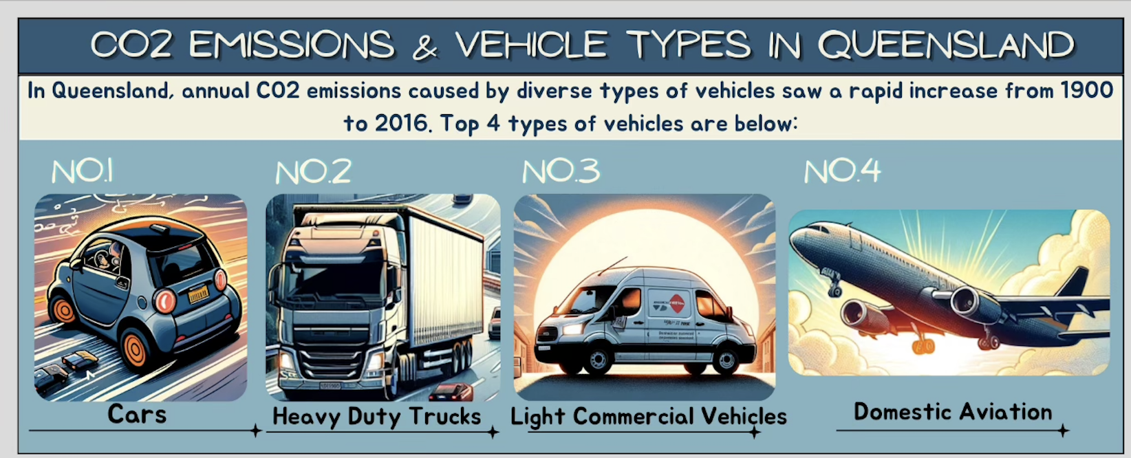
Stage 2: Human–AI co-creation of comic strips.
Once the narrative structure is defined, the second stage focuses on producing the comic strip through an iterative collaboration between humans and generative AI tools. This involves three further steps:

- 4.
Generating and refining AI images. The guidelines described in Section H are employed to produce candidate illustrations based on human-crafted prompts that reflect the identified insights (e.g., objects, characters, or locations). Humans iteratively refine these prompts, curate outputs, and select images that best align with the intended narrative.
Example: The context-based prompting guideline (Section H) was used to create an initial image for a comic strip, and the style-alternation iterative prompting approach was adopted to continuously refine the keywords in the context-based prompting guideline until a desired image style was achieved (e.g., the car image showcased in Figure 14). Following this, the example-based prompting guideline was used to produce relevant figures (e.g., the heavy-duty trucks, light commercial vehicles and domestic aviation images in Figure 14), using the initial image (e.g., the car image) as the example.
- 5.
Building comic strips. The curated AI-generated images are integrated into the predefined panel layouts. Human designers ensure coherence between visuals and narrative flow, balancing stylistic consistency with the communicative goals of the comic.
- 6.
Adding storytelling elements. Finally, storytelling features are layered onto the panels. Titles and subtitles help distil the dataset topics [54], annotations (e.g., labels, arrows, speech balloons) support clarification of insights [43], and highlights (e.g., bold text, colour contrasts) emphasise key statistics and trends [103].
Example: In the vehicle breakdown strip, subtitles contextualised the scope (“Top 4 types of vehicles in Queensland”), and labels emphasised the categories (Cars, Heavy Duty Trucks, etc.; See Figure 14). Figure 15, the CO2 comparison strip, shows the use of speech balloons to highlight the totals (“10 million tonnes” vs. “20 million tonnes”).
