1631
\vgtccategoryVIS 2022 Analytics & Decisions Papers
\vgtcpapertypealgorithm/technique
\authorfooterAnjul Tyagi, Tyler Estro, Erez Zadok and Klaus Mueller are at the Computer Science Department, Stony Brook University, New York. E-mail: {aktyagi, testro, ezk, mueller}@cs.stonybrook.edu.
Geoff Kuenning is at the Computer Science Department, Harvey Mudd College, Claremont, California. E-mail: geoff@cs.hmc.edu
\shortauthortitleTyagi et al.: PC-Expo : A Metrics-Based Interactive Axes Reordering Method for Parallel Coordinate Displays
\CCScatlist\CCScatK.6.1Management of Computing and Information SystemsProject and People ManagementLife Cycle;
\CCScatK.7.mThe Computing ProfessionMiscellaneousEthics
\teaser![[Uncaptioned image]](2208.03430v1/teaser.png) PC-Expo is a real-time all-in-one Parallel Coordinate Plot
(PCP) axes reordering framework. PC-Expo detects local properties in
high-dimensional data that
can be used to reorder the PCP axes automatically or
with human-in-the-loop (HIL) interactions A. We
have implemented detectors for the 12 most common data properties used
to reorder PCPs,
shown on the properties panel B. Users can
create their own optimization scheme using a weighted sum of these
properties, by selecting respective properties and weights from (B), summarized as a donut chart E for
automated axes reordering. PC-Expo also supports HIL axes reordering via
a heatmap and local views D, C, and
F. D summarizes the weighted sum of
user-selected properties detected locally for each axis pair.
C shows where these visualization properties were
detected for a particular axis pair, with a linked scatterplot
F for visualizing the 2D data points. Users can manually
reorder the axes using these local views by clicking on
D sequentially. The granularity slider in
B lets users control the
size of local regions used to detect the properties. Area
charts next to PCP axes in A show the local regions
where the properties selected on (B) are detected on the axis.\vgtcinsertpkg
PC-Expo is a real-time all-in-one Parallel Coordinate Plot
(PCP) axes reordering framework. PC-Expo detects local properties in
high-dimensional data that
can be used to reorder the PCP axes automatically or
with human-in-the-loop (HIL) interactions A. We
have implemented detectors for the 12 most common data properties used
to reorder PCPs,
shown on the properties panel B. Users can
create their own optimization scheme using a weighted sum of these
properties, by selecting respective properties and weights from (B), summarized as a donut chart E for
automated axes reordering. PC-Expo also supports HIL axes reordering via
a heatmap and local views D, C, and
F. D summarizes the weighted sum of
user-selected properties detected locally for each axis pair.
C shows where these visualization properties were
detected for a particular axis pair, with a linked scatterplot
F for visualizing the 2D data points. Users can manually
reorder the axes using these local views by clicking on
D sequentially. The granularity slider in
B lets users control the
size of local regions used to detect the properties. Area
charts next to PCP axes in A show the local regions
where the properties selected on (B) are detected on the axis.\vgtcinsertpkg
PC-Expo: A Metrics-Based Interactive Axes Reordering Method for Parallel Coordinate Displays
Abstract
Parallel coordinate plots (PCPs) have been widely used for high-dimensional (HD) data storytelling because they allow for presenting a large number of dimensions without distortions. The axes ordering in PCP presents a particular story from the data based on the user perception of PCP polylines. Existing works focus on directly optimizing for PCP axes ordering based on some common analysis tasks like clustering, neighborhood, and correlation. However, direct optimization for PCP axes based on these common properties is restrictive because it does not account for multiple properties occurring between the axes, and for local properties that occur in small regions in the data. Also, many of these techniques do not support the human-in-the-loop (HIL) paradigm, which is crucial (i) for explainability and (ii) in cases where no single reordering scheme fits the users’ goals. To alleviate these problems, we present PC-Expo, a real-time visual analytics framework for all-in-one PCP line pattern detection and axes reordering. We studied the connection of line patterns in PCPs with different data analysis tasks and datasets. PC-Expo expands prior work on PCP axes reordering by developing real-time, local detection schemes for the 12 most common analysis tasks (properties). Users can choose the story they want to present with PCPs by optimizing directly over their choice of properties. These properties can be ranked, or combined using individual weights, creating a custom optimization scheme for axes reordering. Users can control the granularity at which they want to work with their detection scheme in the data, allowing exploration of local regions. PC-Expo also supports HIL axes reordering via local-property visualization, which shows the regions of granular activity for every axis pair. Local-property visualization is helpful for PCP axes reordering based on multiple properties, when no single reordering scheme fits the user goals. A comprehensive evaluation was done with real users and diverse datasets confirm the efficacy of PC-Expo in data storytelling with PCPs.
keywords
High dimensional data visualization, Parallel Coordinates Chart, Data Storytelling, Data Analysis1 Introduction
Visual analytics of high-dimensional (HD) data is crucial in many applications. Common HD visualization techniques include embedding methods like MDS [26, 27] and t-SNE [50], and projection methods like RadViz [10] and Star Coordinates [24]. Most of these techniques suffer from information loss and distortions as the data is transformed to lower dimensions. Parallel Coordinate Plots (PCPs) [20] have been a popular choice for HD data visualization since they can convey a large number of dimensions without distortions. PCPs are considered a storytelling method where each ordering of axes presents a particular story from the HD data, and techniques like axes repetition, data scaling, and axes inversion have been suggested to enable a persuasive narration of a story [40, 18, 46, 47]. Previous storytelling work with PCPs mainly focused on axes arrangement based on common data properties like correlation, clustering, and the number of line crossings [43]; they detect these properties in every pair of dimensions in the data and then find the corresponding axes arrangement using the traveling salesman problem (TSP) [15, 53] over the computed scores. Yet, given the complex patterns that can appear in HD datasets, there is no one-solution-fits-all for PCP axes arrangement and storytelling. Different use cases require conveying different stories through PCPs and hence require different axes arrangements.
Existing, fully automated PCP axes-arrangement techniques have four major shortcomings. The first is the lack of human-in-the-loop (HIL) support, which limits their utility to just a few applications. Second is the lack of capabilities to explore local regions (a subset of records) of the data. As HD data are typically complex many properties may only occur locally. For example, there can be local regions of positively correlated clusters in an overall negatively correlated data set. Depending on the use case, such local clusters could have major significance. However, these regions might be completely ignored by fully automated axes-ordering techniques if they are dominated by other, more global phenomena gauged by a global metric. While techniques exist that work with local detection [30] they are too slow since they work at a fairly low level of granularity. In addition, they also lack adaptability since the size of the local regions cannot be customized.
Third, there is also a growing interest in explainability [52, 8, 49, 48] in modern computer-human interaction systems. For visualization frameworks that are deployed for high-liability applications (e.g., crime-fighting), explainability is a crucial feature. Most existing PCP axes-ordering techniques fail to convey why a particular ordering was chosen. The fourth and final shortcoming involves a lack of support for axes reordering with multiple patterns. For example, in Figure 1 one of the analysts from our user study preferred to order the PCP axes based on different properties instead of just using a single property. This calls for a HIL paradigm and an all-in-one, explainable PCP storytelling system.

We designed PC-Expo (see Figure PC-Expo: A Metrics-Based Interactive Axes Reordering Method for Parallel Coordinate Displays) to address these pending issues which all call for a more refined PCP axes reordering methodology. PC-Expo offers real-time detection schemes for the 12 most common data analysis properties used to reorder PCPs, previously introduced by Blumenschein et al. [7]. Users can create their optimization scheme using these properties and detect them locally across the data dimensions. PC-Expo supports automated and manual axes reordering based on these detected properties. To support a HIL paradigm with explainability, PC-Expo incorporates a local view of each dimension pair, highlighting regions of local activity in the data.
Our main contributions (plus code and software release) 11 1 PC-Expo demo is available at: \urlhttps://paracoords.herokuapp.com/ are:
- •
Localized and real-time detection algorithm implementations for the 12 most common properties [7] used for PCP reordering;
- •
HIL and explainable PCP axes reordering via local views in PC-Expo (see Figure PC-Expo: A Metrics-Based Interactive Axes Reordering Method for Parallel Coordinate Displays, labels C, D, and F);
- •
Multi-property axes reordering (see Figure 1); and
- •
A fully automated optimization algorithm for PCP axes reordering based on localized property detection.
2 Related Work
We summarize several lines of PCP axes-reordering research by comparing them based on the type of properties they can detect and the optimization schemes they follow (see Table 1). Based on the 12 most common data analytics properties, that can be used to reorder PCPs as described in [7], Table 1 compares techniques that are used to detect these properties partially. Compared to the individual techniques, PC-Expo can be used to detect all the 12 properties available in a single interface.
|
Technique |
Makwana |
Peng (Outliers) [36] |
Artero |
LU (SVD) [29] |
Ankerst |
Pargnostics [12] |
Ours |
| Clear Grouping | ✓ | ✓ | ✓ | ||||
| Density Change | ✓ | ✓ | |||||
| Split Up | ✓ | ✓ | |||||
| Neighborhood | ✓ | ||||||
| Positive Correlation | ✓ | ✓ | ✓ | ||||
| Negative Correlation | ✓ | ✓ | ✓ | ||||
| Positive Variance | ✓ | ✓ | ✓ | ||||
| Negative Variance | ✓ | ✓ | ✓ | ||||
| Positive Skewness | ✓ | ✓ | |||||
| Negative Skewness | ✓ | ✓ | |||||
| Fan | ✓ | ✓ | ✓ | ✓ | |||
| Outliers | ✓ | ✓ | |||||
| Pairwise Axis | ✓ | ✓ | ✓ | ✓ | ✓ | ||
| Localized Axes | ✓ |

2.1 High-Dimensional Data Visualization
High-dimensional (HD) data come in various types: numerical, ordinal and nominal. While some HD data visualization techniques are specifically designed for only a subset of these data types, others apply to all. The most general data type is numerical, and techniques [54] have been proposed to convert ordinal and nominal into numerical values for better visualization and data handling. A popular paradigm for visualizing HD numerical data is the scatterplot matrix [17], which decomposes the HD space into a set of bivariate projections. Variants of this approach include bi-variate projections of the full space and HyperSlices-based approaches [5, 37]. However, these techniques do not scale with the number of attributes as the number of plots increases exponentially. Even though quality metrics like DSC [42] can be used for automated plot selection and reduction, it remains difficult to mentally fuse the disjoint relationships conveyed in the individual plots.
Techniques that use non-linear optimization to embed the data into a 2D plane can overcome these challenges. They include MDS [26], Kernel PCA, Local Linear Embedding [39], Spectral Clustering [34], and t-SNE [50]. However, these techniques lose the context to the attributes in the data transformation process, making it difficult for users to discern the semantics of the embedded patterns. Conversely, linear transformations into a radial layout as produced by RadViz [10, 16, 19] and Star Coordinates [24, 28] preserve this context, but they cannot preserve distance relationships which can lead to ambiguities in the layout. Adding an optimization step can recover these relationships [9].
PCPs have the unique ability to visualize HD data without any distortions or ambiguities. Their inherent shortcoming is that the information that can be visually extracted is dependent on the axes ordering. Scalability to large datasets is also a problem as the increasing number of polylines leads to cluttered displays which are hard to read. To alleviate the latter, Ellis and Dix [13] calculate the over-plotting percentage in PCPs and provide a lens system to see through highly cluttered regions in the plot. An improvement of this work includes clutter-reduction techniques in PCPs [14]. Illustrative PCP [31] aims to reveal different patterns in PCPs lines using edge bundling, axes distribution, and cluster visualization. Johansson et al. [22] discuss four methods to reveal clusters in PCPs using data-transformation techniques. They propose that data scaling using root and log transforms can reveal patterns in PCP lines. Pomerenke et al. [38] describe the existence of ghost clusters in PCPs because of line patterns, which can be prevented by adjusting line widths in PCPs at specific positions based on projection angles. Peng et al. [36] show how to properly cluster the PCP lines with a strategy that assigns each point to a PCP cluster. Improving upon clustering with PCPs, Peltonen et al. [35] describe how to find local and global neighbors of data points in a PCP.
All of these techniques focus on detecting patterns in an already existing PCP representation. However, as mentioned, the axes ordering plays a crucial role in generating the data pattern that are actually revealed to the user and the detector. In PC-Expo, we take one step back and allow users to prioritize and detect the patterns in the generation stage which greatly increases the yield. It allows users to reorder the PCP’s axes to present the desired pattern-based story through PCPs.
2.2 HD Data Visualization Metrics
HD data metrics are used to bridge the gap between visual representation through charts and analytical tasks that are commonly performed on such data. Visualizations are affected by the choice of metrics that analysts use to create them; this resonates with the idea that every visualization has a story to tell, and that these metrics help in quantifying how well a visualization depicts the story [32]. Tufte [44] was the first to propose quality metrics for 2D charts, which spawned several additions to better represent information in 2D scatterplots. Eagan et al. [1] relates these metrics to most common data-analytics tasks, listing correlation and cluster identification as the two most important quality metrics for scatterplots. Bertini et al. [6] suggests sampling metrics for scatterplots to reduce the cluttering of points. Scagnostics [45] suggests metrics for detecting visual structures in scatterplots, which were extended by Wilkinson et al. [51].
Along with metrics for 2D data, specific metrics have been devised for analyzing line patterns in PCPs. Blumenschein et al. [7] suggest 12 metrics and their line patterns in PCPs which can impact the quality and visual representation of the plots. Pargnostics by Dasgupta et al. [12] proposed 6 metrics for PCPs and a reordering strategy based on these properties. Users could create a weighted optimization scheme based on the Pargnostics properties, which motivated our development of PC-Expo. Beyond Pargnostics, other metrics covered in Blumenschein are convergence of lines [30], outliers [36], skewness and variance [29], and axes similarity [2]. These metrics can assist in storytelling with PCPs. However, they are not available in a single interface and some of these techniques are unusably slow on large datasets, as seen in our evaluation results (Section 6). PC-Expo extends these properties by adding PCP axes reordering with positive and negative skewness and variance (Figure 2). We developed real-time detectors for these line patterns using analytical methods and parallel programming, which are all available to users in a single interface. Also, users can detect these line patterns locally in the data, a feature that is not supported in any prior work that we are aware of.
2.3 Axes Reordering in Parallel Coordinate Plots
Axes reordering in PCPs play a crucial role in presenting desired information accurately. This has been a major application for the metrics devised for PCPs (see Section 2.2). Some of the algorithms optimize to find the ordering directly on the data [3, 21] while others calculate the PCP metrics for every axis pair before optimizing [12, 30, 36]. After the metrics are calculated for every axis pair, TSP solvers can be used to find the PCP axes reordering from the data [12]. A major limitation of existing algorithms is the lack of localized detection of these metrics. For example, there can be local regions of positively correlated clusters in an overall negatively correlated data set. With metric detection without localized support, the algorithm will return zero correlation for such data. With existing techniques, such local attributes in the data go undetected during PCP reordering. Also, it is hard for the users to clearly visualize why a particular ordering was chosen, and there is no way to enter user feedback into these algorithms. In PC-Expo, we introduce localized detection of all the line patterns in PCPs; and these can be fully controlled by users. Users can choose the localization level, or even reorder the axes based on different metrics manually, using the scores obtained via our detection scheme.
3 Formative Study
To systematically evolve our idea of an all-in-one PCP axes-ordering framework, we applied Munzner’s nested model [33] for visualization application design. Before designing PC-Expo, we conducted a formative study to get to know user requirements and their views on the state-of-the-art PCP tools, libraries, and general workflows. This approach helped us concretize PC-Expo’s design with a user-centered evaluation at an earlier development stage.
The formative study participants were carefully chosen to be analysts and researchers who use PCPs as their regular visualization technique for HD data. A total of 10 participants contributed to this study, out of which 4 were visualization researchers (3 Ph.D. students and 1 professor), 3 systems researchers (1 Ph.D. student and 2 professors), and 3 data analysts working in the industry. While the data analysts and visualization researchers helped us design the principles related to visual aspects of PCPs, the systems researchers helped us make the PCPs more generic and applicable across different domains. One of the major contributions from systems researchers in this aspect was in optimizing the detection schemes and extending their usability with parallel programming and low-level optimizations.
We interviewed our participants in several meetings, asking questions about the pros and cons of the existing techniques and tools they use to design PCPs, getting suggestions for improving the current systems, and asking about any important additions they believed would be useful in a new system. All of these interviews and answers were used to iteratively design PC-Expo’s final form.
3.1 Key Findings
The purpose of performing the formative study with domain experts and potential users were to gather a list of requirements that we expected our framework to meet. Our many discussions culminated in the following requirements list, ordered by importance:
R1: Localization. None of the existing PCP ordering algorithms show where the properties lie on the axes. Highlighting these properties on the PCP axes helps the user understand how the final ordering was obtained and what portion of the data contributed to the final ordering.
R2: Real-time metrics calculation. Existing PCP reordering techniques either (i) work for only a few metrics or (ii) are more generic but are too slow [12], as seen with the existing tools22 2 PCP Reordering Implementation \urlhttps://subspace.dbvis.de/pcp/. Thus, a more flexible and faster implementation for real-time detection would be useful for PCP axes ordering applications.
R3: HIL axes reordering. PC-Expo should support HIL axes reordering because no single optimization scheme can fulfill all use cases. For flexibility, users should be able to use their domain knowledge and feedback from our local detector algorithms to reorder the PCP axes.
R4: Aggregate view. The aggregate view has two uses. For local HIL axes reordering, PC-Expo should quantify each of the properties selected by the users on all the axis pairs in the data. For automated axes ordering, users should be able to visualize the weighted properties and the corresponding optimization function on the interface.
R5: Multi-property axes reordering. As shown in Figure 1, users sometimes need to investigate different patterns in their data, which cannot be accomplished using a single reordering strategy. PC-Expo should support multi-property axes reordering for such use cases.
4 Properties in PC-Expo
Figure 2 shows the 12 properties supported in PC-Expo and their corresponding line patterns. Users can create a custom optimization scheme using a weighted sum of these properties, each of which our system then detects in the data. We implemented individual detectors that look for local regions in the data using a sliding window of a user-specified size, and then calculate the corresponding property values at each window position. Each property is calculated for every primary (left) and secondary (right) axis of an axis pair. In the descriptions below we refer to the primary axis as and the secondary axis as . Out of the 12 properties, 7 are calculated directly from the 2D bivariate data defined by the axis pair, i.e., correlation, variance, density change, clear grouping, split up, neighborhood and fan; the other 5 are calculated on the marginal axis (i.e., the primary axis) only. We describe the detection algorithms for each property next.
4.1 Correlation, Variance, Skewness, and Outliers
To find correlation, we compute the Pearson correlation directly using Equation 1; is the correlation coefficient calculated using every point and . Here, is the set of points falling within the sliding window on the primary axis . The points are the corresponding tuple values of on the secondary axis . and are the mean values of all and , respectively. The variance can be directly inferred as the numerator value in Equation 1.
| (1) |
Skewness is a marginal property in PC-Expo with values in to indicate negative and positive skew. It is calculated using the Fisher-Pearson coefficient shown in Equation 2, where is the central moment of the data.
| (2) |
Finally, the outliers calculation within the given window is done by calculating the points falling outside the range of where and are the first and third quartile, respectively, and marking them as outliers. The total number of outlier points is then the outlier score for that sliding window.
4.2 Density Change
In PCPs, the density of lines between any pair of axes in the data can change. In a local context, this is the difference between densities of the points on a pair of axes for a given window. For quantifying the change in densities of two marginal distributions, we adopted the idea of Kullback-Leibler (KL) divergence, which has been widely used in data-analytics applications. KL divergence gives a score based on the difference in the entropies of two probability distributions. For our purposes, the first step is to estimate the probability density functions (pdf) of the points on the two marginal axes, and . We use Kernel Density Estimation [25, 41] with a Gaussian kernel to estimate the probability densities of the data points, shown in Equation 3.
| (3) |
where is the estimated pdf for point within a group of points on the axis, which is estimated using the Gaussian kernel with a bandwidth parameter (see Equation 4). The bandwidth parameter controls the perimeter of points around that are to be considered for estimating the density. For our use case, we set to be equal to the standard deviation of the points in the current window, to speed up calculations and improve result consistency.
| (4) |
After the densities for each point in a window are estimated, we can compute the divergence between the two axes using Equation 5.
| (5) |
4.3 Clear Grouping and Split-Up
In PCPs, clear grouping and split-up are inverse properties. Clear grouping refers to points that occur in a cluster on one axis and are also clustered on another axis. Conversely, split up means that clustered points on one axis are further apart on the other. To calculate the value of clear grouping, we use the idea of local neighbors on a marginal axis as proposed by Peltonen et al. [35]. Shown in Equation 6, for a given point on a set of local points on the axis , the probability that point is the neighbor of point can be estimated as a probability distribution function. Equation 6 estimates the probability of point being a neighbor of point .
| (6) |
While comparing points from the two axes, we estimate the neighborhood probabilities of all points compared to the other points on the axes using Equation 6. This can be treated as a pdf of neighborhood probabilities for each point. The KL divergence between and for a point on two axes and shows the number of neighbors that are still intact when transitioning from axis to (see Equation 7).
| (7) |
To extend Equation 7 to all the points in a local window, we can sum the values for all points; this gives us an estimate of grouping behavior on a pair of axes across all points, as shown in Equation 8. For consistent scoring, we have to limit the values to a fixed range across the dataset. However, the range of depends on the input data; hence we normalize based on the precomputed mean and standard deviation of a sample of values from the dataset to produce . Finally, for split-up calculations, since we define split up as an inverse property of clear grouping, we obtain split-up values using .
| (8) |
4.4 Neighborhood and Fan
In the context of PCP line pattern detection, neighborhood refers to the amount of parallelism in lines and fan refers to the divergence of points that originate from a small region on the left axes. We calculate these values from the existing PCP metrics proposed in Pargnostics [12] as parallelism and divergence, respectively. Parallelism is calculated using the extent of the angle distribution of lines for an axis pair, because parallel lines tend to have a lower range of line angles that occur between an axis pair. Similarly, divergence is calculated using a 2D histogram, counting the number of bins with a value greater than zero on the secondary axis for a given bin on the main axis, respectively.
4.5 Confidence Scores and Normalization
When dealing with the calculation of metrics locally, it is crucial to normalize the scores based on the global properties of the axes for consistency and misinformation prevention. We developed normalization schemes for each of the 12 properties in PC-Expo to ensure that the calculated values are presented based on their confidence scores. For correlation and variance reporting, the final scores are normalized based on the p-values, obtained for a correlation value, (see Equation 1) for a given pair of axes and . Referring to as , the calculation is shown in Equation 9 ( is the number points under the sliding window).
| (9) |
Similarly, for skewness, the p-values used for normalization are calculated using permutation tests. Also, in case of negative values for correlation, variance, and skewness, the values are inverted to represent higher scores when the actual values are lower. For KL divergence-based properties—density change, split-up and clear grouping—no normalization is required since KL divergence automatically accounts for the number of samples used in the calculation. Hence, the values are consistent across dimensions. For the Pargnostics-based properties [12] neighborhood and fan we scale the values based on the fraction of points they were calculated for. Hence, for a local window with fewer points, a large value is scaled down, as compared to a window with more points. Finally, no normalization is required for outliers as they are calculated directly over the full range of axis pairs.
5 PC-Expo Design
To implement our idea of a real-time, HIL, explainable and localized PCP axes-reordering framework, we developed PC-Expo with the help of the principles discovered during the formative study discussed in Section 3. PC-Expo allows users to interactively visualize and optimize the PCPs on their data and convey the desired story with high accuracy and confidence. As shown in Figure PC-Expo: A Metrics-Based Interactive Axes Reordering Method for Parallel Coordinate Displays, PC-Expo consists of six views, which we discuss next. The R# next to each view denotes the requirements from the formative study that the particular view satisfies.
5.1 PCP Display with Localized Area Charts (R1-R5)
Shown in Figure PC-Expo: A Metrics-Based Interactive Axes Reordering Method for Parallel Coordinate Displays (A), the goal of the PCP display view is to show the final PCP resulting from the user interactions or direct optimizations. This view summarizes how the properties chosen by the user affect the axes reordering with the help of area charts overlaid on the PCP axes. As shown in Figure 3, this aggregate view helps visualize where the user-selected properties were detected locally in the final PCP; this is crucial for explainability of our optimization algorithm’s final result. Users can choose the granularity of the local regions to explore and look for line patterns; this updates the granularity of the local heatmaps and the area chart in this view.


5.2 Sidebar for Local Optimization (R1, R2, R5)
Shown in Figure PC-Expo: A Metrics-Based Interactive Axes Reordering Method for Parallel Coordinate Displays (B), the sidebar offers full control to the users to reorder the PCP axes based on the properties they like. Users can choose from the 12 properties (see Figure 2) with adjoining checkboxes; further, users can choose weights for each property using the sliders. These weights are useful when optimizing directly over these properties to optimize a PCP axis’ order: they let users control how much contribution from each property should be considered for a final optimization. For direct optimization, PC-Expo calculates the weighted sum of these property values for each axis pair in the data, where the weights are determined by the slider values. Once final scores for each axis pair are calculated based on the localization level chosen by the user, a TSP [12] over these scores gives the final PCP axes ordering. The sidebar also offers localization control with the window size slider, which controls the length of the sliding window. The value on the window size slider is the percent of axis range to be considered for localized properties detection on the axis. Users can also filter the features they want to use in the final PCP using the data features selection tab.
5.3 Local View (R1, R3, R5)
Shown in Figure PC-Expo: A Metrics-Based Interactive Axes Reordering Method for Parallel Coordinate Displays (C, F), the local view is the key component of PC-Expo for allowing HIL and explainable PCP axes reordering. Based on the property weights and the localization level (granularity) chosen by the users in the sidebar, our algorithm detects local regions of activity in the data. The local view communicates these local regions to the user, assisting in decision making and understanding the data behavior. Any axis pair in the data can be selected from the heatmap, as seen in Figure PC-Expo: A Metrics-Based Interactive Axes Reordering Method for Parallel Coordinate Displays (D); the local view shows the details of all properties and their intensities on the chosen axis pair.
The local view also supports user interactions to enable a deeper dive into local data regions. Each property is given its individual axis with a fixed slider width; the sliders can be dragged to highlight the corresponding points on the adjoining PCP and scatterplot displays, as seen in Figure PC-Expo: A Metrics-Based Interactive Axes Reordering Method for Parallel Coordinate Displays (F). This helps users identify small regions of interest based on specific properties in the data.
5.4 Heatmap for HIL Axes Reordering (R3, R4, R5)
Shown in Figure PC-Expo: A Metrics-Based Interactive Axes Reordering Method for Parallel Coordinate Displays (D), the heatmap summarizes the scores from the detection algorithms based on the properties chosen by the user. Each cell in the heatmap corresponds to the value of normalized weighted sum of properties detected for a pair of dimensions in the dataset. Clicking on any cell opens up a window with details of the local view, showing how the final score for the current cell was calculated. One major benefit of the heatmap is to assist in HIL axes reordering based on the calculated scores from the detectors. As shown in Figure 4, users can view the details of each cell in the heatmap and use that information to reorder the PCP axes. Also, this reordering does not have to stick to a single property and can include multiple properties per axis pair, as shown in Figure 1. Users can generate a new heatmap after every axis-pair selection to select the next adjoining axes, allowing for PCP reordering based on multiple properties. Each property score is normalized between [0,1] before calculating the weighted sum values for the heatmap.
5.5 Property Weights and Global Optimization (R2)
For quick results, PC-Expo supports a fully automated global optimization scheme. With the help of our global optimization algorithm, users can generate a PCP axes reordering based on selected properties, corresponding weights, and the localization level. This algorithm performs a branch-and-bound TSP algorithm [12] on the calculated heatmap data and generates PCP axes reordering automatically. The optimization function showing each property’s contribution to the axes reordering is summarized using a donut chart; see Figure PC-Expo: A Metrics-Based Interactive Axes Reordering Method for Parallel Coordinate Displays (E).
6 Evaluation
This section presents an evaluation of PC-Expo for its effectiveness and design efficiency, through a comparison with existing PCP reordering tools, a system usability study [4] survey, and detailed user interviews.
6.1 User Study
We conducted a user study to evaluate PC-Expo for its ability to support PCP axes reordering tasks with real users. The study aimed at investigating PC-Expo’s support as an interactive visual-analytics system and quantifying how well the system meets user needs. We designed three tasks for this study to compare PC-Expo with the existing baseline PCP axes ordering algorithms presented in Table 1. All these baseline algorithms were compiled into a single dashboard by Blumenschein et al. [7], known as the dimensional reordering for parallel coordinates (DRPC). We carefully designed the tasks for this user study so they can be performed with both PC-Expo and DRPC. Since PC-Expo supports more properties and a detailed local view—not available in DRPC—we evaluated these features separately following up from this user study (see Sections 6.2 and 6.3). Since PC-Expo gives a detailed view of every axis pair weighted sum while performing the reordering tasks, users could memorize the correct sequence for the task. To prevent this, all the user study tasks were first performed on DRPC, followed by PC-Expo.
6.1.1 Operation Details
DRPC and PC-Expo support different types of operations which were noted during the user study. There are a total of 22 operations supported in DRPC which include choosing between 7 reordering strategies, 2 types of distance metrics, and 6 weights-specific Pargnostics PCP reordering. PC-Expo supports multiple operations which can linearly increase with data dimensionality. Besides fixed operations for choosing the properties and local view interactions, the matrix view and the main PCP view depend on the data dimensionality.
6.1.2 Participants
We recruited 10 participants for this study (4 females and 6 males; aged between 22 and 30 years) via social media and mailing lists. 5 experts were the same participants from the formative study (Sec 3. We recruited 5 additional non-experts to participate in this study. All of the non-experts were graduate students studying computer science.
6.1.3 User Study Tasks
Employing a within-subject design, we created three tasks for this user study to compare PC-Expo and DRPC on multiple aspects of PCP axes reordering. All the tasks required users to come up with a final PCP axes reordering which they thought worked best. For a fair comparison, every task was related to correlation and clustering analysis, since it is well supported in the baseline tool. Based on the formative study (Section 3), this setup covers general cases that analysts encounter in data storytelling with PCPs. Also, the tasks were ordered in increasing levels of the detailing needed to generate the final result. The time and number of operations taken by the user to generate final result were logged for every task. To quantify the goodness of final PCP axes ordering produced by the participants, final scores were generated using the predefined properties for that task (e.g., as per Figure 5, top). Since the localization is undefined for DRPC-based reorderings, an average of all the localization levels supported in PC-Expo was used to score the axes orderings obtained with DRPC. For a fair comparison, users were not allowed to see the final score through the area charts on the final axis orderings, as it was a direct proxy to the final score.
Task 1 focused on global, fully automated PCP axes reordering use cases. Users were asked to reorder the PCP axes to best present correlated clusters and to separate outliers in the data. For the baseline, the task involved experimenting with existing methods for correlation [12, 2, 3] and outliers [36] based PCP reordering. PC-Expo, can perform the task by choosing appropriate property weights on the sidebar and looking at the corresponding generated PCPs. The final scores of the properties correlation and outliers were calculated by using PC-Expo to compare the goodness of generated PCP orderings from both tools (see Figure 5, top). This task evaluated PC-Expo for the speed and accuracy of the local property detection algorithms it used.
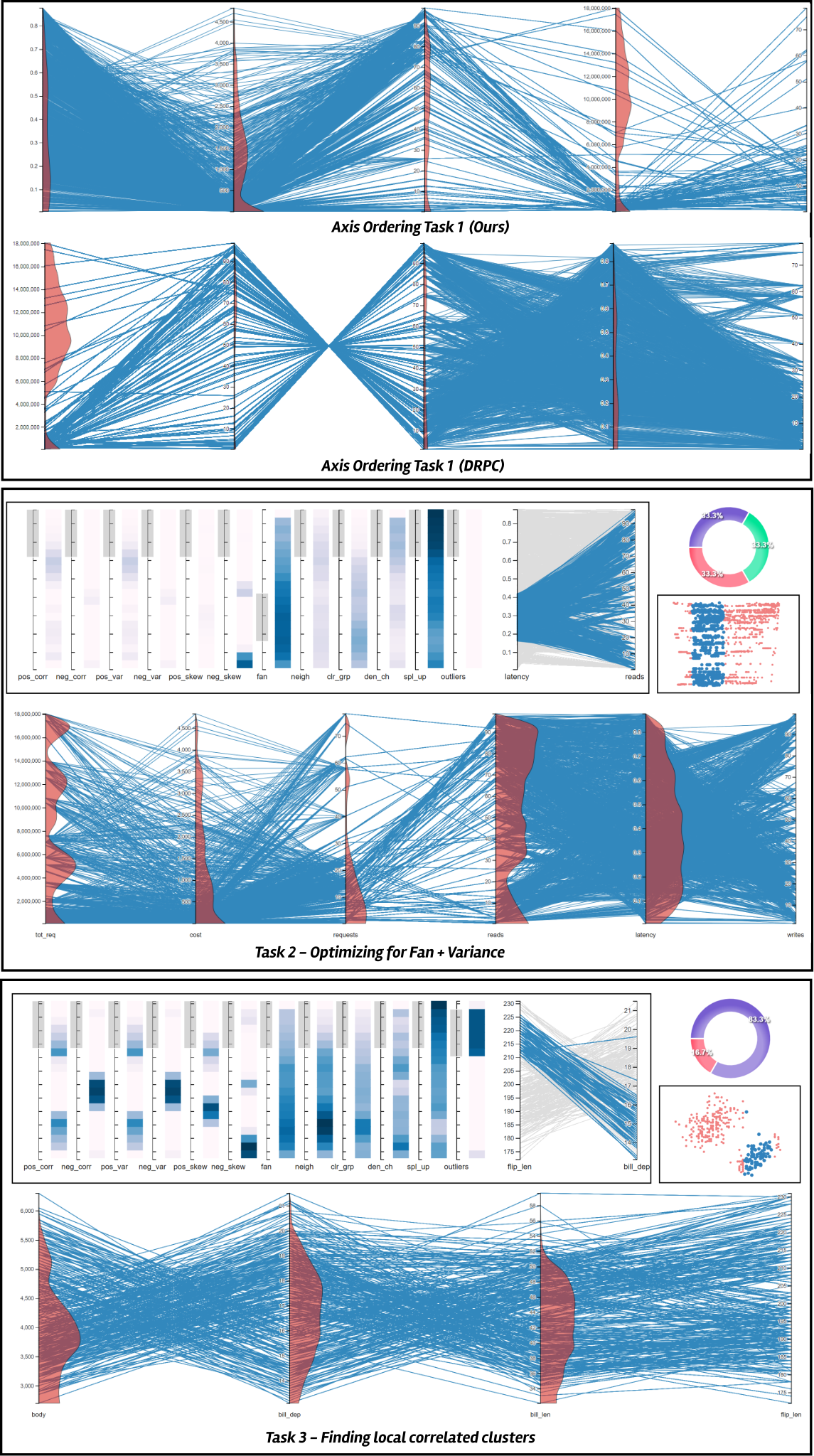
Task 2 focused on cluster identification with maximum variability. In this task, participants were asked to reorder the PCP to show the maximum number of small clusters on one axis that spread on the other axis (i.e., fan-shaped clusters with high divergence). This scenario is common in general analytical tasks where the users seek to find the behavior of some data sample with respect to a dependent variable. For example, in the computer systems domain a relationship between “hard drive type” and “total requests” follows this pattern because hard drives that can handle more requests are preferred (see Figure 5, center). For final evaluation, the scores of the properties fan and outliers were used to compare the axes orderings. This task evaluated PC-Expo for HIL axes reordering efficiency.
Task 3 focused on finding small regions of similar behavior in the data. Users were asked to reorder the PCPs to show the maximum number of local structures in the data based on correlation (positive or negative). Some examples of this scenario include finding the relationship between “miles per gallon” and “weight” in the cars dataset. Cars with higher weight generally have low MPG and vice versa. Building upon task 2, this task emphasized finding local regions of interest in the data. Figure 5 (bottom) shows an example user-generated PCP ordering for this task. Final scores for the participant reorderings were generated using the clear grouping, and correlation properties in PC-Expo. This task evaluated PC-Expo for multi-property HIL axes reordering.
6.1.4 User Study Dataset
We used two datasets for this study: a systems dataset for tasks 1 and 2 and the penguins [23] dataset for task 3. The systems dataset is larger and has more complicated patterns that are not straightforward to visualize. The penguins dataset, however, is less complex with simpler-to-detect local patterns.
The Systems dataset was collected over a set of several experiments run at our university to record the system performance for a large number of configurations. Currently, the dataset consists of 10 dimensions with a total of 100k configurations, giving the recorded performance values for each. For the tasks to run in real-time on the baseline tool, we sampled the dataset down to 2k rows and 6 dimensions, total requests, cost, requests per second, number of reads, latency, and number of writes. This allowed for a fair comparison of time and number of operations between PC-Expo and the baseline (DRPC). This dataset was chosen for the study because the final PCP reordering results could be evaluated by systems researchers. Also, some of the user study participants were not from the systems domain, allowing a fair comparison with no preexisting knowledge of data features.
The Penguins dataset [23] is a publicly available dataset with 2k rows and 6 features, containing details about different species of penguins. This dataset contains simple local features, which better suited Task 3 because of time constraints on the tasks.
6.1.5 Procedure
During the study, participants completed the above three tasks using both DRPC and PC-Expo, one after another. Prior to the tasks, participants were first introduced to both systems. Participants were allowed to play with the tools using some pre-determined PCP reordering examples, independent of the user study tasks. After the users were comfortable using the tools, they were introduced to the tasks sequentially. Each task was limited to 20 minutes, and the time and number of operations were logged for each user.
6.1.6 Results
Figure 6 summarizes the user study results obtained from the participants’ interactions for PC-Expo and DRPC. We compared the two tools based on three factors: time, number of operations(N/Ops), and score of the final PCP orderings generated by the participants.
The results show that the average participant time for axes reordering tasks was lower in PC-Expo compared to the baseline. For task 1, the average time on PC-Expo was 1.8 minutes compared to the 5.1 minutes on DRPC. For task 2, the average time for PC-Expo was 5.3 minutes compared to 14.8 minutes on DRPC. And for task 3, the average time for PC-Expo was 4.3 minutes compared to 9.1 minutes on DRPC. There is a clear trend of increasing time difference between the baseline and PC-Expo as the task complexity increases. This indicates the efficacy of PC-Expo in faster PCP axes reordering.
For number of operations (N/Ops), our user study showed mixed results. In task 1, the average N/Ops for PC-Expo were 18.5 compared to a lower number, 7.7, for DRPC. A similar pattern was seen during task 2 where the average N/Ops for PC-Expo was 34.8 compared to 31 for DRPC. However, in task 3, the average N/Ops in PC-Expo was lower: 15.8 compared to the 33.4 in DRPC. The higher N/Ops for PC-Expo can be attributed to the local view because the users validate their choices through the local view interactions.
For the third set of result attributes, we compared the final scores obtained from the PCP axes ordering finalized by the participants. These PCP orderings were input to PC-Expo and the value of the final area charts was compared. PC-Expo had better results in all three tasks compared to the baseline in this case. The average score for task 1 with PC-Expo was 1.13 compared to 0.62 for DRPC. For task 2 this gap increased, with an average of 1.09 for PC-Expo and 0.32 for DRPC. For task 3, PC-Expo had an average score of 1.64 compared to 0.44 for DRPC. This clearly shows the value of local properties visualization supported in PC-Expo, which aids in better final PCP designs compared to the baseline.
Comparing the numbers from the results, it is clear that even though users end up finding higher N/Ops while working with PC-Expo, the quality of the results is better and the time taken to perform the axes reordering is lower. Each interaction in PC-Expo aids in better development towards a final result, and the users reach the goal faster and with higher accuracy. Full results from the user study and the numbers for each participant and tasks are provided in the supplementary material.


6.2 System Usability Study
After collecting the results from the user study tasks, every participant was interviewed to collect feedback on the usability of PC-Expo. This study aimed at evaluating PC-Expo for multiple factors based on the system usability scale (SUS) [4]. The SUS score is an industry standard for quantifying the usability of any visual analytics tool through a series of questions that focus on evaluating different aspects of the tool and are sequenced alternatively to focus on positive and negative aspects. Participants are required to answer each question on a 5-point Likert scale that ranges from Strongly Disagree (1) to Strongly Agree (5). The question sequence is altered during the interview to collect positive and negative feedback about the tool. Figure 7 shows the 10 SUS questions used to evaluate PC-Expo. The whole interview lasted about 10 minutes for each participant.
6.2.1 Results
As shown in Figure 8, PC-Expo received a positive usability feedback from a majority of the participants. Overall, based on participant ratings for the 10 SUS questions, PC-Expo received an average SUS score of 81.5. Since the baseline SUS standard is 68 [4], the SUS evaluation results for PC-Expo show that our system is highly adaptable and has great usability in this domain. We also separately evaluated the SUS scores for experts and non-experts in this study. The expert SUS scores averaged 84 while the non-expert scores averaged 79, both being higher than the baseline score. Detailed scores and analyses for each participant are provided in the supplementary material.
Further analyzing the scores from the participants for individual SUS questions (see Figure 7), the questions receiving the most unanimous high votes included (Q4) no need for tech support and (Q9) confidence. These results indicate that PC-Expo’s design is easy to use and users are highly confident in the generated results, complementing the fundamental principle of explainability for developing the tool. Questions receiving the second-highest vote counts included (Q3) Easy to use, (Q5) Well integrated, and (Q6) Consistency. These results show that PC-Expo aligns well with the goals of real-time and accurate implementation of the PCP reordering schemes. Overall, the average IQR of votes across all the questions was 1.25, which is considered low (good) on a 5 point scale. This shows that both experts and non-experts had a similar experience with PC-Expo, and hence the tool is consistent across users.
Besides the majority of positive feedback, a few questions received mixed reviews during the study. (Q1) Use frequently, had two low votes from experts, which we attribute to the limitations of PCPs with very high-dimensional datasets (discussed further in Section 6.3). Also, (Q10) High learning curve, had three low votes from non-experts participants. To further evaluate these issues, we conducted a detailed interview session, discussed next in the follow up text.
6.3 User Interviews
Besides the general SUS interviews, we separately collected detailed feedback from two study participants with the lowest SUS scores: an expert (E1) and a non-expert (E2). These interviews helped us gain further insights into user experience with PC-Expo, its limitations, and potential areas of improvement. Some of the interview results and user comments are discussed below. We have categorized the user comments based on their experience with PC-Expo. Three extra question discussions are provided in the supplementary material.
Ease of exploration. Both participants agreed that the local view and heatmap reordering were useful in exploring local regions in the data. E1 suggested an improvement in their comment: “Sometimes we want to intentionally ignore a property, for example, ignore outliers while optimizing for other properties. In such cases, negative weights for some properties would be helpful.”
Use on regular basis. Both users gave positive reviews on the usability of PC-Expo, with a few suggestions for improvement. P1 commented: “I regularly come across the issue with PCPs when the dimensionality of data increases. Very high dimensional datasets are hard to fit with PCPs. Maybe involving dimension reduction techniques to shrink data dimensionality before analysis with PC-Expo will be a good addition.” E2 further suggested: “I really found PC-Expo very useful for data storytelling with PCPs. Every axis ordering presents a different story in the data and PC-Expo makes it easy for us to get the right story out with PCPs. I suggest adding similar support for tools that work with categorical data will be a good next step. Parallel Sets can be extended with this local visualization of properties too.”
Ease of usage and creativity. Both participants mentioned that they scored PC-Expo high on this criterion. E1 commented: “It is very easy to understand line patterns and local properties in my data with PC-Expo. Since now we have implemented real-time detection schemes for several line patterns, it will be interesting to extend this work with machine learning. Maybe we can create a small dataset of detected patterns with PC-Expo and use it to train a supervised model.” E2 also commented about the multi-property axes reordering: “This was the first time I experimented with multi-property reordering in PCPs. It was very easy to see which was a dominating property for a particular axes pair through PC-Expo.
7 Conclusion
Axes reordering plays a crucial role in HD data storytelling with parallel coordinate plots. In this work, we present PC-Expo, an all-in-one, real-time, human-in-the-loop, localized PCP axes reordering framework. Our framework implements real-time detection algorithms for the 12 most common data analytical properties occurring in PCPs as shown in past research [7]. This enables PC-Expo to extend the pattern detection from a full axis scale to a more localized approach. With PC-Expo, we can detect several data patterns on a local level and visualize their behavior across all dimensions. These local-detection schemes allow further advancements in PCP axes reordering techniques.
PC-Expo supports two types of axes reordering schemes: fully automated and human-in-the-loop (HIL). In the fully automated method, users can control the localization level in PC-Expo and calculate pairwise data dimension scores. Using these scores, the final ordering can be generated using a traveling salesman [15] algorithm. Conversely, in the HIL paradigm, PC-Expo supports local views of pairwise dimensions, highlighting zones of activity for the user-selected properties in the data. This information can be used to manually generate the ordering of axes as desired for different use cases. And when every data ordering in a PCP presents a different story, no single axes ordering algorithm can suit all usage scenarios. PC-Expo aims to assist the users in presenting their story through PCPs with high accuracy and confidence.
We learned several important lessons while designing PC-Expo. Our initial discussions with domain experts during the formative study were decisive in pinning down the main design components. After all the tasks and contributions were formulated with the experts’ help, it was easier to design the visual interface for PC-Expo with all the components. Primarily, we realized that adding a human in the loop is important as a means of allowing users to infuse their own domain knowledge into the process.
Future work.
Beyond PC-Expo’s effectiveness, there are aspects that can be improved. Our interviews with the user-study participants pointed out several features and directions for future work. First, adding support for negative-weight properties is useful if the user wants to actively ignore a particular property. Also, scalability is an issue with PC-Expo when the data dimensionality goes beyond 15 dimensions. The matrix view gets cluttered and calculation of metrics on window sizes smaller than 30% becomes slower. To overcome this, data filtering and dimension reduction techniques can be incorporated into PC-Expo. We would also like to explore different metric combination measures besides weighted sum. Since weighted sum has known limitations, for e.g. the distribution of the solution space is not uniform [11], we would like to explore other distance measures to combine the metrics. Additionally, we plan to add a history feature to PC-Expo; this will allow users to backtrack the process of ordering the axes through the heatmap. One of the user study participants also suggested additional support for high-dimensional datasets using dimension-reduction techniques. We can reduce the dimensionality of the data to make it easier to represent information through a PCP and allow faster property calculation. More advanced additions to PC-Expo include storytelling with natural language processing. The idea is that we can combine the properties in PCPs to tell a common story that they represent in the data. In this way, every PCP axes ordering can be linked to a data story that can be presented in a few sentences. Also, it’ll be interesting to know if pre-classification of data records locally would help in further improving the axis ordering techniques. These features are not yet supported, and we continue to design and develop PC-Expo. Finally, we plan to deploy PC-Expo for real users to collect in-depth user feedback in a longitudinal study.
8 Acknowledgements
We would like to thank the anonymous VIS 2022 reviewers for their valuable comments. This work was partially funded by NSF grants CNS 1900706, IIS 1527200 and 1941613, and NSF SBIR contract 1926949.
References
- [1] R. Amar, J. Eagan, and J. Stasko. Low-level components of analytic activity in information visualization. In IEEE Symposium on Information Visualization, pp. 111–117, 2005.
- [2] M. Ankerst, S. Berchtold, and D. A. Keim. Similarity clustering of dimensions for an enhanced visualization of multidimensional data. In IEEE Symposium on Information Visualization, p. 52, 1998.
- [3] A. O. Artero, M. C. F. de Oliveira, and H. Levkowitz. Enhanced high dimensional data visualization through dimension reduction and attribute arrangement. In Intern. Conference on Information Visualisation, pp. 707–712, 2006.
- [4] A. Bangor, P. Kortum, and J. Miller. Determining what individual SUS scores mean: Adding an adjective rating scale. Journal of Usability Studies, 4(3):114–123, 2009.
- [5] W. Berger, H. Piringer, P. Filzmoser, and E. Gröller. Uncertainty-aware exploration of continuous parameter spaces using multivariate prediction. In Computer Graphics Forum, vol. 30, pp. 911–920, 2011.
- [6] E. Bertini and G. Santucci. By chance is not enough: preserving relative density through non uniform sampling. In International Conference on Information Visualisation, 2004.
- [7] M. Blumenschein, X. Zhang, D. Pomerenke, D. A. Keim, and J. Fuchs. Evaluating reordering strategies for cluster identification in parallel coordinates. In Computer Graphics Forum, vol. 39, pp. 537–549, 2020.
- [8] Z. Cao, G. Kuenning, K. Mueller, A. Tyagi, and E. Zadok. Graphs are not enough: Using interactive visual analytics in storage research. In 11th USENIX Workshop on Hot Topics in Storage and File Systems (HotStorage 19), 2019.
- [9] S. Cheng, W. Xu, and K. Mueller. Radviz deluxe: An attribute-aware display for multivariate data. Processes, 5(4):75, 2017.
- [10] K. Daniels, G. Grinstein, A. Russell, and M. Glidden. Properties of normalized radial visualizations. Information Visualization, 11(4):273–300, 2012.
- [11] I. Das and J. E. Dennis. A closer look at drawbacks of minimizing weighted sums of objectives for pareto set generation in multicriteria optimization problems. Structural optimization, 14(1):63–69, 1997.
- [12] A. Dasgupta and R. Kosara. Pargnostics: Screen-space metrics for parallel coordinates. IEEE Transactions on Visualization and Computer Graphics, 16(6):1017–1026, 2010.
- [13] G. Ellis and A. Dix. Enabling automatic clutter reduction in parallel coordinate plots. IEEE Transactions on Visualization and Computer Graphics, 12(5):717–724, 2006.
- [14] G. Ellis and A. Dix. A taxonomy of clutter reduction for information visualisation. IEEE Trans on Visualization and Computer Graphics, 13:1216–23, 2007.
- [15] M. M. Flood. The traveling-salesman problem. Operations Research, 4(1):61–75, 1956.
- [16] G. Grinstein, C. B. Jessee, P. Hoffman, P. O’Neil, and A. Gee. High-dimensional visualization support for data mining gene expression data. In E. V. Grigorenko, ed., DNA Arrays: Technologies and Experimental Strategies, pp. 86–131. CRC Press, 2001.
- [17] J. A. Hartigan. Printer graphics for clustering. Journal of Statistical Computation and Simulation, 4(3):187–213, 1975.
- [18] J. Heinrich and D. Weiskopf. State of the art of parallel coordinates. In Eurographics (State of the Art Reports), pp. 95–116, 2013.
- [19] P. Hoffman, G. Grinstein, K. Marx, I. Grosse, and E. Stanley. DNA visual and analytic data mining. In Proceedings of the 8th Conference on Visualization, pp. 437–441, Oct. 1997.
- [20] A. Inselberg and B. Dimsdale. Parallel coordinates: A tool for visualizing multi-dimensional geometry. In Proc. IEEE Visualization, pp. 361–378, Oct. 1990.
- [21] J. Johansson and C. Forsell. Evaluation of parallel coordinates: Overview, categorization and guidelines for future research. IEEE Transactions on Visualization and Computer Graphics, 22:1–1, Nov. 2015.
- [22] J. Johansson, P. Ljung, M. Jern, and M. Cooper. Revealing structure within clustered parallel coordinates displays. In IEEE Symposium on Information Visualization (INFOVIS), pp. 125–132, Oct. 2005.
- [23] Kaggle Datasets. Penguins data, 2022. \urlhttps://www.kaggle.com/code/parulpandey/penguin-dataset-the-new-iris/data.
- [24] E. Kandogan. Star coordinates: A multi-dimensional visualization technique with uniform treatment of dimensions. In Proceedings of the IEEE Information Visualization Symposium, vol. 650, p. 22, Feb. 2000.
- [25] L. Kish. Survey Sampling. John Wiley & Sons, Inc., New York, 1965.
- [26] J. Kruskal. The relationship between multidimensional scaling and clustering. In Classification and Clustering, pp. 17–44. Elsevier, 1977.
- [27] A. Kumar, A. Tyagi, M. Burch, D. Weiskopf, and K. Mueller. Task classification model for visual fixation, exploration, and search. In Proceedings of the 11th ACM Symposium on Eye Tracking Research & Applications, pp. 1–4, 2019.
- [28] D. J. Lehmann and H. Theisel. Optimal sets of projections of high-dimensional data. IEEE Transactions on Visualization and Computer Graphics, 22(1):609–618, Jan. 2016.
- [29] L. F. Lu, M. L. Huang, and J. Zhang. Two axes re-ordering methods in parallel coordinates plots. Journal of Visual Languages & Computing, 33:3–12, Apr. 2016.
- [30] H. Makwana, S. Tanwani, and S. Jain. Axes re-ordering in parallel coordinate for pattern optimization. International Journal of Computer Applications, 40(13):43–48, Feb. 2012.
- [31] K. T. McDonnell and K. Mueller. Illustrative Parallel Coordinates. Computer Graphics Forum, 27(3):1031–1038, May 2008.
- [32] N. Miller, B. Hetzler, G. Nakamura, and P. Whitney. The need for metrics in visual information analysis. In Proc. Workshop on New Paradigms in Information Visualization and Manipulation, pp. 24–28. Las Vegas, NV, Nov. 1997.
- [33] T. Munzner. A nested model for visualization design and validation. IEEE Transactions on Visualization and Computer Graphics, 15(6):921–928, 2009.
- [34] A. Y. Ng, M. I. Jordan, and Y. Weiss. On spectral clustering: Analysis and an algorithm. In Advances in Neural Information Processing Systems 14 (NIPS), 2001.
- [35] J. Peltonen and Z. Lin. Parallel coordinate plots for neighbor retrieval. In 8th International Conference on Information Visualization Theory and Applications, Feb. 2017.
- [36] W. Peng, M. O. Ward, and E. A. Rundensteiner. Clutter reduction in multi-dimensional data visualization using dimension reordering. In IEEE Symposium on Information Visualization, pp. 89–96. Austin, TX, Oct. 2004.
- [37] H. Piringer, W. Berger, and J. Krasser. HyperMoVal: Interactive visual validation of regression models for real-time simulation. In Computer Graphics Forum, vol. 29, pp. 983–992, 2010.
- [38] D. Pomerenke, F. L. Dennig, D. A. Keim, J. Fuchs, and M. Blumenschein. Slope-dependent rendering of parallel coordinates to reduce density distortion and ghost clusters. In Proc. IEEE Visualization, pp. 86–90, Oct. 2019.
- [39] S. T. Roweis and L. K. Saul. Nonlinear dimensionality reduction by locally linear embedding. science, 290(5500):2323–2326, 2000.
- [40] H. Siirtola and K.-J. Räihä. Interacting with parallel coordinates. Interacting with Computers, 18(6):1278–1309, 2006.
- [41] B. W. Silverman. Density Estimation for Statistics and Data Analysis. Routledge, 2018.
- [42] M. Sips, B. Neubert, J. P. Lewis, and P. Hanrahan. Selecting good views of high-dimensional data using class consistency. In Computer Graphics Forum, vol. 28, pp. 831–838, 2009.
- [43] A. Tatu, G. Albuquerque, M. Eisemann, P. Bak, H. Theisel, M. Magnor, and D. Keim. Automated Analytical Methods to Support Visual Exploration of High-Dimensional Data. IEEE Transactions on Visualization and Computer Graphics, 17(5):584–597, 2011.
- [44] E. R. Tufte. The Visual Display of Quantitative Information. Graphics Press, 2nd ed., 2011.
- [45] J. W. Tukey and P. A. Tukey. Computing graphics and exploratory data analysis: An introduction. In Proceedings of the Sixth Annual Conference and Exposition: Computer Graphics 85., pp. 773–785. Dallas, TX, 1985.
- [46] A. Tyagi. Visualization and optimization techniques for high dimensional parameter spaces. arXiv preprint arXiv:2204.13812, 2022.
- [47] A. Tyagi, Z. Cao, T. Estro, E. Zadok, and K. Mueller. Ice: An interactive configuration explorer for high dimensional categorical parameter spaces. In 2019 IEEE Conference on Visual Analytics Science and Technology (VAST), pp. 23–34. IEEE, 2019.
- [48] A. Tyagi, C. Xie, and K. Mueller. Visual steering for one-shot deep neural network synthesis. arXiv preprint arXiv:2009.13008, 2020.
- [49] A. Tyagi, J. Zhao, P. Patel, S. Khurana, and K. Mueller. User-centric semi-automated infographics authoring and recommendation. arXiv preprint arXiv:2108.11914, 2021.
- [50] L. Van der Maaten and G. Hinton. Visualizing data using t-SNE. Journal of Machine Learning Research, 9(11), 2008.
- [51] L. Wilkinson, A. Anand, and R. Grossman. Graph-theoretic scagnostics. In Proceedings of the IEEE Symposium on Information Visualization (INFOVIS), pp. 157–164, 2005.
- [52] W. Xu. Toward human-centered AI: A perspective from human-computer interaction. Interactions, 26(4):42–46, 2019.
- [53] Z. Zhang, K. T. McDonnell, and K. Mueller. A network-based interface for the exploration of high-dimensional data spaces. In IEEE Pacific Visualization Symposium, pp. 17–24, 2012.
- [54] Z. Zhang, K. T. McDonnell, E. Zadok, and K. Mueller. Visual correlation analysis of numerical and categorical data on the correlation map. IEEE Trans on Visualization and Computer Graphics, 21(2):289–303, 2014.