Deducing neighborhoods of classes from a fitted model
a) TU Dortmund University, Germany; ∗corresponding author: gerharz@statistik.tu-dortmund.de
b) Technical University of Munich, Germany
Abstract
In todays world the request for very complex models for huge data sets is rising steadily. The problem with these models is that by raising the complexity of the models, it gets much harder to interpret them. The growing field of interpretable machine learning tries to make up for the lack of interpretability in these complex (or even blackbox-) models by using specific techniques that can help to understand those models better. In this article a new kind of interpretable machine learning method is presented, which can help to understand the partitioning of the feature space into predicted classes in a classification model using quantile shifts. To illustrate in which situations this quantile shift method (QSM) could become beneficial, it is applied to a theoretical medical example and a real data example. Basically, real data points (or specific points of interest) are used and the changes of the prediction after slightly raising or decreasing specific features are observed. By comparing the predictions before and after the manipulations, under certain conditions the observed changes in the predictions can be interpreted as neighborhoods of the classes with regard to the manipulated features. Chordgraphs are used to visualize the observed changes.
Keywords: Interpretable Machine Learning, Explainable Artificial Intelligence, Classification Task, Feature Space Partitioning, Chordgraphs
1 Introduction
With the increasing demand for very complex models in the areas of data analysis and predictive modeling the number of blackbox models is growing steadily. The problem with these models is that by raising the predictive power of a model or an algorithm by adding more complexity to it, the loss of interpretability can be tremendous. Often it is easy to understand the general idea of the fitting algorithm, but to understand every single detail of the prediction process of the specific model is pretty hard. In a random forest with 500 trees, for example, it is easy to understand a single classification tree, but to completely understand the whole ensemble model it is necessary to look at every split in every tree, which gets too expensive if the corresponding classification task was very huge and complex (Breiman 2001).

The world of interpretable machine learning (IML) methods tries to open a door to understand the internals of these complex models without having to understand every single internal detail of them. A famous IML method is the computation of the permutation feature importance as described by Breiman 2001. Here, the input is randomly permuted feature by feature and the increase of the misclassification rate is measured to determine the features’ importance in the model. In contrast, the partial dependence plot, for example, does not calculate the importance of a feature in a model, but it is a well-known method to estimate the mean effect of a specific feature on the target value by manipulating the inputs of some data and to observe how the output changes (Friedman 2001). A typical structure for these kind of IML methods is displayed in Figure 1.
Another interpretable machine learning method that is based on this structure is the individual conditional expectations (ICE) plot, which, similar to the partial dependence plot, describes the effect of a specific feature on the target value, but instead of displaying a mean effect it presents the individual changes for every observation (Goldstein et al. 2015). Another completely different IML method is the usage of anchors (Ribeiro et al. 2018). Anchors are used to find specific features and their respective feature values that determine the prediction of an observation, while the other features could be randomly altered without affecting the prediction too much.
A first attempt to summarize the yet rather limited selection of available IML methods is found in the publicly available book of Molnar 2019, which lists more IML methods and explains their usages on every day examples. Most of those methods are applicable on both regression and classification tasks (or even more), while the method proposed in this article is specifically designed for classification tasks only.
The quantile shift method (QSM) presented in this work is based on the basic concept of IML (see Figure 1) and is used to determine which classes are modeled as neighbors by a fitted model with regard to specific features of interest. The QSM is used to determine, which small changes in the features lead to a substantial change in the predictions as the predicted class labels change. These changes can then be interpreted as neighborhoods for the different classes of an observation before and after the manipulation. In contrast, the anchors method is used to find the features and their respective values, which determine a specific prediction and interpret them as substantial for a specific prediction. While both methods observe whether slight changes in the features change a prediction, the interpretation is substantially different.
The remainder of this article is structured as follows. In Section 2, we introduce the mathematical details of the method and derive the corresponding change matrix, which will later be presented as a chordgraph. Additionally, we illustrate the method’s relevance with an artificially created example with labels from the field of medicine and also provide an in-depth discussion and explanation of how to generally interpret the method’s results. In Section 3, the method’s effectiveness is illustrated with a real data example and different ways to use the QSM are shown. Finally, Section 4 concludes and discusses advantages and disadvantages of the proposed method.
2 Methodology
In this section, we first set the mathematical background for the QSM and explain how to interpret it. As there are certain conditions, which have to be kept in mind to assure a nice interpretation of the results, we will then explain some possible pitfalls and how they can be solved or estimated.
2.1 Mathematical background
In the following, we will set the mathematical background for the QSM.
The aim is to slightly increase or decrease the value of the features of
interest and observe the changes in the predicted classes.
Suppose is a final model fitted for a
classification task on a sample of size with different
classes, , and be the set of all the features used for
this classification with a specific set-size . Then,
denotes the estimated probability by
the model for an observation to belong
to a specific class . Next, we determine
such that is the class with
the highest probability as estimated by the model for
the observation (from here on we will always talk about
the same fitted model, which is why we drop index in the
following for better readability).
Next, we choose a subset containing the features of interest. Mostly, the subset has a size of , i.e. we focus on a single specific feature. Let now represent the feature-vector for observation , , where those features from M each were manipulated componentwisely by a small amount.
The manipulation is done by slightly increasing or decreasing the quantile-function of the subset containing the features of interest (see Figure 2). For this purpose, a small value , the quantile shift size, is added componentwisely to denoting the empirical cumulative distribution function (ecdf) for all features , with
To prevent extrapolation in the quantile function , is chosen from the interval . Then, for a positive manipulation with , we define:
The modifying values for each are set by the user. As this is a crucial point for the method, in the following we provide some examples and recommendations for a reasonable choice of .

The inverse of the ecdf does not necessarily exist, as typically is not continuous. Hence, for a positive manipulation we have to define
| (1) |
Equation (1) determines each value of feature after the manipulation as one out of the truly observed values of the respective feature, which were used to estimate the ecdf.
Due to the definition of the inverse of the ecdf as defined in Equation (1), a positive manipulation is generally not comparable to a negative manipulation, if it is done the exact same way. While even a slight positive manipulation results in a change of the corresponding feature’s values, slight negative manipulations typically change nothing at all.
In Figure 3 a positive (left) and a negative (right) manipulation is shown for a specific example of a feature vector with five (unique) values, where the second and the fourth ordered value occur twice (see also Table 1). Now the QSM is used with . In the ecdf as defined above, for the point for example, then (blue arrow 1 in the left part of Figure 3). If now the small is added this results in (blue arrow 2). Due to the definition of Equation (1), the positive manipulation results in (blue arrow 3), which means that here even a small positive manipulation results in a change of the feature value.
Next, assume that a small negative manipulation of equal size is used, again for the feature value with corresponding ecdf of (red arrow 1 in the right part of Figure 3). Subtracting the amount now results in (red arrow 2). However, due to the definition in Equation (1), (red arrow 3), which means the value has not changed at all. In fact, in this data example when subtracting not a single value would change and, hence, negative and positive manipulations of the same absolute amount are typically not comparable. For this reason, a negative manipulation has to be defined in another way.

A negative manipulation for a specific value for observation and feature can be done by using a positive manipulation for all values of feature and then searching for the minimal value that is mapped to (or, if no preimage for is found, the preimage of the next larger value with a corresponding preimage is chosen). If this is done for all values of feature , this is the corresponding negative manipulation, which is comparable to a positive manipulation by the same absolute amount of .
| Before | After |
|---|---|
| Before | After |
|---|---|
In Table 1 a small example illustrates this way of producing the negative manipulations. Without loss of generality it is assumed that and the values and both exist twice in the dataset. Next, the quantile shift size is chosen as . However, to obtain the resulting values of the negative manipulation, a positive manipulation by the equivalent positive amount is done first (left part of Table 1). Next, for every value the preimage of the positive manipulation is searched for. If a value does not have a preimage, then the next larger value with a corresponding preimage is chosen and its lowest preimage is taken for the manipulation. For the value , for example, the lowest value from the set of corresponding preimages, i.e. , which is mapped to by the positive manipulation is , which is the corresponding value for the negative manipulation.
For , this results in
Principally, it is recommended to choose with . Hence, can be chosen as the number of ordered values by which all the observations of the respective feature of interest are shifted. When a tiny amount of is added to the ecdf, numerical machine arithmetic problems in the sense of rounding errors11 1 The rounding errors are a consequence of the way real numbers are represented in a computer: as a signums-bit, a bit-sequence for the exponent and a bit-sequence for the significand. might occur when determining the manipulated feature value. Facing this problem, the shift resulting from the addition might get larger than intended.}
To avoid this problem, the usage of is highly recommended. Due to the definition in Equation (1) this leads to the exact same result as , as
for all with .
Now, is the new manipulated observation, which has the same value for those covariates from as , but different values for the features from . These features were increased or decreased by the value that corresponded to the componentwise raise or reduction of the respective ecdf by the amount , not exceeding the minimum or maximum of the empirical distribution of the features from .
Principally, this modus operandi does not only work for metric features, but also for (ordered or nominal) categorical features of the form , where is the number of categories. For this kind of features a manipulation from one group to another has to be chosen manually, e.g. switching from group to another group within a specific feature , i.e. changing from to .
Finally, for observation , and (possibly including some zeros if ) let define the pair of the original and the (potentially) new class prediction resulting from this manipulation, i.e.
We obtain , if the predicted class has not changed by manipulating and otherwise. Note that holds, as the features from were not modified.
2.2 Interpretation
The results could now be given in form of a migration matrix for all observations , where the rows indicate the predicted classes of an observation before the manipulation of and the columns indicate its predicted classes after the manipulation. The trace of this migration matrix counts the number of observations that have not changed classes by the manipulation, while off-diagonal elements aggregate the number of observations that have changed from the predicted class as indicated by the respective row into the predicted class as indicated by the respective column. An example of a migration matrix can be found in Table 2.
The off-diagonal elements of Table 2 can be interpreted as follows:
- •
if , there exists an area in which class is classified close to an area in which class is classified with regard to the manipulation of the features from
- •
if , no area in which class is classified is found next to an area in which class is classified with regard to the manipulation of the features from - but it could still exist! (maybe the manipulation was not substantial enough and the data points have not reached the other side of the border or class was skipped because the manipulation was too strong)
Of course, can be interpreted analogously.
Chordgraphs are a nice way to represent these migration matrices. If we have an examplary migration matrix as defined in Table 2, for a two class example the migration matrix might look like Table 3.
| 10 | 0 | |
| 1 | 9 |
The migration matrix in Table 3 can be visualized as a chordgraph as shown in Figure 4. In the lower half of this figure the ten observations, which belong to class A before the manipulation, are shown by the big red strang of chords starting on the scale between 0 and 10 and ending up on the same scale between 11 and 21 as indicated by the arrow. This shows that ten observations belong to class A before the manipulation and all ten observations are still in class A after the manipulation. In the upper half of this figure the observations, which belong to class B before the manipulation, are shown by the big turquoise strang of chords starting on the scale between 0 and 10. From this strang of chords a big part ends up on the upper halfs scale between 10 and 19, which indicates that nine observations that belong to class B before the manipulation are still in class B after the manipulation, but a small part ends up in the lower half’s scale between 10 and 11, which indicates that one observation belongs to class B before the manipulation, but is in class A after the manipulation. This is exactly, what the migration matrix in Table 3 indicates.
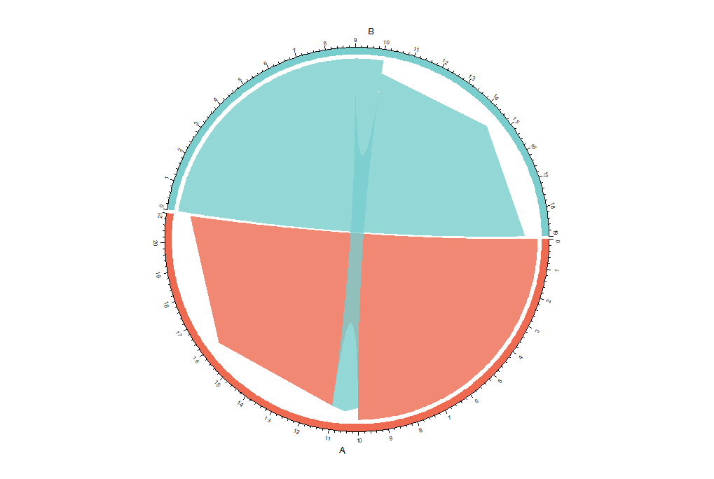
This shows, that the migration matrix, which was a result of the QSM with a specific data manipulation, indicates that in the direction of the data manipulation there is an area of class A modeled in the direction of the manipulation next to an area of class B.
All plots and analyses in this work have been performed in R Version 3.6.0 (R Core Team 2019). The chordgraphs, which are the main visualization tool for this method, were computed with the circlize-package in R (Gu et al. 2014).
2.3 Artifically created medical application
First, we create a simple artificial data example and assign specific labels to the classes in order to illustrate for which kind of research questions this method is applicable. In the same context, we will show why choosing quantiles as basis of the data manipulation can be beneficial compared to choosing a specific number. For illustration purposes, the present example is rather simple and clearly structured, but especially in really complex data situations, in which there are too many features to look at in single plots, using quantile-based manipulations can be advantageous.
Figure 5 shows a 2-dimensional feature space in which three different pain levels are predicted by some statistical model for which we assume that it is able to describe the relationship between , and the target very well. The model maps patients with features and to a 3-class target . All patients with a low value of are assigned to the class medium pain. However, if exceeds a certain threshhold, patients with a very low are assigned to class no pain, patients with a medium value of are assigned to class medium pain and patients with a large value of are assigned to class high pain.

Suppose that this model is provided to a physician, who plans to raise to ease the pain of a patient (e.g., if is the heart-rate, the physician might advise the patient to become physically more active). If at the same time also is small, the model agrees with the physician’s assumption and the patient in fact might get better. However, in contrast to linear relationships as modeled e.g. by standard linear regression, increasing would not always lead to improvement here. For a patient with a rather large value of , an increase of might even result in a migration from the medium pain level to high pain. In this case, a detailed analysis of the migration matrix for increasing would reveal the more complex, non-linear relationships (see Table 4).
This migration-matrix is presented as a chordgraph in Figure 6(a), which is built up from all the observations in the migration-matrix. Each observation is presented as a single chord, starting from the class in which it was predicted before and ending up in the class it was predicted after the feature-manipulation. Multiple observations that have the same starting and ending point in the chordgraph are combined together as a big strang of chords, which is the wider the more observations have the same starting and ending points.
In the present example, it is easy to see that after raising by just a small amount some medium pain patients get better and move to the no pain category, while some get worse and end up in the high pain category.
Furthermore, it is displayed that by decreasing only, a patient with a high pain or medium pain level could actually get better and by decreasing only, high level patients could get better (see Figure 5). Furthermore, by decreasing and simultaneously increasing more substantially (e.g., in case the physician has a very effective drug or any other method for the considerable manipulation of these features) almost every patient classified in the high pain level class by the model is then assigned to a medium pain level and more than half of the medium pain level predictions get now predicted in the no pain level category (see Table 5 and Figure 6(b)).
In this case, if one would increase and decrease by a small amount, then one can easily imagine that in the upper third of Figure 5 some of the medium pain level patients could get worse and become high pain level patients. For the chordgraph in Figure 6(b) the corresponding value of was chosen so large that the graph would not show this type of transition. Actually, the used manipulations were too large such that the class of high pain level patients is skipped. As mentioned in the remarks below, this method does not proof that there is no neighborhood between the two classes for the regarded manipulation. The chordgraph simply displays to which classes the patients would migrate, when the manipulation of the features was that large.
| high pain | medium pain | no pain | |
|---|---|---|---|
| high pain | 534 | 0 | 0 |
| medium pain | 73 | 1286 | 72 |
| no pain | 0 | 0 | 535 |
| high pain | medium pain | no pain | |
|---|---|---|---|
| high pain | 0 | 534 | 0 |
| medium pain | 0 | 444 | 987 |
| no pain | 0 | 0 | 535 |


Note that in Figure 5, features and were intentionally presented without a scale. The intention is to illustrate by this artificial data example why using quantile-based data manipulations can be advantegous compared to using plain (rather arbitrary) numbers. The main reason is that it is often hard to determine what size a “slight” increase or decrease might be in the typical case when the exact distribution of the features is unknown. This is particularly relevant when the task is to find direct neighborhoods. Moreover, if many predictors are present, a fast and automatic method for the computation of the corresponding chordgraphs is essential, instead of determining for every feature and observation manually, what a slight manipulation might be. Different features usually have different scales and, depending on their location in the feature space, a “slight” manipulation could have a different meaning for different observations, especially if a feature of interest has a very complex distribution (e.g., a multimodal distribution). This can be achieved by using small amounts on the quantile scale, which are comparable for all metric features.
Another situation when quantile-based modifications are preferable is the presence of skewed features. A standard example in this regard could be income. Typically, the majority of individuals has a low to moderate salary, whereas a few individuals have a (very) high income. So while the change of the (e.g., monthly) income by a few hundred units might have a drastic effect on the prediction of a certain factor outcome for the first group of individuals, it might be too small to be relevant for the prediction of the outcome of the high-earners. In contrast, quantile-based modifications are more comparable for both subintervals of the income distributions.
2.4 Remarks about the method’s interpretation
In the following, we give some important remarks regarding the interpretation of the results.
- 1.
If we define the preference order
then due to the fact that particularly complex models can produce also complex partitionings of the feature space, it follows
This expresses that the results of the QSM can not be interpreted transitively. In particular, a rather complex model could classify a specific class as a small insula within another class or even spotwise in the feature space, in which case one could get results that seem transitive, but in fact are not (for more details, see Section 2.5).
- 2.
As indicated, the QSM is built to find neighborhoods as described by the model, but not to proof that there is no neighborhood between two classes regarding the manipulation of . If the goal is to proof that a certain class has no direct neighborhoods within the fitted model, then one would have to fill the complete modeled space of the class of interest with data points and then had to manipulate with infinitely small steps from the starting points either until or , respectively, in direction of the manipulation, or until all points have switched classes.
- 3.
The manipulation of could be too big, such that an intermediate class was skipped, and consequently, no direct neighborhood was found. Hence, the “neighborhoods” from above should be regarded more generally as an “exists above” (if the manipulation was done by raising ) or as an “exists below” (if the manipulation was done by decreasing ). To find direct neighborhoods one would have to start with a very small manipulation of and raise (or decrease) it continuously. In contrast to this, if one has a specific manipulation in mind, one could just use this specific manipulation and then the resulting migration matrix shows the corresponding class changes (if any).
- 4.
If specific features are manipulated and a neighborhood is found between two classes, this neighborhood can indeed be interpreted as such, if the task at hand is to find out, how the model describes the neighborhoods. But if the task at hand is to find realistic and practical neighborhoods between modeled classes, then these neighborhoods should always be investigated in two ways. If a neighborhood is found by the intended manipulation between two classes, this means that there exist data points on one side near the border between these two classes. This does not necessarily mean that on the other side of this border data points can also exist. If similar manipulations are carried out in the opposite direction and this neighborhood is not confirmed, then this might mean that due to the manipulation unobservable feature combinations have been created and thus the found neighborhood has no practical use. A reason for this might be that the model simply extrapolates into this area of the feature space (general problem of extrapolation, which can lead to unreasonable interpretations; Hooker 2004).
- 5.
In many cases multiple data points could occur with equal values of a possible feature of interest. If those points are directly at a border between two classes, different problems can be observed, as shown in Section 2.6.
- 6.
Finally, a rather straightforward and fundamental remark: If the model at hand is rather bad and inappropriate, the found neighborhoods between the classes are correct for describing and understanding the model, but would not reflect the reality. Hence, it is important to properly evaluate the model first, before it is interpreted!
2.5 Transitive interpretations
To show possible problems regarding a transitive interpretation of this method, here is a small artifical data example. In Figure 7 a feature space with two features and is shown. A model now labels most of this feature space as class B, while a small area with a low value of both features is labeled as class C and a small area with high values of both features is labeled as class A. In addition to that there are 10 red and grey data points, which are used to describe the partitioning of the feature space with the QSM.

Now, the feature space partitioning should be determined by choosing and , meaning keeping constant. Hence, only neighborhoods with regard to are looked for. With 10 different data points, this means that holding constant each data point gets assigned the next higher value of contained in the dataset. The data point with the highest does not change, as it is already at the upper bound of the range of . This manipulation results in the following migration matrix:
| 1 | 1 | 0 | |
| 0 | 5 | 1 | |
| 0 | 0 | 2 |
In Figure 7 the two points, which change their prediction, are marked in red and switch the modeled class through the dashed lines. These are the two points shown in the migration matrix in Table 6 as one has switched from class A to class B and the other one from class B to class C. As there is an area of class B modeled in the direction of the manipulation above an area of class A, and then there is an area of class C modeled in the direction of the manipulation above an area of class B, based on the corresponding migration matrix one could conclude that in the direction of the data manipulation there is some kind of “hierarchy”. Particularly, here one might conclude that along the direction of this manipulation class A is below class B, which itself is below class C, but as shown in Figure 7 this is not the case. Even if the dimensionality would be too large to graphically visualize it, just by checking the respective feature of interest for the groups seperately would likely confirm the non-transitivity for this example.

In particular, the respective chordgraph as shown in Figure 8 can suggest some kind of “hierarchy”. The chordgraph shows the migration of one observation from class A to class B and the migration of one observation from class B to class C, which looks like a hierarchical structure that actually does not exist. To conclude, QSM results should not be interpreted with regard to transitivity!
In this specific case the QSM just describes that there is in fact an area of class B modeled in the direction of the manipulation above an area of class A and there is an area of class C modeled in the direction of the manipulation above an area of class B. Thus, with this specific manipulation these two neighborhoods were found. When using other manipulations in other directions, then other neighborhoods could be found.
2.6 Multiple data points with the same value
When multiple data points with the same value occur in a dataset and the QSM is used, some unexpected problems can occur. In the left graph of Figure 9, there are 3 data points with an equal value for . When choosing the shift size , so the smallest possible number that allows the data points to shift, then all 3 data points would change their predictions. In this case a neighborhood between class A and class B and another neighborhood between class A and class C would be found. Here, the corresponding migration matrix and chordgraph would indicate a “stronger” neighborhood between A and B, because more points switch between these two classes than between class A and class C. However, compared to the remaining unique data points the jumpsizes (lengths of the arrows) of the three tied points are disproportionately large. As shown in the right graph of Figure 9, if the same three data points would not be exactly equal but just slightly differ, then just one of these data points would change its prediction and the neighborhood between class A and class B would not even be found in this case, which is another problem.
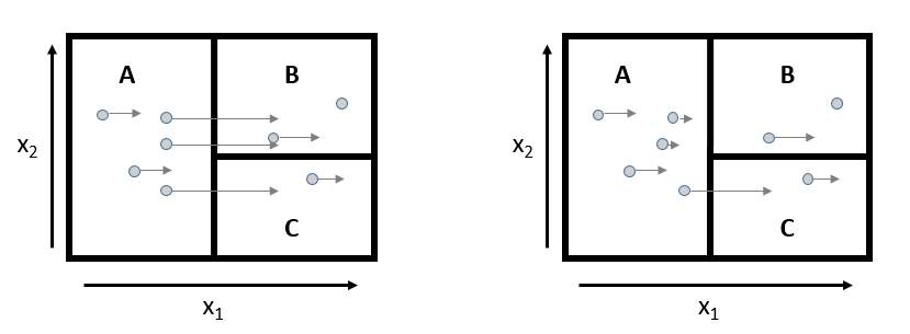
If the shift size is chosen, such that every data point is shifted by 2 unique values of , then both neighborhoods would be found even in the situation of the right graph in Figure 9, when the data points are not exactly equal, as one of the data points changes its prediction from class A to class B.
For any continuous (and random) feature the probability for a specific value is zero. Hence, multiple data points with the same covariate value theoretically should never occur. But in real world applications, for example due to rounding, equal covariate values are possible and could substantially change the interpretation of the QSM (see Figure 9).
If some observations have exactly the same value for a feature of interest (e.g., due to rounding), then they tend to be shifted unfairly compared to those observations with unique values for that feature. To avoid this problem, there are some ways to adjust the QSM to treat observations with equal values more fairly compared to those, which have unique values for a specific feature.
- 1.
Shift all ties: One possibility is to shift all of the data points that share a specific value of a feature of interest and observe the changes in the predictions (left graph in Figure 9). In this example this guarantees that all data points are shifted, and neighborhoods can be found more easily. As mentioned above, this method might tend to shift the groups of observations with equal values of a specific feature of interest disproportionately large compared to observations with unique values.
- 2.
Repeatedly shift ties randomly: Another alternative in the case of multiple observations with equal values for a specific feature of interest, is to repeatedly shift the observations. As shown in the right graph of Figure 9, when the observations were just slightly jittered, in this example two observations were changed by almost no amount and one by a larger amount. As a consqeuence, these observations are treated more fair compared to the other observations than in the shift all ties method, but very unequally amongst themselves. For the artificial example, the prediction of just one of these three obervations changes. The repeatedly shift ties randomly method does exactly that, but instead of jittering and thus adding some blurredness to the data, it repeatedly executes the QSM and randomly determines an order of the tied observations. While all observations with unique values of the feature of interest are shifted in the same way for all the repeated shifts, the observations sharing their value of the feature of interest with other observations are shifted in just a fraction of the repeats by the full shift as in the shift all ties method. Hence, observations with equal values of the specific feature of interest are in most repetitions shifted less, and if is rather small, they might not be shifted at all. Thus, in comparison to the shift all ties method, this method treats the observations with the same values of the specific feature of interest more fair compared to the observations, which have unique values of this feature of interest.
The differences of these methods are illustrated in Section 3 on a real data example.
3 Real Data Application
In this section, the QSM is applied to a real data set in order to provide some insight on the method’s potential. For this purpose, the iris dataset is used, where the species of flowers are classified by some metric features of the flowers.
The iris dataset is a dataset containing 150 observations for 3 different species of different iris flowers and 4 metric features, which contain the sepal width, the sepal length, the petal width and the petal length of the flowers (Fisher 1936; Anderson 1936).
The two features petal length and petal width are known to be good predictors for the species. A classification tree is used to predict the three different species by these two features with the rpart-package (Therneau and Atkinson 2019). In Figure 10 the resulting partitioning of the feature space is shown.

An important reason why this dataset is used here, is that the dataset
contains a lot of observations with equal feature values. For the petal
width, for example, the 150 observations have just 22 different values.
For the fitted model, quantile shift sizes of
and
, respectively,
are chosen. Here, the shift all ties method and the
repeatedly shift ties randomly method are compared. For the
former method, ten repetitions where utilized to get an overall
migration matrix.
| setosa | versicolor | virginica | |
|---|---|---|---|
| setosa | 50 | 0 | 0 |
| versicolor | 0 | 48 | 6 |
| virginica | 0 | 0 | 46 |
| setosa | versicolor | virginica | |
|---|---|---|---|
| setosa | 50 | 0 | 0 |
| versicolor | 0 | 48 | 6 |
| virginica | 0 | 0 | 46 |
| setosa | versicolor | virginica | |
|---|---|---|---|
| setosa | 500 | 0 | 0 |
| versicolor | 0 | 510 | 30 |
| virginica | 0 | 0 | 460 |
| setosa | versicolor | virginica | |
|---|---|---|---|
| setosa | 500 | 0 | 0 |
| versicolor | 0 | 480 | 60 |
| virginica | 0 | 0 | 460 |
In Table 7 it is shown that by using the shift all ties method, six observations change their prediction from versicolor to virginica, and all other predictions remain the same for both choices of . In the left migration matrix of Table 8 it is shown that by using the repeatedly shift ties randomly method, for the shift size altogether 30 observations change their prediction from versicolor to virginica in ten repetitions, which means that just three observations change their prediction per repetition. In the right migration matrix of Table 8 it is shown that for the shift size even 60 observations change their prediction from versicolor to virginica in ten repetitions, which means that 6 observations change their prediction per repetition, and which coincides with the results for the shift all ties method.
This shows that the repeatedly shift ties randomly method is more sensible to changes of in general compared to the shift all ties method, which instead can be argued as slightly more robust in regard to small changes of .
Furthermore, it is shown here that using the different methods changes the resulting migration matrix, even though in this example the difference is just in the number of observations, which change their prediction. As argued above, the repeatedly shift ties randomly method treats the observations more fairly, which is why it generally should be preferred.
Figure 11 displays that the small change in does actually not change the visual impression on the found neighborhoods, as the migration matrix in the shift all ties method stays the same for both choices of .
In Figure 12 the visual impression (slightly) changes for the repeatedly shift ties randomly method, when again is modified. This is also more intuitive as by raising the absolute value of the shift size , in general the intention is that this increases the chance that predictions do switch and, thus, by raising the absolute value of one would expect to observe more changes. The main downside here is that the migration matrix gets blown up due to the repetitions and, hence, does not represent the amount of observations in the original dataset anymore. This also affects the scaling of the chordgraph’s axis. But as the visual impression and interpretation are the main reasons why chordgraphs are chosen as the visual representation method instead of just reading the exact numbers of switched predictions - e.g., from the migration matrix - this is rather negligible. Another downside is that the repeatedly shift ties randomly method takes more time to compute than the shift all ties method.
Overall, both methods show the same neighborhoods, and even in complex data situations they should tend to do so, if the number of performed repetitions is chosen appropriately. The only difference is that the repeatedly shift ties randomly method is more sensible to changes in compared to the shift all ties method.
4 Conclusion
In this work, a method to determine neighborhoods between predicted classes in a fitted model is presented, accompanied by examples illustrating the purpose of the method and how to correctly interpret the corresponding results. The method improves the understanding of the partitioning of the feature space of a statistical classification model and can be simply visualized and interpreted with the aid of chordgraphs. The main advantage of the method surely is the gain of insight about the partitioning of the feature space of the corresponding classification model at hand, even though the model at hand might be a mere black-box, hardly interpretable for practitioners.
Similar to most statistical tools, the method is an approximization of the reality, which becomes more meaningful the better the model at hand performs. However, the real additional value of the proposed method is its wide and unrestricted applicability to any kind of classification model. In general, the method can also be applied in very high-dimensional and complex settings. The only conditions are that the fitted model at hand builds upon a feature space and returns a categorical output or predicted probabilities for the different response categories.
The greatest risks when using this method are probably false
interpretations of results, as the pitfalls in this regard are manifold.
Of course, the method only describes the underlying model, and, hence,
heavily relys on its goodness-of-fit and adequacy.
The usage of a weak model, which badly represents reality, will almost
certainly lead to unpractical interpretations by the proposed method (as
any other model-describing methods would do as well). Another source for
potential misinterpretation could occur, if the feature manipulations
are too strong or too weak, such that some neighboring classes are
skipped or simply not found.
Nevertheless, the examples in this work show the variety of fields this method could be applied to. First of all, QSM can help to determine which classes are modeled close to each other by the model at hand and can show in which order they are modeled next to each other with regard to the manipulation. Even more, this method shows to which class predictions generally tend to switch if one or multiple specific feature(s) of interest are actively changed. Even though this does generally not allow any conclusions regarding causality and, hence, results have to be interpreted with caution, the method can be relevant e.g. in clinical usage when a specific medication should be used to alter the features.
Since extrapolation typically is a problem in many statistical modeling
tasks and typically gets worse when the model complexity rises, care has
to be taken when large feature manipulations are used. These might force
the model to predict new classes in a region of the feature space where
data points are rather unlikely or even impossible.
In order to avoid this problem, it is recommended to start with rather
small feature manipulations, assuming that very small manipulations do
not create impossible observations. As it is typically hard to determine
what generally defines a “likely” observation, we recommend that this
should be decided manually by the user. Altogether, this manuscript aims
at providing sufficient advice to enable practitioners to safely use
this tool for meaningful interpretations.
5 Sponsor
This work was supported by the German Innovation Funds according to § 92a (2 )Volume V of the Social Insurance Code (§ 92a Abs. 2, SGB V - Fünftes Buch Sozialgesetzbuch), grant number: 01VSF18019. The funding body did not play any role in the design of the study and collection, analysis, and interpretation of data and in writing the manuscript.
References
- Anderson (1936) Anderson, E. (1936, September). The species problem in iris. Annals of the Missouri Botanical Garden 23(3), 457.
- Breiman (2001) Breiman, L. (2001). Random forests. Machine Learning 45(1), 5–32.
- Fisher (1936) Fisher, R. A. (1936, September). The use of multiple measurements in taxonomic problems. Annals of Eugenics 7(2), 179–188.
- Friedman (2001) Friedman, J. H. (2001). Greedy function approximation: A gradient boosting machine. The Annals of Statistics 29(5), 1189–1232.
- Goldstein et al. (2015) Goldstein, A., A. Kapelner, J. Bleich, and E. Pitkin (2015, January). Peeking inside the black box: Visualizing statistical learning with plots of individual conditional expectation. Journal of Computational and Graphical Statistics 24(1), 44–65.
- Gu et al. (2014) Gu, Z., L. Gu, R. Eils, M. Schlesner, and B. Brors (2014). circlize implements and enhances circular visualization in r. Bioinformatics 30, 2811–2812.
- Hooker (2004) Hooker, G. (2004). Diagnostics and extrapolation in machine learning.
- Molnar (2019) Molnar, C. (2019). Interpretable machine learning: A guide for making black box models explainable.
- R Core Team (2019) R Core Team (2019). R: A Language and Environment for Statistical Computing. Vienna, Austria: R Foundation for Statistical Computing.
- Ribeiro et al. (2018) Ribeiro, M. T., S. Singh, and C. Guestrin (2018). Anchors: High-precision model-agnostic explanations.
- Therneau and Atkinson (2019) Therneau, T. and B. Atkinson (2019). rpart: Recursive Partitioning and Regression Trees. R package version 4.1-15.