1067
\vgtccategoryResearch
\vgtcpapertypealgorithm/technique
\authorfooterA. Wu, W. Tong, and H. Qu are with Hong Kong University of Science and Technology. Email: awuac, wtong, huamin@ust.hk.
T. Dwyer is with Monash University. E-mail: Tim.Dwyer@monash.edu.
B. Lee is with Microsoft Research. E-mail: bongshin@microsoft.com.
P. Isenberg is with Inria. Email: petra.isenberg@inria.fr.
\shortauthortitleBiv et al.: Global Illumination for Fun and Profit
\CCScatlist\CCScatK.6.1Management of Computing and Information SystemsProject and People ManagementLife Cycle;
\CCScatK.7.mThe Computing ProfessionMiscellaneousEthics
\teaser![[Uncaptioned image]](2008.06678v1/teaser.png) MobileVisFixer automatically transforms SVG-based visualizations from mobile or desktop versions into mobile-friendly designs with several modifications: (A) resize the view and modify axes; and (B) resize the view, reposition the legend, modify the title and axes.
\vgtcinsertpkg
MobileVisFixer automatically transforms SVG-based visualizations from mobile or desktop versions into mobile-friendly designs with several modifications: (A) resize the view and modify axes; and (B) resize the view, reposition the legend, modify the title and axes.
\vgtcinsertpkg
Introduction
MobileVisFixer: Tailoring Web Visualizations for Mobile Phones Leveraging an Explainable Reinforcement Learning Framework
Abstract
We contribute MobileVisFixer, a new method to make visualizations more mobile-friendly. Although mobile devices have become the primary means of accessing information on the web, many existing visualizations are not optimized for small screens and can lead to a frustrating user experience. Currently, practitioners and researchers have to engage in a tedious and time-consuming process to ensure that their designs scale to screens of different sizes, and existing toolkits and libraries provide little support in diagnosing and repairing issues. To address this challenge, MobileVisFixer automates a mobile-friendly visualization re-design process with a novel reinforcement learning framework. To inform the design of MobileVisFixer, we first collected and analyzed SVG-based visualizations on the web, and identified five common mobile-friendly issues. MobileVisFixer addresses four of these issues on single-view Cartesian visualizations with linear or discrete scales by a Markov Decision Process model that is both generalizable across various visualizations and fully explainable. MobileVisFixer deconstructs charts into declarative formats, and uses a greedy heuristic based on Policy Gradient methods to find solutions to this difficult, multi-criteria optimization problem in reasonable time. In addition, MobileVisFixer can be easily extended with the incorporation of optimization algorithms for data visualizations. Quantitative evaluation on two real-world datasets demonstrates the effectiveness and generalizability of our method.
keywords
Mobile visualization; Responsive visualization; Machine learning for visualizations; Reinforcement learning.The last decade has seen an explosive growth of smartphone usage: statistics show that mobile devices have been used more than traditional desktops for web access globally since 2016 [gibbs:2016, Enge:2019]. It is, therefore, becoming increasingly important to develop mobile-friendly websites that are readable and usable on mobile devices. We see efforts to promote mobile-friendly websites from both industry and research communities. For instance, Microsoft [BingTool] and Google [GoogleTool] have developed tools to test mobile friendliness, and favor mobile-friendly websites for their search results, which contribute to a trend towards mobile-first design. In addition, there are commercial services [Mobify] and research efforts [mahajan2018automated, althomali2019automatic] to fix problems with mobile designs that could cause a frustrating experience. These efforts are typically focused on the design and layout of websites for mobile devices and do not address the specific challenges of mobile visualization design. As a result, a considerable number of visualizations on the web suffer from readability and usability issues, such as visual clutter, overlapping or tiny text, and overflowing content[Brych2018, Young2019].
Despite the increasing acknowledgment of the opportunities and importance of mobile data visualizations [roberts2014visualization, lee2018data, choe2019mobile, lee2020reaching], little work has attempted to investigate and fix the problems with mobile web-based visualizations. From a theoretical aspect, we lack empirical studies to understand the types of problems that occur in mobile visualizations. Recent work [mahajan2018automated] has identified common types of mobile-related problems for general websites, but they are not readily applicable to the visualization context. From an applied perspective, existing approaches are limited in helping practitioners detect and repair problems with visualizations on mobile devices. For example, the mobile friendliness test tools mentioned earlier [BingTool, GoogleTool] do not properly handle SVG-based visualizations. Practitioners who carefully craft custom designs, therefore, have to manually test and verify their visualizations on different screen sizes, which is tedious and time-consuming. After detecting problems, practitioners often find it difficult to repair them [Brych:2018, Bremer:2019]. Practitioners typically need to adjust multiple SVG elements and CSS style properties simultaneously, while ensuring that those adjustments do not introduce any new problems [mahajan2018automated]. Automated tools that help tailor visualizations for mobile devices are one way to address these challenges.
Existing automated solutions [Gal:2017, Teal:2019, motivateExample:20] usually adjust visualizations by rule-based methods, e.g., word-wrapping if text overflows. Their decision rules are interpretable and almost operable in their built-in visualization options. However, such rules are often deterministic that could result into sub-optimal results in real-world scenarios. Fig. 1 illustrates a real-world example by Google Charts [motivateExample:20] where it adjusts texts according to a set of rules. Those adjustments lead to readability issues as some text components (i.e., Fig. 1 B2, B3) become invisible and unreadable. Although it is possible to add new rules to handle the situation, such rule-based methods face challenges such as large manual efforts and the combinatorial explosion of possible conditions [saket2018beyond]. It remains challenging and time-consuming to design rules for automatic responsive visualizations that scale well to the real-world diversity.
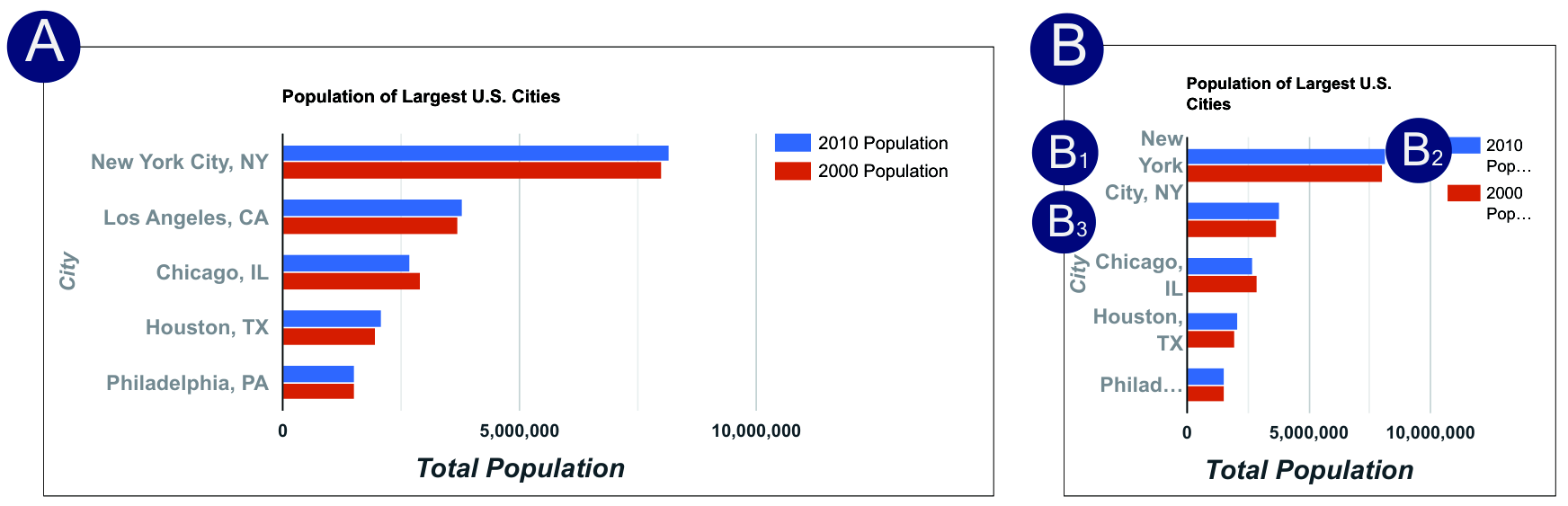

In this paper, we present MobileVisFixer, an interpretable reinforcement-learning-based approach that automatically learns and applies decision rules for generating mobile-friendly visualizations. We focus on SVG-based, single-view Cartesian visualizations with linear or discrete scales, which are found common on the web [battle2018beagle]. To motivate the design of MobileVisFixer, we collected 374 web visualizations and categorized problems we saw when displaying these visualizations on mobile devices into five types of common issues. To optimize visualizations, MobileVisFixer first deconstructs charts into a declarative format which not only captures the underlying data encoding but also efficiently reduces the difficult, multi-criteria optimization problem. MobileVisFixer then utilizes a novel greedy heuristic based on Policy Gradient methods that solves the reduced optimization problem. Quantitative evaluation on a real-world dataset shows that MobileVisFixer successfully solve 89% of visualizations with mobile-friendly problems in reasonable time: Figs. MobileVisFixer: Tailoring Web Visualizations for Mobile Phones Leveraging an Explainable Reinforcement Learning Framework and 2 show several mobile-friendly visualizations that were automatically generated with MobileVisFixer. Further evaluation of MobileVisFixer on a different dataset demonstrates the generalizability of the learned model.
In summary, the primary contributions of this paper are:
- •
A categorization of five common issues with mobile visualizations derived from 374 web-based visualizations.
- •
The design and implementation of MobileVisFixer, which automatically converts SVG-based visualizations into mobile-friendly designs. MobileVisFixer takes an explainable machine learning approach to optimize the resolution of four problems across a large set of mobile visualizations.
- •
A set of quantitative evaluations that demonstrate the effectiveness, generalizability, and explainability of MobileVisFixer.
1 Related Work
This paper draws upon prior work at the intersection of mobile web and mobile visualization, machine understanding of visualization, as well as automated visualization design.
1.1 Mobile and Mobile Web Visualization
There is a growing body of work examining how to adopt desktop web content to mobiles. Typical approaches include Responsive Web Design [mullins2015responsive] that dynamically responds to size changes of the browser window using fluid grids and CSS media queries, as well as Adaptive Web Design [gustafson2015adaptive] that detects screen size and selects an appropriate design from multiple alternatives. However, both approaches introduce considerable development and testing costs, as developers must verify web-page appearance through trial-and-error. As such, much research in the software community has studied how to automatically detect [walsh2015automatic, walsh2017automated, althomali2019automatic] and repair [mahajan2018automated, mahajan2017automated] mobile-friendly issues. In contrast to our work, none of those approaches is targeted at visualizations. In particular, existing techniques do not consider layout constraints in visualizations, and would potentially break the visual encoding and data binding. Moreover, they do not support SVG which is the basis of many web-based visualization. SVG is a difficult target because it has its own set of elements, attributes, and properties that make it more complex than HTML alone.
In order to approach fixing problems with mobile visualizations we considered past design guidelines from the Visualization community. Already 14 years ago, Chittaro [chittaro2006visualizing] argued that the different characteristics of mobile visualizations present new research challenges. Since then, research has proposed and evaluated mobile encodings for a wide range of data-types such as temporal data [kay2016ish, chen2017visualizing, brehmer2018visualizing], spatial-temporal data [kim2007visual], or small multiples [brehmer2019comparative]. In contrast to this work on the development and study of dedicated mobile encodings is research that looked at how to adapt larger visualizations to smaller screen. Hoffswell et al. [hoffswelltechniques] recently conducted a survey of existing practices for responsive visualization design and subsequently developed a tool to help people manually edit visualizations for different screen sizes. On the commercial side, software like Power BI [Gal:2017] and Tableau [Teal:2019] also offered support for responsive layout but they do not proactively detect and diagnose potential problems. Our work adds to this stream of research by proposing novel approaches that automatically detect and repair issues in mobile visualizations.
1.2 Machine Understanding of Visualization
To detect and repair problems present in mobile visualizations, our work takes inspiration from past work on the automatic extraction and manipulation of information in visualizations. In a broader sense, recent research has been devoted to enabling machines to understand data visualizations from different perspectives. A majority of work investigates ways to retrieve data from charts [choi2019visualizing, cliche2017scatteract, al2015automatic, poco2017reverse, jung2017chartsense, savva2011revision], while other research attempts to retrieve color mappings [poco2017extracting] and visual importance [bylinskii2017learning]. Furthermore, researchers have developed and evaluated deep neural networks that reason about data visualizations including performing graphical perception tasks [haehn2018evaluating] and visual question answering tasks [kafle2018dvqa].
The work more closely related to ours is Battle el al.’s [battle2018beagle] Beagle system, which analyzes general SVG-based visualizations and automatically classifies them by type. The approach is similar to ours in that it also targets the general SVG-based visualizations we focus. We, however, take a different focus on adjusting SVG attributes related to layouts and visual styles to alleviate mobile-friendly issues while preserving the visual encoding. As such, related to ours are Harper and Agrawala’s methods for re-styling visualizations [harper2014deconstructing] and for generating reusable templates [harper2017converting] as well as following work [hoque2019searching] on how to infer the visual style and structure from visualization collections. However, they do not specifically address the relationships of visual styles among elements in visualizations, e.g., the layout relationship between text labels and corresponding marks. Our work contributes to this space by studying how to model and deconstruct such relationships from SVG-based visualizations.
1.3 Automated Visualization Design
Generating precise and elegant data visualizations is considered difficult even for experts [qin2019making]. Several automated visualization design tools have been proposed to ease this process by rule-based or model-based systems. Rule-based systems typically introduce a set of heuristic rules to recommend visual encodings [mackinlay2007show, wongsuphasawat2017voyager] or generate layouts [ren2018charticulator]. They have proven effective since their rules span a rich range of carefully curated design constraints considering data types and encoding channels. Nevertheless, it requires system designers to apply prior domain knowledge from empirical studies to manually construct rules and curate a rule set [saket2018beyond]. Therefore, recent research starts shifting to model-based systems such as Data2Vis [dibia2019data2vis] and VizML [hu2019vizml], which recommend design choices that are learned from a large corpus through machine-learning models. However, despite promising results, their models have not proven superior. In addition, the comprehensive data collection and labelling process could be expensive.
Different from the above work that recommends visual design given data, we study how to automatically adapt the layouts of existing visualizations to mobile screens. Our method is inspired by the recent success of hybrid systems that augments rules with machine learning models [moritz2018formalizing, saket2018beyond]. In particular, we proposes a novel explainable reinforcement learning framework that automatically learns and executes human-interpretable rules for adjusting layout parameters to improve mobile-friendliness. Compared with existing rule-based responsive visualization techniques (e.g. [Gal:2017, Teal:2019]) that are usually deterministic, our framework could learn stochastic decision rules (policies) that allows generating more flexible solutions to varying real-world scenarios. Besides, our framework embraces algorithmic explainability and transparency which helps model developers debug mistakes in cost functions, and reason about the quality of the learned model.
2 Mobile-Friendly Issues in Web Visualizations
To gain an insight into mobile-friendly issues in web visualizations, we collected and analyzed SVG-based visualizations on the web. Our focus on web-based visualization is motivated by the fact that visualizations are often consumed on mobile devices, custom-designed, and thus difficult to adjust for all viewing scenarios. We note that we focus on layout-related readability issues of SVG-based visualizations and do not consider interaction problems.
We developed a web crawler to collect SVG-based visualizations following Hoque and Agrawala’s approach [hoque2019searching]. As their results are mainly from the bl.ock.org domain, we extended their seeding pages with other visualization portals, such as Google Charts. In addition, we randomly visited the hyperlinks in the queue to increase the diversity. We used the Device Mode by Chrome DevTools to crawl visualizations rendered on an iPhone X screen. We also crawled the desktop version to help us reason about if the creators had attempted to adapt visualizations to mobile screens or simply scaled them down. At the end, we obtained 374 visualization examples from 103 domains.
Two authors of this paper manually inspected all mobile visualizations and coded problems that hurt the appearance and readability of the mobile visualizations. The coding schemes were originally based on existing literature about mobile-friendly problems in general web content [GoogleTool, BingTool], such as small font size and wrong viewport. Throughout the coding, we iteratively updated the coding schemes and re-coded samples when necessary. In the following text, we describe the most common sources of problems we found in detail.
2.1 Mobile-friendly issues
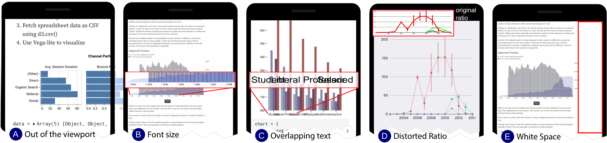
We identify five common issues that impair the mobile-friendliness of visualizations (Fig. 3). We discuss them together with the contributing inappropriate changes between desktop and mobile versions.
1) Out of the viewport. Out of 374 visualizations, 122 (32.6%) had problems related to content being placed outside of the screen. This problem can occur when absolute or miscalculated values of SVG properties lead to display coordinates outside of the current viewpoint. This problem forces viewers to scroll horizontally to view the whole content, resulting in a poor user experience [LePage:2019].
2) Unreadable font size. A large number (118, 31.5%) of visualizations included font sizes that were hardly readable. This problem occurs when programmers only resize visualizations to fit the current screen, making visualizations fully visible but making content less legible.
3) Cluttered text. About 16.0% of visualizations (60) contained overlapping and cluttered text elements. This problem is partly due to the absence of intrinsic mechanisms for preventing overlap in SVG elements or no implemented ways to avoid label overlap.
4) Distorted layout. For 85 (22.7%) web-based visualizations the layout was artificially stretched. This problem occurs because mobile devices are predominantly held in portrait orientation even when browsing multimedia content [Podger:2019], while desktop web browsing is more typically in landscape mode. To address this difference, web programmers often adjust web content to the screen’s width, letting content spread out vertically. However, such practices, when applied in the SVG context, can render visualizations in a distorted aspect ratio that potentially causes unintended bias in visual perception [talbot2012empirical].
5) Unwanted white space. The fifth most common (21, 5.6%) cause of problems in the SVG-based visualizations we coded was excess white space, leading to non-optimal space usage and potentially unreadable content. This problem is often due to the use of fixed-width layout attributes such as padding and margins.
We found that 142 (37.9%) visualizations exhibited no changes between desktop and mobile designs, while only 98 (26.2%) visualizations exhibited none of the above five issues. This indicates that many visualization creators might neglect responsive design. Besides, we observed entanglement among issues. About 36.6% (101) out of the 276 non-mobile-friendly visualizations contained more than one issue.
Beyond these five common issues, we also found several rare cases pertained to mobile-friendliness. A few visualizations embed third-party icons or images that do not automatically scale well to the mobile screen. Besides, touch elements (e.g., buttons) can be too close to each other that users might have difficulties tapping desired ones.
2.2 Discussion
Our analysis shows several visualization-specific problems for mobile content compared to those of general web content [mahajan2018automated]. While content sizing and viewport configuration are commonplace for both visualizations and general web content, research by Mahajan et al. [mahajan2018automated] does not discuss our last three issues (i. e., cluttered text, distorted layout, and unwanted white space). This underscores the potential for developing an automatic, visualization-specific approach.
It is challenging to address all five issues we uncovered simultaneously, since they are highly inter-dependent. For example, increasing the font size to make text legible might lead to overlapping text making it illegible. Therefore, designers must fix related problems in a trial-and-error process, often leaving some problems not optimally solved. Furthermore, designers might fail to anticipate data changes that could distort the layout [walny2019data]. For example, Fig. 3 (C) 11 1 https://observablehq.com/@2shabby/grouped-bar-chart forks a template 22 2 https://observablehq.com/@d3/grouped-bar-chart of a grouped bar chart. However, its labels are considerably longer than that of the template and the mobile version is compromised.
3 MobileVisFixer - Overview
MobileVisFixer automatically generates mobile-friendly designs for SVG-based visualizations. It currently addresses four common types of problems introduced in section 2: content sizing for viewport, font sizing, text overlap, and white space. We leave the last one, distorted ratio, to future work because it requires perceptual guidelines for a large number of visualizations for which they are not yet clearly defined. Specifically, due to the different screen size between desktops and mobiles, resizing is the most common compromise solution for responsive visualization design [hoffswelltechniques] that usually distorts the aspect ratio. It, however, remains unclear to what extend that such distortions influence perceptions.
There are some straightforward repairs for the four issues in graphics design [o2014learning], e.g., moving text or graphical marks elsewhere to prevent overlap. However, naive movements of elements can easily violate data representations where positions are mapped to data. Therefore, the challenge of generating a reasonable repair involves two objectives–addressing multi-criteria mobile-friendly issues and strictly maintaining the underlying visual encoding.
MobileVisFixer transforms visual encoding to a mathematical form. It defines a visualization as a set of visual elements , including text and graphical marks. Each element is described by a visual encoding which specifies values for visual properties , such as positions and sizes in SVG attributes and CSS styles. We use a simplified notation to consider all values in the real domain, assuming that categorical attributes can be expressed by enumerations. Let denote all valid element-property pairs, where . The visualization is thereby expressed as a vector containing values for all those pairs, namely . MobileVisFixer quantifies the mobile-friendly issues with a multi-criteria cost function, denoted . The objective is to determine a set of patches, denoted , that minimizes :

| (1) |
Our approach for solving the above multi-criteria, high-dimensional optimization problem consists of two phases, deconstruction and optimization, as shown in Figure 4. The input to MobileVisFixer is an SVG file containing a visualization to be rendered on mobile devices. The deconstruction phase (section 4) decodes the visualization to extract the data and encoding, which are described in a declarative format. The output is , the parameters used in the declarative descriptions of visualizations, which are reduced from in the convenience of solving effectively. The optimization phase () proposes a novel explainable reinforcement learning framework that solves (Eq. 1) and generates optimal , as well as the corresponding visualization.
The term “optimal” here refers to a reasonable solution that minimizes built-in costs and thus improves mobile-friendliness for a particular visualization. It does not mean “optimal” for any specific set of requirements (e.g., data, context) of a human designer. A designer, instead could view different results from our tool and select from or refine multiple generated designs until they find the “best” designs for their own tasks and additional considerations [moritz2018formalizing].
4 Deconstruction
The deconstruction phase decodes the SVG to identify – sets of SVG elements with visual properties that are subject to adjustments to improve the mobile-friendliness, as well as – a declarative description of visualizations that facilitate the computation. The general intuition of this decision is two-fold: (1) most encoding properties (e.g., color, border) should remain faithful to the original chart; and (2) each mobile-friendly issue typically maps to a small set of properties. This reduces the solution space of in Eq. 1 from to . However, this phase needs to consider constraints for the change of properties that are related to the underlying data binding and visual consistency.
To consider those constraints, MobileVisFixer introduces visual groups – sets of elements described by the same set of encodings, e.g., the tick-labels in an axis form a visual group. Following the same notation used for element-wise encoding (), group-wise encodings can be expressed as , and corresponding values . Thus, the solution space is further reduced to . MobileVisFixer determines by deconstructing the visual encoding through two steps: (1) generating visual groups and their intra-group encoding and (2) determining layout dependencies – the inter-group layout relationships.
The first step builds on Hoque and Agrawala’s [hoque2019searching] method for recovering data, marks, and encoding from a D3 chart. Due to the complexity and diversity of data visualizations, MobileVisFixer currently focuses on single Cartesian visualizations with linear or discrete scales. MobileVisFixer extends their method to support non-D3 charts by dismissing D3’s specification for the SVG tree structure. For instance, D333 3 https://github.com/d3/d3-axis utilizes a
<g>} template for rendering axes.
In addition to searching and traversing such \mintinline
html¡g¿ nodes, MobileVisFixer also uses a linear scan algorithm to search axis candidates with aligned tick-labels and ticks. The result of this step is a set of visual groups, as well as coordinate scales. Figure 5 (B) shows each visual group annotated by the same background color, except for the line in the x-Axis and the bars which already has their own background color.
The second step aims to identify the layout dependency of the visual group. Similar to Vega’s specification[satyanarayan2016vega], the layout of a group depends on either the coordinate scale or another anchoring group. The latter case is referred to as reactive geometry which is particularly common for describing the layout of text labels. MobileVisFixer describes reactive geometry by a tuple , where and are the anchoring position for the group and anchoring group respectively, and is the offset value in corresponding direction. Possible anchoring positions include Left, X-Center, Right, Top, Y-Center, and Bottom. For instance, the labels in Figure 5 (A) are horizontally aligned center to their corresponding bars, which is described as X-Center, X-Center, 0.
The resulting specification of visualizations is similar with Vega [satyanarayan2015reactive], a declarative format based on grammar-based specifications.
We choose a subset of Vega specifications related to layouts.
As shown in Table , MobileVisFixer includes five classes (Title, Axis, Legend, Mark, and Label) and 10 visual groups, which are basic structural elements of visualizations.
Different from Vega where labels are included in marks, we consider labels as a separate class since they have unique encoding properties such as font-sizes.
For each group, MobileVisFixer identifies a set of encoding properties which are subject to adjustments to improve mobile-friendliness.
For instance, adjustable properties for includes \formatHTML¡fontSize¿, ¡x¿ and C_g^*