Visualizing Modular FormsThanks: This work was supported by the Simons Collaboration in Arithmetic Geometry, Number Theory, and Computation via the Simons Foundation grant 546235.Thanks: The author benefitted from many conversations at the fall 2019 ICERM program on Illustrating Mathematics (where this project was born) and at the special number theory day organized at Bowdoin College by Naomi Tanabe.
Abstract.
We examine several currently used techniques for visualizing complex-valued functions applied to modular forms. We plot several examples and study the benefits and limitations of each technique. We then introduce a method of visualization that can take advantage of colormaps in Python’s matplotlib library, describe an implementation, and give more examples. Much of this discussion applies to general visualizations of complex-valued functions in the plane.
1. Introduction
1.1. Motivation
Graphs of real-valued functions are ubiquitous and commonly serve as a source of mathematical insight. But graphs of complex functions are simultaneously less common and more challenging to make. The reason is that the graph of a complex function is naturally a surface in four dimensions, and there are not many intuitive embeddings available to capture this surface within a 2d plot.
In this article, we examine different methods for visualizing plots of modular forms on congruent subgroups of . These forms are highly symmetric functions and we should expect their plots to capture many distinctive, highly symmetric features.
In addition, we wish to take advantage of the broader capabilities that exist in the Python/SageMath data visualization ecosystem. There are a vast number of color choices and colormaps implemented in terms of Python’s matplotlib library [3]. While many of these are purely aesthetic, others are chosen to allow the most accurate perception by as many viewers as possible. By using matplotlib colormaps, it is possible to choose colors to support different types of color perception, including for people who see color differently. We describe this further in §3.
Although our emphasis is on plots of modular forms, many of the techniques described apply more generally to graphing complex-valued functions. We hope this paper will be of help to any reader wanting to visualize complex functions.
1.2. Broad Overview of Complex Function Plotting
Over the last 20 years, different approaches towards representing graphs of complex functions have emerged. The most commonly used approach is one first introduced by Frank Farris in a review [2] of Needham’s Visual Complex Analysis.
The idea is to represent the output of a complex function though color. Frequently, one uses hue to represent argument and lightness to represent magnitude. Or more generally, one can associate a color to each point in the complex plane and then color the domain of a complex function by the color of . This technique is now called domain coloring. Using hue and lightness to represent argument and magnitude is the default complex plotting method in SageMath [9], as well as other common complex plotting libraries.
In principle, such a graph gives perfect information about the function. But in practice, it is often difficult to distinguish between hue and lightness — and in particular it is challenging to determine if two points with different hues have the same lightness. Thus some variations omit a dimension from the graph and plot only the magnitude or phase. Even though the resulting graphs do not perfectly capture , the omission of a dimension can be beneficial. Other variations specially color the complex plane in other ways.
In [10], Wegert describes an approach using domain coloring, but emphasizing phase plots as a visual tool. He also produces phase plots with small brightness adjustments near certain magnitude thresholds. The effect is similar to looking at a contour map of a landscape, except that each pixel’s color carries meaning (the phase of evaluated at that point).
1.3. Paper Overview
In §2, we give a short survey of common existing complex plotting techniques applied to modular forms. We include images coming from the ideas of Farris and Wegert, built using SageMath. We also reproduce the plots associated to modular forms on the L-Function and Modular Form Database (LMFDB [6]).
In §3, we describe how one can incorporate pre-established colormaps into modular form visualizations. And in §3.1, we discuss one such implementation in terms of matplotlib. This is a new implementation.
Throughout, we revisit the same basic figures with each visualization technique. We plot four different modular forms on three different domains in each technique. Each plot reveals different behaviors of the underlying forms.
2. Survey of Visualizations
2.1. Halfplane and Disk Models
Plots of modular forms typically represent the form either on the upper halfplane or on the Poincaré disk. We first describe the relationship between these two types of plots, and then survey different visualizations of forms in each plot type.
Let denote the complex upper halfplane. A modular form of weight on a congruence subgroup is a holomorphic function satisfying
| (1) |
as well as certain growth conditions at the cusps of . See [1] for complete definitions.
To the congruence subgroup is associated a positive integer called the level. The automorphy condition (1) implies strong symmetry conditions on in terms of . In particular, implies that will be periodic with period . Thus one can constrain a plot to a vertical strip of width without omitting any information.
In practice, one would cut off the vertical strip at some height . If is a cuspform, so that , then heuristically most interesting behavior of the form will lie within a well-chosen box . In practice, is typically much larger than , and it’s necessary to investigate some smaller box. We refer to this type of plot as a plot of in the upper halfplane.
Alternately, the upper halfplane is conformally equivalent to the Poincaré disk . There are infinitely many such maps taking to , but we choose the möbius transform
| (2) |
Under , the points in are mapped to , respectively, in . Thus the apparent vertical orientation remains fixed in both models.
Plotting a modular form on is a complete picture; values of at every point of will be represented through such a plot. We refer this type of plot as a plot of in the disk.
2.2. Visualizations
Let denote the Ramanujan Delta function, the unique holomorphic cuspform of weight on . And let denote the unique holomorphic cuspform of weight on . We think of as a “simple” modular form, and is perhaps the most widely-recognized modular form. Each of these forms is catalogued in the LMFDB [6], referenced by a label. The function has label 1.12.a.a.1.111 1 https://www.lmfdb.org/ModularForm/GL2/Q/holomorphic/1/12/a/a/1/1/ and has label 5.4.a.a.1.122 2 https://www.lmfdb.org/ModularForm/GL2/Q/holomorphic/5/4/a/a/1/1/.
We also consider two more complicated modular forms: , a weight modular form on , identified by label 105.2.a.a.1.133 3 https://www.lmfdb.org/ModularForm/GL2/Q/holomorphic/105/2/a/a/1/1/; and , a weight modular form on , identified by label 10.20.a.a.1.144 4 https://www.lmfdb.org/ModularForm/GL2/Q/holomorphic/10/20/a/a/1/1/.
We should expect forms of similar weight to share characteristics, and we should expect forms whose levels have similar numbers of cusps to share some characteristics. Here, we’ve chosen levels that correlate strongly with the number of cusps. Thus the two forms of smaller level have fewer distinct cusps than the two forms of larger level.
Note that has small level and small weight, has small level and moderately large weight, has very large level and very small weight, and has moderately large level and high weight,
In the plots that follow, we will show these four forms in the order from top to bottom. To produce the plots, we approximate each modular form by its first Fourier coefficients and evaluate the function on a grid, and store it as a PNG. We plot each form on the Poincaré disk, on a natural box in , and then on a “zoomed-in” portion of . Specifically, all “zoomed-in” plots on are of the region . For the other plots on , we plot on , on , on , and on .
The region choices for and are natural: these are each wide enough to include at least one period, and tall enough to capture most interesting properties. (This will be apparent in the graphs). For and , it’s not practical to plot a box sufficiently wide to capture a period. Instead we plot a smaller region.
We plot each of these four forms on each of the three regions with a variety of different visualizations and discuss each in turn.
Remark 1.
We do not intend to emphasize one type of visualization as being universally better than all the others. As we will see, each type has flaws and only presents a single view. Nonetheless, at the end of paper we give our recommendations for producing visualizations.
2.2.1. Standard domain coloring


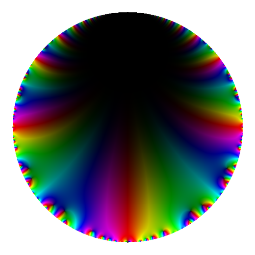




In Figure 1, we present default plots (as created by complex_plot in SageMath). In these plots, the is represented by hue and is represented by brightness, where is black and is white.
The fact that each form plotted is a cuspform is immediately clear as each plot on the disk is dominated by the color black (corresponding to the overall size being small). Further, a closer look will reveal that each cusp appears to be visibly dark. This is most obvious in the two lower level forms, and , where each cusp has a relatively large dark region around it. As the number of cusps increases, the behavior around cusps becomes more varied. Very near the boundary, our approximation for the form is less accurate. This is one factor contributing to why the cusps of are far less pronounced.
The weight of each form manifests primarily in how quickly the form can go from very bright to very dark. Here, the two forms of higher weight, and , have regions of near-white brightness near the boundary that very rapidly darken towards the top of the disk. The two forms of lower weight are much more even in brightness. The high weight of is another factor contributing to why its cusps are less pronounced: there are smaller regions of darkness around each cusp.
It is possible to adjust the mapping from magnitude to brightness, but in practice these plots look roughly the same for a wide choice of maps and it takes quite a bit of tuning to choose an appropriate map.55 5 Adjusting the map from magnitude to brightness for SageMath’s complex_plot is possible, but nontrivial; the map is defined internally and the current plotting interface doesn’t give any option to choose or alter this map. In order to adjust this map, it is necessary to modify the source for SageMath’s plotting routines directly.
2.2.2. Magnitude plot without color


We now produce plots after ignoring the phase of and instead only using the magnitude . There remains a choice of how to map magnitude to brightness; it is common to use maps of the form for some . Taking yields the plots in Figure 2. We note that adjusting the power is the most natural and clearest way to adjust the overall darkness/lightness scale of this style of plot: larger alpha causes points near zeros to be much darker and points near poles to be much lighter; smaller alpha decreases this effect.
Qualitatively, each of these pictures offers very similar information as those in Figure 1. The lack of phase information makes it slightly more challenging to distinguish between the images of and in the disk. But note that it is very easy to determine forms of low weight and high weight, as the forms with low weight have much slower changes in brightness.
The complicated and varied behavior of near the boundary is more evident in this plot. The presence of many more points of small size is made far more obvious. It is just barely possible to observe the region of decreasing size around the cusp.
2.2.3. Magnitude plot with periodic linear color


In the LMFDB, magnitude is mapped periodically to color. That is, hue represents the magnitude modulo , where blue is zero, and increases through purple, red, orange, yellow, and so on. In Figure 3, we mimic the plots in the LMFDB attained by ignoring the phase of mapping the magnitude mod to hue.
Recall from §2.2 that each of the four forms we are considering has a label on the LMFDB, and we gave links to their homepages. Each page has a medallion with a plot similar to the plots on the Poincaré disk given here.
The large bluish blob corresponds to a region where the magnitude of the form is never more than . The larger weights of and correspond to more rapid growth away from cusps, leading both to smaller bluish regions and more tightly packed lines; has larger weight, and both of these traits are even more prominent in its graphs.
For the lower weight forms and , this is a very accurate plot. But and change too rapidly near the boundary, causing a static-like appearance. Increasing resolution helps, but in practice it is not feasible to produce sufficiently high resolution images to completely make sense of the boundary with this type of plot.
This sort of plot is very well-suited for low weight forms of any level. The small weight means that even at moderate resolution, the image will appear well-defined even near the boundary. Then the cusps associated to the level will be visually apparent by the varying types of behaviors near the boundary. This is most obvious in the detail images for and , where we can clearly see the greater variety in behavior near the cusps at the boundary in plots of .
2.2.4. Magnitude plot with periodic logarithmic spacing


In Figure 4, we change yet again the map from magnitude to color. We now allow the hue to represent for some base . Thus two consecutive bands of red will correspond to the points in one band being times the size of the points in the other.
We note that adjusting the factor between consecutive bands (i.e. choosing the base of the logarithm in the map from magnitude to color) controls the number of spacing of bands, and thus it is possible to make the plots visually simpler or more complex by experimenting with this parameter. The plots in Figure 4 were produced with .
The effect in these plots is similar to giving a higher resolution of Figure 3. A large amount of detail and data is visible within these plots; however this is double-edged, and the plots are now busier. The high growth rate in the forms of higher weight is indicated by many more tightly packed bands of color near the boundary.
Note that there is a region where the resolution appears insufficient in the detail plot for . This is actually caused by small errors in the approximation for interfering with the extremely tiny values of there. As can be seen from the nearly black portions of Figure 1 and Figure 2, is extremely small in this region, and thus even small errors in the approximation produce noticeable artifacts in the graph.
These plots are particularly useful for plots on , where even for high weight the plots appear mostly well-formed. In the disk, the rapid decay at the top of the disk (at the cusp) causes tight concentric circles of color and attracts a lot of visual attention, even though the actual behavior is mostly regular and relatively uninteresting there.
2.2.5. Pure phase plots


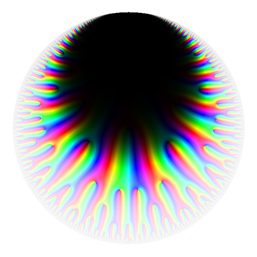
Following the ideas of Wegert [10], we now consider phase plots. In Figure 5, we ignore magnitude completely and only consider the phase. There is a natural mapping from phase to hue: we allow hue to represent , and the natural periodicity of phase works well with the natural periodicity of the color wheel.
Qualitatively, less behavior of each modular form is evident in its phase plot in comparison to its magnitude plot. This is partly due to the lack of poles and infrequent zeros away from the boundary. Poles and zeros are singularities in phase plots, and the behavior of the colors around these points describes the order and nature of these points.
2.2.6. Phase plots with magnitude contours


Again following Wegert [10], we create phase plots with contours representing magnitude. We indicate the contours by adjusting the lightness: below each contour we adjust the lightness to be darker and above each contour we adjust the lightness to be lighter. The sudden change from darker to lighter indicates the contour itself.
The phase naturally maps to hue as in the pure phase plots in Figure 5. Contours could be chosen with spacing defined linearly as in §2.2.3 or logarithmically as in §2.2.4. In these plots, we have chosen logarithmic spacing with respect to . That is, two consecutive contour lines indicate that the points along one have twice the magnitude of the points along the other.
Remark 2.
We emphasize that it is not necessary to compute the contours themselves. Instead, one defines a coloring of the complex plane that includes brightness adjustments along the desired contours. In this case, we defined brightness adjustments around points of magnitude for integers . Then simply plotting the function with respect to this domain coloring causes the contours to appear. This is a key idea why approaches based on domain coloring are simple to compute.
The plotting program used to produce these plots is available at [5].
These plots carry all the information visible in the pure phase plots of §2.2.5 and some of the information contained within the logarithmically spaced magnitude plots of §2.2.4, but these two sets of information are not displayed equally. The colors grab attention far more than the brightness adjustments around contours — analogous to the lightness difficulties for the standard domain coloring plots of §2.2.1. These plots emphasize argument more than magnitude.
3. Choosing Color
We surveyed many different visualizations in §2, but one thing remained constant: the choices of color. In most complex function visualization packages, there is only one color choice available. All visualizations in §2 were created using the only color scheme for complex_plot available in SageMath.66 6 The behavior in Matlab and Maple appears similar, though it is possible to define a color scheme. On the other hand Mathematica has an extensive library of complex plotting color schemes.
Unfortunately, this color scheme has flaws. For one example, it has uneven perceptual contrast: it has points of locally high color contrast (giving the impression of additional local variation) and points of locally low color contrast (hiding local variation). Thus in Figure 5, for instance, green is particularly visible and the yellow-green border is particularly striking, even though there is no underlying feature that this is identifying. Further, in the plots in the upper halfplane, the vertical bands of color seem to favor green-yellow at the expense of purple-blue.
In his excellent article [4], Kovesi describes this problem and details how to create colormaps that are perceptually uniform — that don’t have uneven perceptual contrast. His work led to the creation of new default colormap, called viridis, for Python’s matplotlib plotting library.
More recently, Nuñez, Anderton, and Renslow wrote an article [7] describing their Python module cmaputil, which helps make perceptually uniform colormaps that additionally support perception by those with various forms of color vision deficiency. They created the Python colormap cividis (obtained by modifying viridis, hence the name), which they show is a good colormap for those with reduced sensitivity to red or green light. It is possible to make other colormaps suitable for other types of perception using this tool.
We have incorporated matplotlib colormaps into our plotting routines. In particular, we implemented phase plots and phase plots with contours using these colormaps. In this section, we describe this implementation and give examples of the resulting plots.
Remark 3.
SageMath and matplotlib share many plotting routines, and newer versions of SageMath will default to these new perceptually uniform colormaps for real-valued plotting. But SageMath’s complex_plot does not directly use matplotlib. We are working towards making these new plotting routines easy to use and publicly available, and possibly incorporating them into SageMath.
3.1. Implementation Overview
Some of the details of this implementation are specific to Python and SageMath, but the overall idea readily generalizes.
- (1)
Begin with a desired complex function , a region , and a desired colormap .
- (2)
Evaluate and for each point in an grid containing . (Optionally mask points in this grid outside of to avoid unnecessary computation. For example, to produce the plots of and in the disk, we mask points with .) This gives an array.
- (3)
Map each phase to . This is most often done through the natural map , but note that it is possible to add an offset through . This might be done to choose which phase corresponds to the endpoints of the colormap. (See plots in Figure 10 for examples).
- (4)
Each matplotlib colormap is implemented as a function , where is red-green-blue-alpha colorspace. We don’t currently use the alpha channel. Thus apply to each mapped phase and discard the alpha channel to get .
If the intention is to produce a pure phase plot, then (after discarding the magnitude) one now has an array, and one now produces a plot using this data in this grid, either directly or using a plotting library. For example, matplotlib’s method matplotlib.pyplot.imshow will directly plot this array.
However, if the intention is to produce a phase plot with (logarithmically spaced) magnitude contours, then additional work is necessary. We would like to adjust the brightness as done in §2.2.6, but the brightness of an pixel is nontrivial to work with directly.
Instead we convert each pixel to colorspace (hue-saturation-lightness) and adjust lightness. As most plotting libraries use (as does the underlying hardware), we convert back to prior to plotting. Thus to produce a phase plot with magnitude contours we perform these additional steps.
- (5)
Map each element to colorspace, where refers to “hue-saturation-lightness”. In , it is possible to directly manipulate the lightness. This gives an array.
- (6)
Map each magnitude to a lightness adjustment in the range . For example, to have logarithmic contours, one could use a map of the form with a fixed lightness adjustment in a neighborhood of . This has the effect of creating logarithmically spaced contours. This gives an array.
We note that we refer to to mean the least nonnegative number of the form for , i.e. the “computer science” modulo operation.
- (7)
For each , apply the corresponding lightness adjustment to each value. (It may be necessary to renormalize lightness at this step). This gives a single array.
- (8)
Map each back to to get the final array.
And now one can directly plot this array or use a library like matplotlib to plot this array, as noted above.
Remark 4.
Each step can be done very quickly if one uses vectorized array operations as in NumPy [8]. We also note that Python’s colorsys library implements NumPy-vectorized conversions between and . Then the most time-consuming step is then the evaluation of on the grid, as should be expected.
3.2. Example visualizations with colormaps
We now give example visualizations with matplotlib colormaps. The three mostly commonly used matplotlib colormaps are currently twilight, viridis, and cividis. Each of these maps is perceptually uniform and designed for clean presentation of data.


The twilight colormap is also cyclic. This means that the two ends of the colormap line up perfectly, and thus it is a good colormap to represent phase in phase plots. The viridis and cividis colormaps are not cyclic. There is a sharp difference in colors at the two ends of the colormap . Plotting a modular form using either viridis or cividis thus highlights the points where the phase crosses over the end of the colormap.
In some cases, this may be undesirable. For exploratory visualization, using a cyclic perceptually uniform colormap often seems superior. But more generally it is sometimes desirable, or even advantageous, to emphasize certain aspects of a complex plot, and using a non-cyclic colormap to highlight phase-changes is just one possible method.


In Figure 7, we plot the modular form in four different color schemes: the default in SageMath, and the three matplotlib colormaps twilight, viridis, and cividis. In contrast to the default color scheme, these three colormaps produce a plot that is more balanced in appearance. In particular, the perceptually uniform plots don’t overemphasize regions like the bright green and yellow portions in the default color scheme.
Of course, perceptually uniform doesn’t mean perfect. In the twilight colormap, there is a sensation of peaks and troughs resulting from the light and dark areas of the plots; and as both viridis and cividis aren’t cyclic, the sharp color change at the edges of the colormap gives the impression of contours. These are features of the colormap, not of the underlying function.
In Figure 8, we give phase plots in the cividis colormap. For half of the plots, we include logarithmically spaced contours, implemented as described above. These plots should compared with the phase plots in Figure 5 and the contoured phase plots in Figure 6.
In these images, we have mapped the arguments to the colormap in such a way that the sharp change in color from light yellow to dark blue occurs when the phase is , or equivalently when the value of the modular form is a negative real number. On the upper halfplane, a modular form with real coefficients will take real values on vertical lines for . This explains the regularly spaced lines in the plots.
On the one hand, this gives a strong and simple visual indicator of phase change. The regularity of this phase change is more obvious in these plots than the previous phase plots in the default color scheme. But on the other hand, this strongly emphasizes a small subset of phases.
We note also that the colormap cividis is both visually appealing and widely accessible.


In Figure 10 we have included plots in a variety of other matplotlib colormaps. For the top six plots, we’ve used the three colormaps viridis, twilight, and coolwarm. Note that in the middle plot in the second row, we have normalized the non-cyclic colormap coolwarm so that the sharp distinction between red and blue occurs when the argument of is instead of . In the bottom row, we’ve applied the colormaps inferno, plasma, and Paired. Both inferno and plasma are also perceptually uniform, but are very orange. The colormap Paired is a discrete colormap, which has the effect of coloring different regions of the complex plane based on discrete argument sectors.
While each plot in Figure 10 may not be appropriate for initial exploratory visualization, they demonstrate the ability to choose colormap to highlight certain behaviors or areas of the function. And most importantly, they demonstrate that implementing matplotlib colormaps gives access to an existing, very large library of color schemes.
Remark 5.
Choosing color schemes to highlight certain behaviors is not a new concept. For example, Frank Farris has produced several pieces of art based on domain colorings. See his website http://math.scu.edu/~ffarris/ for more.
Finally, we note that it is possible to apply these colormaps to the previous styles of visualization. For example, we can produce a colormapped version of the default SageMath plot (as in Figure 1) by changing steps (5)–(8) in the implementation described in 3.1; map the phase to RGB as described there, but map magnitude to brightness as in §2.2.1 or §2.2.2.
A strategy for making visualizations
Having given examples of several different types of complex plot, we feel we should describe our current preferences for making plots. If we were to choose a single plotting method to present a visualization, we would use contoured phase plots as in Figure 8.
We have found that for initial exploration, it is very effective to pair a contoured phase plot as in Figure 8 with a plot showing the absolute magnitude, such as a colormapped version of the default Sagemath plot.
In Figure 10, we do this for on the disk in the cividis colormap. The strengths and weaknesses of these two plots complement each other. Specifically, the relative magnitudes are very clearly given in the (colormapped) standard domain coloring plot on the right and the phase information is more apparent in the contoured phase plot on the left. The presence of phase information in the standard domain coloring helps to identify the same location in the two plots.
After this initial investigation, it is possible to choose regions and colormaps to highlight different behaviors of the function.
But overall, the idea of choosing colormaps for exploratory complex function visual analysis is young, and there remains much to be discovered.
References
- DS [05] Fred Diamond and Jerry Shurman. A first course in modular forms, volume 228. Springer Verlag, 2005.
- Far [98] Frank A Farris. Visual complex analysis. by tristan needham. The American Mathematical Monthly, 105(6):570–576, 1998.
- Hun [07] J. D. Hunter. Matplotlib: A 2d graphics environment. Computing in Science & Engineering, 9(3):90–95, 2007.
- Kov [15] Peter Kovesi. Good colour maps: How to design them. arXiv preprint arXiv:1509.03700, 2015.
- LD [20] David Lowry-Duda. phase_mag_plot. https://github.com/davidlowryduda/phase_mag_plot/, September 2020. [Online; Reference version at https://doi.org/10.5281/zenodo.4035117].
- LMF [19] The LMFDB Collaboration. The L-functions and modular forms database. http://www.lmfdb.org, 2019. [Online; accessed 30 October 2019].
- NAR [18] Jamie R Nuñez, Christopher R Anderton, and Ryan S Renslow. Optimizing colormaps with consideration for color vision deficiency to enable accurate interpretation of scientific data. PloS one, 13(7):e0199239, 2018.
- Oli [06] Travis E Oliphant. A guide to NumPy, volume 1. Trelgol Publishing USA, 2006.
- Sag [20] Sage Developers. SageMath, the Sage Mathematics Software System (Version 8.8), 2020. https://www.sagemath.org.
- WS [10] Elias Wegert and Gunter Semmler. Phase plots of complex functions: a journey in illustration. Notices AMS, 58:768–780, 2010.