ExplainIt!– A declarative root-cause analysis engine for time series data (extended version)Conference: 2019 International Conference on Management of Data; June 30-July 5, 2019; Amsterdam, Netherlands2019 International Conference on Management of Data (SIGMOD ’19), June 30-July 5, 2019, Amsterdam, NetherlandsPrice: 15.00DOI: 10.1145/3299869.3314048ISBN: 978-1-4503-5643-5/19/06
Abstract.
We present ExplainIt!, a declarative, unsupervised root-cause analysis engine that uses time series monitoring data from large complex systems such as data centres. ExplainIt! empowers operators to succinctly specify a large number of causal hypotheses to search for causes of interesting events. ExplainIt! then ranks these hypotheses, reducing the number of causal dependencies from hundreds of thousands to a handful for human understanding. We show how a declarative language, such as SQL, can be effective in declaratively enumerating hypotheses that probe the structure of an unknown probabilistic graphical causal model of the underlying system. Our thesis is that databases are in a unique position to enable users to rapidly explore the possible causal mechanisms in data collected from diverse sources. We empirically demonstrate how ExplainIt! had helped us resolve over 30 performance issues in a commercial product since late 2014, of which we discuss a few cases in detail.
1. Introduction
In domains such as data centres, econometrics (fred), finance, systems biology (seth2015granger), and many others (nasa), there is an explosion of time series data from monitoring complex systems. For instance, our product Tetration Analytics is a server and network monitoring appliance, which collects millions of observations every second across tens of thousands of servers at our customers. Tetration Analytics itself consists of hundreds of services that are monitored every minute.
One reason for continuous monitoring is to understand the dynamics of the underlying system for root-cause analysis. For instance, if a server’s response latency shows a spike and triggered an alert, knowing what caused the behaviour can help prevent such alerts from triggering in the future. In our experience debugging our own product, we find that root-cause analysis (RCA) happens at various levels of abstraction mirroring team responsibilities and dependencies: an operator is concerned about an affected service, the infrastructure team is concerned about the disk and network performance, and a development team is concerned about their application code.
To help RCA, many tools allow users to query and classify anomalies (bailis2017macrobase), correlations between pairs of variables (pelkonen2015gorilla; vmware-wavefront). We find that the approaches taken by these tools can be unified in a single framework—causal probabilistic graphical models (pearl2009causality). This unification permits us to generalise these tools to more complex scenarios, apply various optimisations, and address some common issues:
- •
Dealing with spurious correlations: It is not uncommon to have per-minute data, yet hundreds of thousands of time series. In this regime the number of data points over even days is in the thousands, and is at least two orders of magnitude fewer than the dimensionality (hundreds of thousands). It is no surprise that one can always find a correlation if one looks at enough data.
- •
Addressing specificity: Some metrics have trend and seasonality (i.e., patterns correlated with time). It is important to have a principled way to remove such variations and focus on events that are interesting to the user, such as a spike in latency §3.4.
- •
Generating concise summaries: We firmly believe that summarising into human-relatable groups is key to scale understanding §3.2. Thus, it becomes important to organise time series into groups—dynamically determined at users’ direction—and rank the candidate causes between groups of variables in a theoretically sound way.
We created ExplainIt!, a large-scale root-cause inference engine and explicitly addressed the above issues. ExplainIt! is based on three principles: First, ExplainIt! is designed to put humans in the loop by exposing a declarative interface (using SQL) to interactively query for explanations of an observed phenomena. Second, ExplainIt! exploits side-information available in time series databases (metric names and key-value annotations) to enable the user to group metrics into meaningful families of variables. And finally, ExplainIt! takes a principled approach to rank candidate families (i.e., “explanations”) using causal data mining techniques from observational data. ExplainIt! ranks these families by their causal relevance to the observed phenomenon in a model-agnostic way. We use statistical dependence as a yardstick to measure causal relevance, taking care to address spurious correlations.
We have been developing ExplainIt! to help us diagnose and fix performance issues in our product. A key distinguishing aspect of ExplainIt! is that it takes an ab-initio approach to help users uncover interactions between system components by making as few assumptions as necessary, which helps us be broadly applicable to diverse scenarios. The user workflow consists of three steps: In step 1, the user selects both the target metric and a time range they are interested in. In step 2, the user selects the search space among all possible causes. Finally in step 3, ExplainIt! presents the user with a set of candidate causes ranked by their predictability. Steps 2–3 are repeated as needed. (See Figure 11 in Appendix for prototype screenshots.)
Key contributions: We substantially expand on our earlier work (explainit-causalml2018) and show how database systems are in a unique position to accomplish the goal of exploratory causal data analysis by enabling users to declaratively enumerate and test causal hypotheses. To this end:
- •
We outline a design and implementation of a pipeline using a unified causal analysis framework for time series data at a large scale using principled techniques from probabilistic graphical models for causal inference (§3).
- •
We propose a ranking-based approach to summarise dependencies across variables identified by the user (§4).
- •
We share our experience troubleshooting many real world incidents (§5): In over 44 incidents spanning 4 years, we find that ExplainIt! helped us satisfactorily identify metrics that pointed to the root-cause for 31 incidents in tens of minutes. In the remaining 13 incidents, we could not diagnose the issue because of insufficient monitoring.
- •
We evaluate concrete ranking algorithms and show why a single ranking algorithm need not always work (§6).
Although correlation does not imply causation, having humans in the loop of causal discovery (tenenbaum2003theory) side-steps many theoretical challenges in causal discovery from observational data (pearl2009causality, Chap. 3). Furthermore, we find that a declarative approach enables users to both generate plausible explanations among all possible metric families, or confirm hypotheses by posing a targeted query. We posit that the techniques in ExplainIt! are generalisable to other systems where there is an abundance of time series organised hierarchically.
2. Background
We begin by describing a familiar target environment for ExplainIt!, where there is an abundance of machine-generated time series data: data centres. Various aspects of data centres, from infrastructure such as compute, memory, disk, network, to applications and services’ key performance metrics, are continuously monitored for operational reasons. The scale of ingested data is staggering: Twitter/LinkedIn report over 1 billion metrics/minute of data. On our own deployments, we see over 100 Million flow observations every minute across tens of thousands of machines, with each observation collecting tens of features per flow.
In these environments time series data is structured: An event/observation has an associated timestamp, a list of key-value categorical attributes, and a key-value list of numerical measurements. For example: The network activity between two hosts datanode-1 and datanode-2 can be represented as:
timestamp=0 flow{src=datanode-1, dest=datanode-2, srcport=100, destport=200, protocol=TCP} bytecount=1000 packetcount=10 retransmits=1Here, the tag keys are src, dest and srcport, destport joined with three measurements (bytecount, packetcount, and retransmits). Such representations are commonly used in many time series database and analytics tools (opentsdb; yang2014druid). Throughout this paper, when we use the term metric we refer to a one-dimensional time series; the above example is three-dimensional.
3. Approach
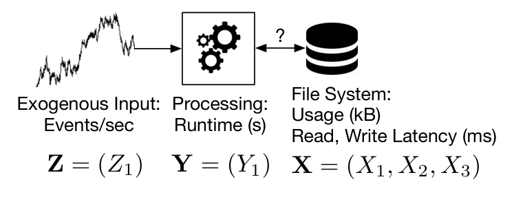
To illustrate our approach we will use an application shown in Figure 1: a real-time data processing pipeline with three components that are monitored. First, the input to the system is an event stream whose input rate events/second is the time series . The second component is a pipeline that produces summaries of input, and its average processing time per minute is . Finally, the pipeline outputs its result to a file system, whose disk usage and average read/write latency are collectively grouped into . For brevity, we will drop the time from the above notations. Thus, in this example our system state is captured by the set of variables .
Workflow: As mentioned in §1, we require the users to specify the target metric(s) of interest (denoted by ). Typically, these are key performance indicators of the system. Then, users specify two time ranges: one that roughly includes the overall time horizon (typically, a few days of minutely data points are sufficient for learning), and another (optional) overlapping time range to highlight the performance issue that they are interested in root-causing (see Figure 2). If the second time range is not specified, we default to the overall time range. In this step, the user also specifies a list of metrics to control for specificity (denoted by ), as described in §3.4. Finally, the user specifies a search space of metrics (denoted by ) that they wish to explore using SQL’s relational operators. ExplainIt! scores each hypothesis in the search space and presents them in the order of decreasing scores (with a default limit of top 20) to the user (§3.5). The user can then inspect each result, and fork off further analyses and drill down to narrow the root-cause. Algorithm 1 is the pseudocode to ExplainIt!’s main interactive search loop.
Due to its ab-initio approach, ExplainIt! is only typically used when the usual processes in place such as monitoring dashbords, rules, or alerts are insufficient. After a typical session in ExplainIt!, the user identifies a small set of metrics that are useful for frequent diagnosis to create new dashboards and alerts.

3.1. Model for hypotheses
For a principled approach to root-cause analysis, we found it helpful to view each underlying metric as a node in some unknown causal Bayesian Network (BN) (pearl2009causality). A BN is a directed acyclic graph (DAG) in which the nodes are random variables, and the graph structure encodes a set of probabilistic conditional dependencies: Each variable is conditionally independent of its non-descendants given its parents (pearl2009causality). In a causal BN the directed edges encode cause-effect relationship between the variables; that is, the edge encodes the fact that causes . Put another way, an intervention in (e.g., higher/lower input events) results in a change in the distribution of (higher/lower average processing time), but an intervention in (e.g., artificially slowing down the pipeline) does not affect the distribution of . One possible causal hypothesis for the dynamics of the example is (a) the chain: or ; other hypotheses are (b) the fork: and (c) the collider: .
The root-cause analysis problem translates to finding only the ancestors of a key set of variables () that measure the observed phenomenon, in DAG structures that encode the same conditional dependencies as seen in observations from the underlying system. In our experience, we neither needed to learn the full structure between all variables, nor the actual parameters of the conditional dependencies in the BN.
The causal BN model makes the following assumptions:
- •
Causal Markov / Principle of Common Cause: Any observed dependency (measured by say the correlation) between variables reflect some structure in the DAG (sep-physics-Rpcc). That is, if is not independent of (i.e. ), then and are connected in the graph.
- •
Causal Faithfulness: The structure of the graph implies conditional independencies in the data. For the example in Figure 1 the causal hypothesis implies that .
Taken together, these assumptions help us infer that (a) the existence of a dependency between observed variables and mean that they are connected in the graph formed by replacing the directed edges with undirected edges; and (b) the absence of dependency between and in the data mean there is no causal link between them. The assumptions are discussed further in the book Causality (pearl2009causality, Sec. 2.9).
Why? The above approach offers three main benefits. First, the formalism is a non-parametric and declarative way of expressing dependencies between variables and defers any specific approach to the runtime system. Second, the unified approach naturally lends itself to multivariate dependencies of more complex relationships beyond simple correlations between pairwise univariate metrics. Third, the approach also gives us a way to reason about dependencies that might be easier to detect only when holding some variables constant; see conditioning/pseudocauses (§3.4) for an example and explanation.
Each of these reasons informs ExplainIt!’s design: The declarative approach can be used to succinctly express a large number of candidate hypotheses for both univariate and multivariate cases. We also show how conditional probabilities can be used to search explanations for specific variations in the target variable, improving overall ranking.
3.2. Feature Families
Grouping univariate metrics into families is useful to reduce the complexity of interpreting dependencies between variables. Hence, grouping is a critical operation that precedes hypothesis generation. Each metric has tags that can be used to group; for example, consider the following metrics:
| Name | Tags |
|---|---|
| input_rate | type=event-1 |
| input_rate | type=event-2 |
| runtime | component=pipeline-1 |
| disk | host=datanode-1, type=read_latency |
| disk | host=datanode-2, type=read_latency |
| disk | host=namenode-1, type=read_latency |
We can group metrics their name, which gives us three hypotheses: input_rate{*}, runtime{*}, disk{*}. Or, we can group the metrics by their host attribute, which gives us four families:
*{host=datanode-1}, *{host=datanode-2}, *{host=namenode-1}, *{host=NULL}
The first family captures all metrics on host datanode-1, can be used to create a hypothesis of the form “Does any activity in datanode-1 …?” Using SQL, users also have the flexibility to group by a pattern such as disk{host=datanode*}, which can be used to create a hypothesis of the form “Does any activity in any datanode …?” They can incorporate other meta-data to apply even more restrictions. For example, if the users have a machine database that tracks the OS version for each hostname, users can join on the hostname key and select hosts that have a specific OS version installed. We list many example queries in Appendix C.
3.3. Generating hypotheses
A causal hypothesis is a triple of feature families , organised as (a) an explainable feature—, (b) the target variable—, and (c) another list of metrics to condition on—. Clearly, there should be no overlap in metrics between , and . While and must contain at least one metric, could be empty. Testing any form of dependency (chains, forks, or colliders) in the causal BN can be reduced to scoring a hypothesis for appropriate choices of ; see the PC algorithm for more details (spirtes2000causation). While one could automatically generating exponentially many hypotheses for all possible groupings, we rely on the user to constrain the search space using domain knowledge.
The hypothesis specification is guided by the nature of exploratory questions focusing on subsystems of the original system. In Figure 1, this would mean: “does some activity in the file system explain the increase in pipeline runtimes that is not accounted for by an increase in input size ?” Contrast this to a very specific (atypical) query such as, “does disk utilisation on server 1 explain the increase in pipeline runtime?” We can operationalise the questions by converting them into probabilistic dependencies: The first question asks whether . We can evaluate this by testing whether is conditionally independent of given , i.e., whether (§3.5).
3.4. Conditioning and pseudocauses
The framework of causal BNs also help the user focus on a specific variation pattern inherent in the data in the presence of multiple confounding variations. Consider a scenario in which (in Figure 1) has two sources of variation: a seasonal component and a residual spike , and the user is interested in explaining .
We can conceptualise this problem using the causal BN shown in Figure 3 under the assumption that there are independent causes for and . By conditioning on the causes of , we can find variables that are correlated only with and not with , which helps us find specific causes of .
However, we often run into scenarios where the user does not know or is not interested in finding what caused (i.e., the parents of ). The causal BN shown in Figure 3 offers an immediate graphical solution: to explain , it is sufficient to condition on the pseudocause (derived from ) to “block” the effect of the true causes of seasonality () without finding it. Although prior work (bailis2017macrobase) has shown how to express such transformations (trend identification, seasonality, etc.) our emphasis here is to show how techniques from causal inference offer a principled way of reasoning about such optimisations, helping ExplainIt! generate explanations specific to the variation the user is interested in.
3.5. Hypothesis ranking
Recall that scoring a hypothesis triple quantifies the degree of dependence between and controlling for . Each element of the triple contains one or more univariate variables. We implemented several scoring functions that can be broadly classified into (a) univariate scoring to only look at marginal dependencies (when ), and (b) multivariate scoring to account for joint dependencies.
Univariate scoring: When , we can summarise the dependency between and by first computing the matrix of Pearson product-moment correlation between each univariate element and . To summarise the dependency into a single score, we can either compute the average or the maximum of their absolute values:
When is non-empty, we use the scoring mechanism outlined below that unifies joint and conditional scoring into a single method.
Multivariate and conditional scoring: To handle more complex hypothesis scoring, we seek to derive a single number that quantifies to what extent . When , we perform a regression where the input data points are from the same time instant, i.e. . 11 1 The user could specify lagged features from the past when preparing the input data (by using LAG function in SQL). One could use non-linear regression techniques such as spline regression, or neural networks, but we empirically found that linear regression is sufficient. The regression minimises mean squared loss function between the predicted and the observed over data points. After training the model, we compute the prediction , and the residual , which is the “unexplained” component in after regressing on . The variance in this residual relative to the variance in the original signal (call it ) varies between 0 ( perfectly predicts ) and 1 ( does not predict ). The score is this value .
When is not empty, we require multiple regressions. First, we regress to compute the residuals . Similarly, we regress to compute the residual . Finally, we regress and compute the percentage of variance in the residual explained by as outlined above. This percentage of variance is conditional on ; intuitively, if the score (percent variance explained) is high, it means that there is still some residual in that can be explained by , which means that . If , , and are jointly normally distributed, and the regressions are all ordinary least squares, then one can show that the above procedure gives a zero conditional score iff . The proof is in the appendix of the extended version of this paper (explainit-extended).
The score obtained by the above procedure has an overfitting problem when we have a large number of predictors in and a small number of observations. To combat this, we use two standard techniques: First, we apply a penalty (we experimented with both penalty (Lasso) and penalty (Ridge)) on the coefficients of the linear regression. Second, we use -fold cross-validation for model selection (with ), which ensures that the score is an estimate of the model performance on unseen data (also called the adjusted ; see Appendix A). Since we are dealing with time series data that has rich auto-correlation, we ensure that the validation set’s time range does not overlap the training set’s time range (arlot2010survey, § 8.1). In practice we find that while Lasso and Ridge regressions both work well, it is preferable to use Ridge regression as its implementation is often faster than Lasso on the same data.
In §6, we compare the behaviour of the above scoring functions, but we briefly explain their qualitative behaviour: The univariate scoring mechanisms are cheaper to compute, but only look at marginal dependencies between variables. This can miss more complex dependencies in data, some of which can only be ranked higher when we look at joint and/or conditional dependencies. Thus, the joint mechanisms have more statistical power of detecting complex dependencies between variables, but also run the risk of over-fitting and producing more false-positives; Appendix A gives more details about controlling false-positives.
4. Implementation
Our implementation had two primary requirements: It should be able to integrate with a variety of data sources, such as OpenTSDB, Druid, columnar data formats (e.g., parquet), and other data warehouses that we might have in the future. Second, it should be horizontally scalable to test and score a large number of hypotheses. Our target scale was tens of thousands of hypotheses, with a response time to generate a scoring report was in the order of a few minutes (for the typical scale of hundreds of hypotheses) to an hour (for the largest scale).
We implemented ExplainIt! using a combination of Apache Spark (zaharia2016apache) and Python’s scikit machine learning library (scikit-learn). We used Apache Spark as a distributed execution framework and to interface with external data sources such as OpenTSDB, compressed parquet data files in our data warehouse, and to plan and execute SQL queries using Spark SQL (armbrust2015spark). We leveraged Python’s scikit machine learning library’s optimised machine learning routines. The user interface is a web application that issues API calls to the backend that specifies the input data, transformations, and display results to the user.
In our use case, time series observations are taken every minute. Most of our root cause analysis is done over 1–2 days of data, which results in at most 1440–2880 data points per metric. With features per family, the maximum dimension of the feature matrix is . Realistically, we have seen (and tested) scenarios up to . For in the order of tens of thousands, the cost of interpreting the relevance of a group of variables in a scenario already outweighs the benefit of doing a joint analysis across all those variables. For feature matrices in this size range, a hypothesis can be scored easily on one machine; thus, our unit of parallelisation is the hypothesis. This avoids the parallelisation cost and complexity of distributed machine learning across multiple machines. Thus, in our design each Spark executor communicates to a local Python scikit kernel via IPC (we use Google’s gRPC).
4.1. Pipeline
The ExplainIt! pipeline can be broken down into three main stages. In the first stage, we implemented connectors in Java to interface with many data sources to generate records, and User-Defined Functions (UDFs) in Spark SQL to transform these records into a standardised Feature Family Table (see Figure 4 for schema). Thus, we inherit Spark’s support for joins and other statistical functions at this stage. In this first stage, users can write multiple Spark SQL queries to integrate data from diverse sources, and we take the union of the results from each query. Then, we generate a Hypothesis Table by taking a cross-product of the Feature Family Table and applying a filter to select the target variable and the variables to condition. In the final stage, we run a scoring function on the Hypothesis Table to return the Top-K () results. The Score Table also stores plots for visualisation and debugging. Appendix C lists the queries at various stages of the pipeline.
4.2. Optimisations
The declarative nature of the hypothesis query permits various optimisations that can be deferred to the runtime system. We describe three such optimisations: Dense arrays, broadcast joins, and random projections.
Dense arrays: We converted the data in the Feature Family Table into a numpy array format stored in row-major order. Most of our time series observations are dense, but if data is sparse with a small number of observations, we can also take advantage of various sparse array formats that are compatible with the underlying machine learning libraries. This optimisation is significant: A naïve implementation of our scorer on a single hypothesis triple in Spark MLLib without array optimisations was at least 10x slower than the optimised implementation in scikit libraries.
Broadcast join: In most scenarios we have one target variable and one set of auxiliary variables to condition on. Hence, instead of a cross-product join on Feature Family Table, we select and from the Feature Family table, and do a broadcast join to materialise the Hypothesis Table.
Random projections: To speed up multivariate hypothesis testing (§6.2), we also use random projections to reduce the dimensionality of features before doing penalised linear regressions. We sample a matrix , a matrix of dimensions , whose are drawn independently from a standard normal distribution and project the data into this a new space if the dimensionality of the matrix exceeds ; that is,
If we use random projections, we sample a new matrix every time we project and take the average of three scores. In practice, we find there is little variance in these projections, so even one projection is mostly sufficient for initial analysis. Moreover, we prefer random projection as it is simpler to implement, computationally more efficient compared to dimensionality reduction techniques such as Principal Component Analysis (PCA), with similar overall result quality. In some of our debugging sessions, we found that PCA adversely impacted scoring. This is because PCA reduces the feature dimensionality by modeling the normal behaviour, and discards the anomalies in the features that were needed to explain our observations in the target variable.
| Component | Example causes |
|---|---|
| Physical Infrastructure | Slow disks |
| Virtual Infrastructure | NUMA issues, hypervisor network drops |
| Software Infrastructure | Kernel paging performance, Long JVM Garbage Collections |
| Services | Slow dependent services |
| Input data | Straggelers due to skew in data |
| Application code | Memory leaks |
4.3. Asymptotic CPU cost
For data points, and matrices of dimensions , , and , denote the cost of doing a single multivariate regression as . Note that each joint/conditional regression runs separate times for -fold cross-validation, and does a grid-search over values of the penalisation parameter for Ridge regression. Typically, and are small constants: and . Given these values, Table 2 lists the compute cost for each scoring algorithm.
| Method | Cost |
|---|---|
| CorrMean, CorrMax | |
| Joint, Multivariate | |
| Random Projection |
5. Case Studies
We now discuss a few case studies to illustrate how ExplainIt! helped us diagnose the root-cause of undesirable performance behaviour. In all these examples, the setting is a more complex version of the example in Figure 1. The main internal services include tens of data processing and visualisation pipelines, operating on over millions of events per second, writing data to the Hadoop Distributed File System (HDFS). Our key performance indicator is overall runtime—the amount of time (in seconds) it takes to process a minute’s worth of input real time data to generate the final output. This runtime is our target metric in all our case studies, and the focus is on explaining runtimes that consistently average more than a minute; these are problematic as it indicates that the system is unable to keep up with the input rate. Over the years, we found that the root-cause for high runtimes were quite diverse spanning many components as summarised in Table 1. Unless otherwise mentioned, we start our analysis with feature families obtained by grouping metrics by their name (and not any specific key-value attribute).
5.1. Controlled experiment: Injecting a fault into a live system
In our first example, we discuss a scenario in which we injected a fault into a live system. Of all possible places we can introduce faults, we chose the network as it affects almost every component causing system-wide performance degradation. In this sense, this fault is an example of a hard case for our ranking as there could be a lot of correlated effects.
We injected packet drops at all datanodes by installing a Linux firewall (iptables) rule to drop 10%22 2 We chose 10% as that was the smallest drop probability needed to cause a significant perceptual change in the observed runtime. of all packets destined to datanodes. After a couple of minutes, we removed the firewall rule and allowed the system to stabilise. Figure 5 shows a screenshot of the runtime time series, where the effect if dropping network packets is clearly visible.
We ran ExplainIt! against all metrics in the system grouped by their name to rank them based on the causal relevance to the observed performance degradation (see Table 3 for the ranking results). The final results showed the following: (1) The first set of metrics were the runtimes of a few other pipelines that were ranked with high scores (about 0.7). This was expected, and we ignored these effects of the intervention. (2) The second set of metrics were the latencies of the above pipelines whose runtimes were high. Once again, these were expected since the latency is a measure of the “realtime-ness” of the pipelines: the difference between the current timestamp and the last timestamp processed.
| Rank | Feature Family | Interpretation |
|---|---|---|
| 1–3, 5, 7 | Runtime and latency of various pipelines | It took longer to save data. Runtime is the sum of save times, so these dependencies are expected. |
| 4 | TCP Retransmit Count | Increased number of TCP retransmissions. |
| 6 | percentile latency | Increase in database RPC latency. |
| 8 | Number of active jobs on the cluster | Increase in the number of active jobs scheduled on the cluster. |
| 9 | HDFS PacketAckRoundTrip time | Increase in the round-trip time for RPC acknowledgements between Datanodes. |

The third set of metrics were related to TCP retransmission counts measured across all nodes in our cluster. These counters, tracked by the Linux kernel, measure the total number of packets that were retransmitted by the TCP stack. Packet drops induced by network congestion, high bit error rates, and faulty cables are usually the top causes when dealing on observing high packet retransmissions. For this scenario, these counters were clear evidence that pointed to a network issue.
This example also showed us that although metrics in families 1–3, 5, and 7 belonged to different groups by virtue of their names, they are semantically similar and could be further grouped together in subsequent user interactions. The key takeaway is that ExplainIt! was able to generate an explanation for the underlying behaviour (increased TCP retransmissions). In this case, the actual cause could be attributed to packet drops that we injected, but as we shall see in the next example, the real cause can be much more nuanced.
5.2. The importance of conditioning: Disentangling multiple sources of variation
Our next case study is a real issue we encountered in a production cluster running at scale. There was a performance regression compared to an earlier version that was evident from high pipeline runtimes. Although the two versions were not comparable (the newer version had new functionality), it was important for us to understand what could be done to improve performance.
We started by scoring all variables in the system against the target pipeline runtime. We found many explanations for variation. At the infrastructure level, CPU usage, network and disk IO activity, were all ranked high. At the pipeline service level, variations in task runtimes, IO latencies, the amount of time spent in Java garbage collection, all qualified as explanations for pipeline runtime to various degrees of predictability. Given the sheer scale of the number of possible sources of variation, no single metric/feature family served as a clear evidence for the degradation we observed.
To narrow down our search, we first noticed that it was reasonable to expect high runtime at large scale. Our load generator was using a copy of actual production traffic that itself had stochastic variation. To separate out sources of variation into its constituent parts, we conditioned the system state on the observed load size prior to ranking.
The ranking had significantly changed after conditioning: The top ranking families pointed to a network stack issue: metrics tracking the number of retransmissions and the average network latency were at the top, with a score of about 0.3. However, unlike the previous case-study, we did not know why there were packet retransmissions but we were motivated to look for causes.
Since TCP packet retransmissions arise due to network packet drops, we looked at packet drops at every layer in our network stack: at the virtual machines (VM), the hypervisors, the network interface card on the servers, and within the network. Unfortunately, we could not continue the analysis within ExplainIt! as we did not monitor these counters. We did not find drops within the network fabric, but one of our engineers found that there were drops at the hypervisor’s receive queue because that the software network stack did not have enough CPU cycles to deliver the packets to the VM.33 3 We found that the time_squeeze counter in /proc/net/softnet_stat was continuously being incremented. Thus, we had a valid reason to hypothesise that packet drops at the hypervisors were causing variations in pipeline runtimes that were not already accounted for in the size of the input.
Experiment: To establish a causal relationship, we optimised our network stack to buffer more packets to reduce the likelihood of packet drops. After making this change on a live system, we observed a 10% reduction in the pipeline runtimes across all pipelines. This experiment confirmed our hypothesis. Figure 6 shows the distribution in runtime before/after the change. ExplainIt!’s approach to condition on an understood cause (input size) of variation in pipeline runtime helped us debug a performance issue by focusing on alternate sources of variation. Although our monitored data was insufficient to satisfactorily identify the root-cause (dropped packets at the hypervisor), it helped us narrow it down sufficiently to come up with a valid hypothesis that we could test. By fixing the system, we validated our hypothesis. A second analysis after deploying the fix showed that packet retransmissions was no longer the top ranking feature; in fact the fix had eliminated packet drops.

5.3. Correlated with time: Periodic pipeline slowdown
Our third case study is one in which there was a periodic spike in the pipeline runtime, even when the cluster was running at less than 10% its peak load capacity. On visual inspection, we saw that there was a spike in the pipeline runtime from 10s to more than a minute every (approximately) 15 minutes, and the spike lasted for about 5 minutes. This abnormality was puzzling and pointed out to certain periodic activity in the system. We used ExplainIt! to find out the sources of variation and found that metrics from the Namenode family were ranked high. See Table 4 for a summary of the ranking, and Figure 7 for the behaviour.
| Rank | Feature Family | Interpretation |
|---|---|---|
| 1–4, 6–8 | Runtime and latency of various pipelines | It took longer to save data. Runtime is the sum of save times, so these variables are redundant. |
| 5 | Namenode metrics | Namenode service slowdown and degradation. |
| 9 | Detailed RPC-level metrics | Further evidence corroborating Namenode feature family at an RPC level. |
| 27 | JVM-level metrics | Increase in Datanode and Namenode waiting threads. |
When we narrowed our scope to Namenode metrics, we saw that there were two classes of behaviour: positive and negative correlation with respect to the pipeline runtime. We observed that the Namenode’s average response latency was positively correlated with the pipeline runtime (i.e., high response latency during high runtime intervals), whereas Namenode Garbage Collection times were negatively correlated to the runtime: i.e., smaller garbage collection when the pipeline runtimes were high. Thus, we ruled out garbage collection and tried to investigate why the response latencies were high.

A crucial piece of evidence was that the number of live processing threads on the Namenode was also positively correlated with the pipeline runtime. Since the Namenode spawns a new thread for every incoming RPC, we realised that a high request rate was causing the Namenode to slow down. We looked at the Namenode log messages and observed a GetContentSummary RPC call that was repeatedly invoked; this prompted one engineer to suspect a particular service that used this RPC call frequently. When she looked at the code, she found that the service made periodic calls to the Namenode with exactly the same frequency: once every 15 minutes. These calls were expensive because they were being used to scan the entire filesystem.
Experiment: To test this hypothesis, the engineer quickly pushed a fix that optimised the number of GetContentSummary calls made by the service. Within the next 15 minutes, we saw that the periodic spikes in latency had vanished, and did not observe any more spikes. This example shows how it is important to reason about variations in metric behaviour with respect to a model of how the system operates as the input load changes. This helped us eliminate Garbage Collection as a root-cause and dive deeper into why there were more RPC calls.
5.4. Weekly spikes: Importance of time range
Our final example illustrates another example of pipeline runtime that was correlated with time: occasionally, all pipelines would run slow. We observed no changes in input sizes (a handful of metrics that we monitor along with the runtime) that could have explained this behaviour, so we used ExplainIt! to dive deeper. The top five feature families are shown in Table 5. We dismissed the first two feature families as irrelevant to the analysis because the variables were effects, which we wanted to explain in the first place. The third and fourth variables were interesting. When we reran the search to rank variables restricting the search space to only load and disk utilisation, we noticed that the hosts that ran our datanodes explained the increase in runtimes with high score. However, ExplainIt! did not have access to per-process disk usage, so we resorted to monitoring the servers manually to catch the offender. Unfortunately, the issue never resurfaced in a reasonable amount of time.
| Rank | Feature Family | Interpretation |
|---|---|---|
| 1 | Pipeline data save time | It took longer to save data. Runtime is the sum of save times, so this variable is redundant. |
| 2 | Indexing component runtime | It took longer to index data. The effect is not localised, but shared across all components. |
| 3 | Increase in load average | More than usual Linux processes were waiting in the scheduler run queue. |
| 4 | Increase in disk utilisation | High disk IO coinciding with spikes. |
| 5, 6 | Latency, derived from families 1 and 2 | Increase in runtime increases latency, so this is expected. |
| 7 | RAID monitoring data | Spikes in temperature recorded by the RAID controller. |

However, these issues occurred sporadically across many of our clusters. When we looked at time ranges of over a month, we noticed a regularity in the spikes: they had a period of 1 week, and it lasted for about 4 hours (see Figure 8). Since we could not account the disk usage to any specific Linux process, we suspected that there was an infrastructure issue. We asked the infrastructure team what could potentially be happening every week, and one engineer had a compelling hypothesis: Our disk hardware was backed by hardware redundancy (RAID). There is a periodic disk consistency check that the RAID controller performs every 168 hours (1 week!) (raid-weekly). This consistency check consumes disk bandwidth, which could potentially affect IO bandwidth that is actually available to the server. The RAID controller also provided knobs to tune the maximum disk capacity that is used for these consistency checks. By default, it was set to 20% of the disk IO capacity.

Experiment: Once we had a hypothesis to check, we waited for the next predicted occurrence of this phenomenon on a cluster. We were able to perform two controlled experiments: (1) disable the consistency check, and (2) reduce disk IO capacity that the consistency checks use to 5%. Figure 9 shows the results of the intervention. From 2000 hrs to 2015 hrs, the cluster was running with the default configuration, where the runtimes showed instabilities. From 2015 hrs to 2020 hrs we disabled the consistency check, before re-enabling it at 2020 hrs. Finally, at 2025 hrs, we reduced the maximum capacity for consistency checks to 5%. This experiment confirmed the engineer’s hypothesis, and a fix for this issue went immediately into our product.
| Scenario # | # Families | # Features | CorrMean | CorrMax | |||
| 1 | 816 | 130259 | 0.167 | 1.000 | 0.143 | 1.000 | 0.333 |
| 2 | 2337 | 158253 | 0.143 | 0.071 | - | 0.077 | - |
| 3 | 902 | 61229 | 1.000 | 1.000 | 0.200 | 1.000 | 1.000 |
| 4 | 2156 | 141082 | - | - | 0.333 | 0.167 | 0.333 |
| 5 | 800 | 63797 | - | 1.000 | 0.100 | 1.000 | 0.077 |
| 6 | 436 | 29689 | - | - | 0.333 | 0.167 | 0.500 |
| 7 | 751 | 61231 | - | 0.111 | 1.000 | - | 0.200 |
| 8 | 603 | 100486 | - | 1.000 | 0.250 | 1.000 | 1.000 |
| 9 | 622 | 51230 | 0.050 | 0.053 | 0.500 | 0.062 | 0.250 |
| 10 | 601 | 71227 | - | 0.500 | 1.000 | 0.333 | 0.250 |
| 11 | 509 | 27902 | 0.333 | 0.083 | - | - | - |
| Summary | CorrMean | CorrMax | |||||
| Harmonic mean (discounted gain) | 0.002 | 0.004 | 0.009 | 0.009 | 0.009 | ||
| Average (discounted gain) | 0.154 | 0.438 | 0.351 | 0.437 | 0.359 | ||
| Stdev of average discounted gain | 0.300 | 0.465 | 0.353 | 0.456 | 0.350 | ||
| Perfect score / success (%) top-1 | 7 | 23 | 15 | 23 | 15 | ||
| Success (%) top-5 | 19 | 46 | 64 | 46 | 73 | ||
| Success (%) top-10 | 37 | 55 | 82 | 64 | 73 | ||
| Success (%) top-20 | 46 | 82 | 82 | 82 | 82 | ||
6. Evaluation
We now focus on more quantitative evaluation of various aspects of ExplainIt!. We find that the declarative aspect of ExplainIt! simplifies generating tens of thousands of hypotheses at scale with a handful of queries. Moreover, we find that no single scorer dominates the other: each algorithm has its strengths and weaknesses:
- •
Univariate scoring has low false positives, but also has low statistical power; i.e., fails to detect explanations for phenomena that involve multiple variables jointly.
- •
Joint scoring using penalised regression is slower, and the ranking is biased towards feature families that have a large number of variables, but has more power than univariate scoring.
- •
Random projection strikes a tradeoff between speed and accuracy and can rank causes higher than other joint methods.
We run our tests on a small distributed environment that has about 8 machines each with 256GB memory and 20 CPU cores: the Spark executors are constrained to 16GB heap, and the remaining system memory can be used by the Python kernels for training and inference. These machines are shared with other data processing pipelines in our product, but their load is relatively low.
6.1. Scorers
We took data from 11 additional root-cause incidents in our environment and compared various scoring methods on their efficacy. None of these incidents needed conditioning. Table 6 shows some summary statistics about each incident. We compare the following five scoring methods:
- •
CorrMean: mean absolute pairwise correlation,
- •
CorrMax: max absolute pairwise correlation,
- •
: joint ridge regression scoring,
- •
: joint ridge regression after projecting to (at most) 50 dimensional space,
- •
: joint ridge regression after projecting to (at most) 500 dimensional space ().
We manually labelled only the top-20 results in each scenario as either a cause, an effect, or irrelevant (happens only for scores). The scores in top-20 were large enough that no variables were marked irrelevant. To compare methods, we look at the following metrics for a single scenario:
- •
Ranking accuracy: If is the rank of the first cause, define the accuracy to be . This measures the discounted ranking gain (jarvelin2002cumulated; wang2013theoretical), with a binary relevance of 0 for effect, 1 for cause, and a Zipfian discount factor of (cutoff of top-20). We also report the arithmetic and harmonic mean of accuracy across scenarios.
- •
Success rate (in top-): Define precision for a single scenario as 1 if there is a cause in the top results, 0 otherwise. We also report average success rate (across scenarios) of the top- ranking for various .
Table 6 shows the results. The experiments reveal a few insights, which we discuss below. First, univariate scoring methods complement the joint scoring methods that are not robust to feature families with a large number of features. Univariate methods shine well if the cause itself is univariate. However, multivariate methods outperform univariate methods if, by definition, there are multiple features that jointly explain a phenomenon (e.g., §5.4). On further inspection, we found that the true causes did have a non-zero score in the multivariate scorer, but they were ranked lower and hence did not appear in top-20. Second, random projection serves as a good balance of tradeoff between univariate methods and multivariate joint methods. We observed a similar behaviour for discounted cumulative ranking gain with a discount factor of instead of .
Takeaway: The complementary strengths of the two methods highlight how the user can choose the inexpensive univariate scoring if they have reasons to believe that a single univariate variable might be the cause, or the more expensive multivariate scoring if they are unsure. This tradeoff further demonstrates how declarative queries can be exploited to defer such decisions to the runtime system. We are working on techniques to automatically select the appropriate method without user intervention.
6.2. Scalability
Since ExplainIt! supports adhoc queries for generating hypotheses from many data sources, the end-to-end runtime depends on the query and size of the input dataset, the number of scored hypotheses/feature families, and the number of metrics per hypothesis. We found that the scoring time is predominantly determined by the number of hypotheses, and hence normalise the runtime for the 11 scenarios listed above per feature family. Figure 10 shows the scatter plot of scenario runtimes for the five different scoring algorithms. Despite multivariate techniques being computationally expensive, the actual runtimes are within a 2–3x of the simpler scorer (on average), and within 1.5x (for max). Note that this cost includes the data serialisation cost of communicating the input matrix and the score result between the Java process and the Python process, which likely adds a significant cost to computing the scores. On further instrumentation, we find that serialisation accounts on average about 25% of the total score time per feature family for the univariate scorers, and only about 5% for the multivariate joint scorers.
7. Related Work
ExplainIt! builds on top of fundamental techniques and insights from a large body of work that on troubleshooting systems from data. To our knowledge, ExplainIt! is the first system to conduct and report analysis at a large scale.
Theoretical work: Pearl’s work on using graphical models as a principled framework for causal inference (pearl2009causality) is foundation for our work. Other algorithms for causal discovery such as PC/SGS (spirtes2000causation, Sec. 5.4.1) algorithm, LiNGAM (shimizu2006linear) all use pairwise conditional independence tests to discover the full causal structure; we showed how key ideas from the above works can be improved by also considering a joint set of variables. As we saw in §3, root-cause analysis in a practical setting rarely requires the full causal structure of the data generating process. Moreover, we simplified identifying a cause/effect by taking advantage of metadata that is readily available, and by allowing the user to query for summaries at a desired granularity that mirrors the system structure.
Systems: ExplainIt! is an example of a tool for Exploratory Data Analysis (tukey1977exploratory), and one recent work that shares our philosophy is MacroBase (bailis2017macrobase). MacroBase makes a case for prioritising attention to cope with the volume of data that we generate, and prioritising rapid interaction with the user to enable better decision making. ExplainIt! can be thought of as a specific implementation of the key ideas in MacroBase for root-cause analysis, with additional techniques (conditioning and pseudo-causes) to further prioritise attention to specific variations in the data.
The declarative way of specifying hypotheses in ExplainIt! is largely inspired by the formula syntax in the R language for statistical computing (r-formula-1; r-formula-2). In a typical R workflow for model fitting, a user prepares her data into a tabular data-frame object, where the rows are observations and the columns are various features. The formula syntax is a compact way to specify the hypothesis in a declarative way: the user can specify conditioning, the target features, interactions/transformations of those features, lagged variables for time series (r-formula-3), and hierarchical/nested models. However, this formula still refers to one model/hypothesis. ExplainIt! takes this idea further to use SQL to generate the candidate models.
Practical experience: Prior tools designed for a specific use-case rely on labelled data (e.g., (deb2017aesop) for network operators), which we did not have when encountering failure modes for the first time. ExplainIt! also employs hierarchies to scale understanding (similar to (nair2015learning)); however, we demonstrated the need for conditioning to filter out uninteresting events. Early work (cohen2004correlating) proposed using a tree-augmented Bayesian Network as a building block for automated system diagnosis. Our experience is that a hierarchical model of system behaviour needs to be continuously updated to reflect the reality. ExplainIt! is particularly useful in bootstrapping new models when the old model does not reflect reality.
Another line of work on time series data (chen2008exploiting; tao2014metric; cheng2016ranking) has focused primarily on detecting anomalies, by looking for vanishing (weakening) correlations among variables (when an anomaly occurs) (chen2008exploiting). Subsequent work uses similar techniques to both detect and rank possible causes based on timings of change propagation or other features of time series’ interactions (cheng2016ranking; tao2014metric). In our use cases, we have often found a diversity of causes, and existing correlations among variables do not weaken sufficiently during a period of interest. Moreover, our work also shows the importance of human in the loop to discern the likely causes from what is shown, and by further interaction and conditioning as necessary.
8. Conclusions
When we started this work, our goal was to build a data-driven root-cause analysis tool to speed up troubleshooting to harden our product. Our experience in building it taught us that the fewer assumptions we make, the better the tool generalises. Over the last four years, the diversity of troubleshooting scenarios taught us that it is hard to completely automate root-cause analysis without humans in the loop. The results from ExplainIt! helped us not only identify issues, but also fix them. We found that the time series metadata (names and tags) has a rich hierarchical structure that can be effectively utilised to group variables into human-relatable entities, which in practice we found to be sufficient for explainability. We are continuing to develop ExplainIt! and incorporate other sources of data, particularly text time series (log messages), and also improving the ranking using results multiple queries.
References
- [1] Dynamic Linear Models and Time-Series Regression. http://math.furman.edu/˜dcs/courses/math47/R/library/dynlm/html/dynlm.html.
- [2] ExplainIt! – A declarative root-cause analysis engine for time series data (extended version). https://arxiv.org/abs/1903.08132.
- [3] FRED: Economic Research Data. https://fred.stlouisfed.org/.
- [4] LSi Megaraid Patrol Read and Consistency Check schedule recommendations. https://community.spiceworks.com/topic/1648419-lsi-megaraid-patrol-read-and-consistency-check-schedule-recommendations.
- [5] Multivariate normal distribution: Conditional distributions. https://en.wikipedia.org/wiki/Multivariate_normal_distribution#Conditional_distributions.
- [6] OpenTSDB: Open Time Series Database. http://opentsdb.net.
- [7] Prognostic Tools for Complex Dynamical Systems. https://www.nasa.gov/centers/ames/research/technology-onepagers/prognostic-tools.html.
- [8] R: Model Formulae. https://www.rdocumentation.org/packages/stats/versions/3.5.1/topics/formula.
- [9] Statistical formula notation in R. http://faculty.chicagobooth.edu/richard.hahn/teaching/formulanotation.pdf.
- [10] vmWare WaveFront. https://www.wavefront.com/user-experience/.
- [11] What is the distribution of in OLS? https://stats.stackexchange.com/a/130082.
- [12] S. Arlot, A. Celisse, et al. A survey of cross-validation procedures for model selection. Statistics surveys, 2010.
- [13] M. Armbrust, R. S. Xin, C. Lian, Y. Huai, D. Liu, J. K. Bradley, X. Meng, T. Kaftan, M. J. Franklin, A. Ghodsi, et al. Spark sql: Relational data processing in spark. SIGMOD, 2015.
- [14] F. Arntzenius. Reichenbach’s Common Cause Principle. The Stanford Encyclopedia of Philosophy, 2010.
- [15] P. Bailis, E. Gan, S. Madden, D. Narayanan, K. Rong, and S. Suri. Macrobase: Prioritizing attention in fast data. SIGMOD, 2017.
- [16] A. Barten. Note on unbiased estimation of the squared multiple correlation coefficient. Statistica Neerlandica, 1962.
- [17] Y. Benjamini and Y. Hochberg. Controlling the false discovery rate: a practical and powerful approach to multiple testing. Journal of the royal statistical society. Series B (Methodological), 1995.
- [18] H. Chen, H. Cheng, G. Jiang, and K. Yoshihira. Exploiting local and global invariants for the management of large scale information systems. ICDM, 2008.
- [19] W. Cheng, K. Zhang, H. Chen, G. Jiang, Z. Chen, and W. Wang. Ranking causal anomalies via temporal and dynamical analysis on vanishing correlations. SIGKDD, 2016.
- [20] I. Cohen, J. S. Chase, M. Goldszmidt, T. Kelly, and J. Symons. Correlating Instrumentation Data to System States: A Building Block for Automated Diagnosis and Control. OSDI, 2004.
- [21] J. S. Cramer. Mean and variance of R2 in small and moderate samples. Journal of econometrics, 1987.
- [22] S. Deb, Z. Ge, S. Isukapalli, S. Puthenpura, S. Venkataraman, H. Yan, and J. Yates. AESOP: Automatic Policy Learning for Predicting and Mitigating Network Service Impairments. SIGKDD, 2017.
- [23] M. L. Eaton. Multivariate statistics: a vector space approach. Wiley, 1983.
- [24] K. Järvelin and J. Kekäläinen. Cumulated gain-based evaluation of IR techniques. TOIS, 2002.
- [25] V. Jeyakumar, O. Madani, A. Parandeh, A. Kulshreshtha, W. Zeng, and N. Yadav. ExplainIt!: Experience from building a practical root-cause analysis engine for large computer systems. CausalML Workshop, ICML, 2018.
- [26] J. Koerts and A. P. J. Abrahamse. On the theory and application of the general linear model. 1969.
- [27] V. Nair, A. Raul, S. Khanduja, V. Bahirwani, Q. Shao, S. Sellamanickam, S. Keerthi, S. Herbert, and S. Dhulipalla. Learning a hierarchical monitoring system for detecting and diagnosing service issues. SIGKDD, 2015.
- [28] S. Olejnik, J. Mills, and H. Keselman. Using Wherry’s adjusted R 2 and Mallow’s Cp for model selection from all possible regressions. The Journal of experimental education, 2000.
- [29] J. Pearl. Causality. 2009.
- [30] F. Pedregosa, G. Varoquaux, A. Gramfort, V. Michel, B. Thirion, O. Grisel, M. Blondel, P. Prettenhofer, R. Weiss, V. Dubourg, J. Vanderplas, A. Passos, D. Cournapeau, M. Brucher, M. Perrot, and E. Duchesnay. Scikit-learn: Machine Learning in Python. JMLR, 2011.
- [31] T. Pelkonen, S. Franklin, J. Teller, P. Cavallaro, Q. Huang, J. Meza, and K. Veeraraghavan. Gorilla: A fast, scalable, in-memory time series database. VLDB, 2015.
- [32] A. K. Seth, A. B. Barrett, and L. Barnett. Granger causality analysis in neuroscience and neuroimaging. Journal of Neuroscience, 2015.
- [33] S. Shimizu, P. O. Hoyer, A. Hyvärinen, and A. Kerminen. A linear non-Gaussian acyclic model for causal discovery. JMLR, 2006.
- [34] P. Spirtes, C. N. Glymour, and R. Scheines. Causation, prediction, and search. 2000.
- [35] C. Tao, Y. Ge, Q. Song, Y. Ge, and O. A. Omitaomu. Metric ranking of invariant networks with belief propagation. ICDM, 2014.
- [36] J. B. Tenenbaum and T. L. Griffiths. Theory-based causal inference. NIPS, 2003.
- [37] J. W. Tukey. Exploratory data analysis. 1977.
- [38] Y. Wang, L. Wang, Y. Li, D. He, W. Chen, and T.-Y. Liu. A theoretical analysis of NDCG ranking measures. COLT, 2013.
- [39] E. W. Weisstein. Bonferroni correction. 2004.
- [40] F. Yang, E. Tschetter, X. Léauté, N. Ray, G. Merlino, and D. Ganguli. Druid: A real-time analytical data store. SIGMOD, 2014.
- [41] M. Zaharia, R. S. Xin, P. Wendell, T. Das, M. Armbrust, A. Dave, X. Meng, J. Rosen, S. Venkataraman, M. J. Franklin, et al. Apache spark: a unified engine for big data processing. CACM, 2016.
Appendix A Dissecting the score: Controlling false positives
The goal in this section is to develop a systematic way of controlling for false positives when testing multiple hypotheses. Recall that a false positive here means that ExplainIt! returns a hypothesis in its top-, implying that , when in fact the alternate hypothesis that is true. We first consider the ordinary least squares (OLS) scoring method to simplify exposition. Then, we show how ExplainIt! can adapt in a data-dependent way to control false positives, and finally we conclude with future directions to further improve the ranking.

A.1. The distribution of under the NULL
Consider an OLS regression between features of dimension ( is the number of data points and is the number of univariate predictors) and a target (for simplicity, of dimension ), where we learn the parameters of dimension :
where is an error term; the distributional assumption on is convenient for analysis.
The output of OLS is an estimate of : that minimises the least squared error . Let be the predicted values, and be the residuals. Define as follows:
where RSS is the Residual Sum of Squares, and TSS is the Total Sum of Squares. Notice that the TSS is computed after subtracting the mean of the target variable . This means that the score compares the predictive power of the linear model with as its features, to an alternate model that simply predicts the mean of the target variable . The training and the mean are computed using the training data. Since the data is a finite sample drawn from the distribution
any quantity (such as , ) computed from finite data has a sampling distribution. Knowing this sampling distribution can be useful when interpreting the data, doing a statistical test, and controlling false positives.
Under the hypothesis that there is no dependency between and —i.e., the true coefficients —the sample statistic is known [26, 16, 11] to be beta-distributed
The mean of this distribution is , which tends to 1 as . This conforms to the “overfitting to the data” intuition that when the number of predictors increase, even when there is no dependency between and . The distribution under the alternate hypothesis (that ) is more difficult to express in closed form and depends on the unknown value for a given problem instance [21]. The variance of distribution is
So, we can see that the spread of the distribution around its mean falls as , as the number of data points increases.
To fix the over-fit problem, it is known that one can adjust for the number of predictors using Wherry’s formula [28] to compute
While it is difficult to compute the exact distribution of , we can find that (under the hypothesis that there is no dependency)
Notice that the variance increases as ; Figure 12 contrasts the two distributions empirically for .
In ExplainIt! we use Ridge regression, which is harder to analyse than OLS. However, we calculated the empirical distribution under the hypothesis that there is no dependency between and , by sampling the feature matrix and whose entries are each drawn i.i.d@ from . As we increased the ridge penalty parameter in the loss function ( is the number of data points)
and did model selection using cross-validation. We find that value from Ridge regression behaved similar to the adjusted from OLS for the cross-validated , in the sense that it tends towards the true value 0 under the NULL with a smaller variance(see Figure 13).
Takeaways: There are three takeaways from the above analysis. First, it highlights why the plain is biased towards 1 even when there is no relationship in the data and it is important to adjust for the bias to get . Second, it shows that is a sample statistic that has a mean and variance as a function of the number of predictors and data points . In the OLS case, we find that the variance drops as , where is the number of data points if the number of predictors also increases linearly with . Third, although the analysis does not directly applicable to Ridge regression, the cross-validated statistic output by ExplainIt! behaves qualitatively like OLS’s .
A.2. False-positives: The -value of the score
The score output by ExplainIt! is equivalent to of OLS. With knowledge about the mean and variance of the score, we can approximate the -value to each score to quantify: “What is the probability that a score at least as large as could have occurred purely by chance, assuming the NULL hypothesis is true?” This quantity, , can be estimated as follows using Chebyshev’s inequality (we drop for brevity):
Consider the scoring method , where there are 50 predictors. If we have one day’s worth of data at minute granularity () the -value for a score can be approximated as . The inequality can be bounded more sharply using higher moments of and higher powers of , but this approximation is sufficient to give us a few insights and help us control false positives since ExplainIt! is scoring multiple hypotheses simultaneously.
Controlling false-positives: Given a ranking of scores (in decreasing order) and their corresponding -values , we can compute a new set of -values using different techniques, such as Boneferroni’s correction [39] or Benjamini-Hochberg [17] method, to declare hypotheses “statistically significant” for further investigation. With the number of data points usually in the thousands in our experiments, we find that the -values for each score are low enough that the top-20 results could not have occurred purely by chance (assuming no dependency). This is even after applying the strict Boneferroni’s correction for -values, which means that controlling for false-positives in the classical sense of NULL-hypothesis significance testing is not much of a concern unless the scores are very low; for instance when , the -value for is .
Ridge Regression We outline an asymptotic argument for Ridge regression for completeness, which is also used in cases where . In general, it is difficult to compute the exact distribution of the residual sum of squares (RSS) to obtain a bound on its variance. However, we can approximate it and show that its variance has two properties: (1) a similar asymptotic behaviour as from OLS, and (2) a monotonically decreasing function of . First, note that the solution to Ridge regression at a specific regularisation strength can be written as: , where . Then, RSS can be computed as follows:
Under the NULL hypothesis, if , the RSS is a quadratic of the form , where , and is distributed as . It can be shown that the degrees of freedom of this distribution can be written as:
where ’s are the eigenvalues of . Note that the trace is a monotonically decreasing function of .
Similarly, we can work out that the total sum of squares TSS is distributed as . The score for Ridge regression is simply:
To bound the variance of the fraction (call it ), we will use proceed in three steps: First, for large , we can invoke Central Limit Theorem and show that and approach normal distributions: and . Second, let us assume that the joint distribution of can be characterised by their means , marginal variances and some correlation coefficient , satisfying . Third, we will use the fact that if a random variable is bounded to an interval , the variance is .
To bound the variance of the fraction, we will consider typical values of , and identify a region where are most likely to be jointly concentrated, and bound the variance in this region. Since is asymptotically normal, using Chernoff bounds, we can show:
Hence, marginally lies in this range with overwhelming probability:
However, since and are not independent of each other, we should consider the behaviour of in the ratio . For any , we can show that:
Hence, for any the mean shifts linearly in and the variance is independent of . So, it is sufficient to consider the behaviour of at the endpoints of the interval in which is most likely to be concentrated. When , we have:
Notice that the factor cancels out: that is, the range of does not depend on the mean or variance of at all. Also note that will be largest when , which agrees with our intuition that will be large when and are negatively correlated. Thus, for typical values of , will be concentrated in the range:
Conditional on , we can see that lies in an interval of width . Thus, the random variable lies in this interval with high probability:
Therefore, the variance can be bounded by:
Setting and appropriately, we can see that:
where the effective degrees of freedom is the trace of the numerator:
Here, are the eigenvalues of , and is the number of features. Note that the effective degrees of freedom is also monotonically decreasing with higher , and can be approximated in a data-dependent fashion. As , (OLS case), and as , , and . Moreover, it does not depend on the variance .
Appendix B Correctness of the conditional regression procedure
In §3.5, we used a procedure to score to what extent , where a zero score means . We provide a proof of this standard procedure: if are jointly multivariate normally distributed, then a zero score is equivalent to stating that .
Without loss of generality, we assume that the variables are centred so their mean is . If , where the covariance matrix is partitioned into the following block matrices
then the conditional variance can be written as [23, 5]:
Hence, to prove that , we just need to show that the off-diagonal entry—the cross-covariance matrix between and conditional on —i.e., . Now recall that the procedure involves three regressions:
- (1)
, with predictions and residuals ,
- (2)
, with predictions and residuals ,
- (3)
, with residuals , and the score being the of this final regression.
Consider the regression , which denotes , whose solution is the minimiser of the squared loss function .44 4 Since is a matrix, . It can be shown by differentiating the loss with respect to that the solution is the matrix:
Hence, the residuals (and similarly, ) can be written as:
Now, consider the geometry of the third OLS regression, , whose score is the one ExplainIt! returns. A zero (low) score means there is no (low) explanatory power in this regression. Since the OLS regression considers linear combinations of the independent variable (), consider what happens if we view the dependent and independent variables as vectors: a zero score can happen only when the dependent and independent variables are orthogonal to each other. That is,
| (1) |
Substituting the values in the above equation and expanding, we get:
Consider the last term in the product, and substitute the values for and in it using the identity that , and , we have:
Hence, we can see that the dot product between the residuals simplifies to:
From equation 1, we know that: . The first term is a sample estimate of the population covariance . Using that fact, we can get the desired result:
∎
Appendix C Example SQL queries
In ExplainIt!, the user writes SQL queries at three phases: (1) prepare data for the target metric family (), (2) constrain the search space of hypotheses from various data sources (), and (3) a set of variables to condition on (). The results from each phase is then used to construct the hypothesis table using a simple join (in Figure 4). We provide examples for SQL queries in each phase that we used to diagnose issues in the case studies listed in §5. The tables used in these queries have more features than listed below.
First, the user writes a query to identify the target metric that they wish to explain. In our implementation, we wrote an external data connector to interface to expose data in our OpenTSDB-based monitoring system to Spark SQL in the table tsdb. The schema for the table is simple: each row has a timestamp column (epoch minute), a metric name, a map of key-value tags, and a value denoting the snapshot of the metric. This result is stored in a temporary table tied to the interactive workflow session with the user; here, we will refer to it as Target in subsequent queries.
Next, the user specifies multiple queries to narrow down the feature families. We list network, and process-level features below. The flow and processes tables in these queries are from another time series monitoring system.
The above query produces 6 network performance features for every source IP address, for every service that it talks to (identified by service port), for every timestamp (granularity is minutes). The second stage in Figure 4 interprets the 6 aggregated columns (pkts, bytes, network latency, retransmissions, and burstiness) as a map whose keys are the column names, and values are the aggregates. Hence, we can union results from multiple queries even though they have different number of columns in their schema.
The above query also illustrates how we can group hostnames that are numbered (e.g., web-1, web-2, ..., app-1, ... etc.) into meaningful groups (web, app). Enterprises typically have an inventory database containing useful machine attributes such as the datacentre, network fabric, and even rack-level information with every hostname. This side information can be used by joining on a key such as the hostname or IP address of the machine.
The use of SQL also opens up more possibilities:
- •
User-defined functions (UDFs) for common operations. For example, we define a hostgroup UDF instead of SPLIT(hostname, ’-’)[0].
- •
Windowing functions allow users to look back or look ahead in the time series to do smoothening and running averages.
- •
Ranking functions, such as percentiles, allow us to compute histograms that can be used to identify outliers. For example, in a distributed service, the 99th percentile latency across a set of servers is often a useful performance indicator.
- •
Commonly used feature family aggregates (such as percentile latency) can be made available as materialised views to avoid expensive aggregations.
Finally, the user specifies a query to generate a list of variables to condition on. Here, we would like to condition on the total number of input events to the respective pipelines. This result is stored in a temporary table called Condition.
Generating hypotheses: Next, ExplainIt! generates hypotheses by automatically writing join queries in the backend. With SQL, ExplainIt! also has the flexibility to impose conditions on the join to ensure additional constraints on the join operation, which we show in the example below. Let denote the resulting tables from the feature family queries listed above, after transforming them into the following normalised schema:
  timestamp: datetime
  name: string
  value: map<string, double>
Next, ExplainIt! runs the following query to generate all hypotheses. Note that the inputs to the pipelines are matched correctly in the JOIN condition. We use X... for brevity to avoid listing all columns, but highlight the ordering of variables: Features (, Target (), Conditioning ().
The result from this query is a multidimensional time series that is then used by ExplainIt! for ranking. The join type dictates the policy for missing observations for the time series. At this stage, ExplainIt! optimises the representation into dense numpy arrays, scores each hypothesis, and returns the top 20 results to the user. Missing values in the time series are interpolated to the closest non-null observation.
Appendix D Lessons Learnt
In this section we chronicle some important observations that we learnt from our experience.
Visualisations are important: We found substantial benefits in adding diagnostic plots to the results output by ExplainIt!, primarily to diagnose errors in ExplainIt!, and also as a visual aid to the operator for instances where a single confidence score is not adequate. When scoring against conditioned on , we show two plots for every : the time series and the predicted value (e.g., Figure 15). This helped us draw conclusions and instill confidence in our approach of using data to reason about system performance. For example, Figure 14 shows how ExplainIt! is unable to explain the spike in the blue time series, but its confidence in explaining the saw-tooth behaviour is high.
The case study in §5.2 was another instance where visualisations helped build confidence in the ranking: let denote the runtime after conditioning on input size. In Figure 15 the blue plot shows , and the green plot shows , where is the feature family denoting packet retransmissions. We see that the spikes in that are above the mean are explained by , but the spikes below the mean are not. This is interesting because it says that retransmissions explain increases in runtimes, but not dips.
Attributing metadata: In our experience, we found that systems troubleshooting is useful only if the outcome is constructive and actionable. Thus, it is important to identify the key owners of metrics and services, and it is important for them to understand what the metrics mean. For example, we find that broad infrastructure metrics such as “percent CPU utilisation” are not useful unless the CPU utilisation can be attributed to a service that can then be investigated. Fortunately, this arises naturally, as many of the metrics we see in our data are published by individual services.

